Starburst charts: Methods for investigating the geographical perception of and attitudes towards speech samples
Chris Montgomery, Humanities Research Centre, Sheffield Hallam University
Abstract
This article looks at ways in which researchers working within the field of perceptual dialectology might investigate the perception of speech. Despite misgivings about the appropriateness of speech perception tasks within the wider field of folk linguistics (Niedzielski & Preston 2003), it is argued that such research is important when seeking a full understanding of linguistic perception. The article moves on to discuss what type of speech perception task is best suited to a perceptual dialectology framework. Data processing methods are discussed in detail, including a step-by-step guide to the creation of ‘starburst charts’. The utility of such charts is demonstrated using an example from fieldwork undertaken in the north of England and possible future developments using the method are introduced.
Keywords: Language attitudes; perceptual dialectology; voice sample placement; geographical perception; dialectological methods; starburst charts
1. Introduction
This article discusses ways in which researchers may investigate the perception of speech samples within the paradigm of folk linguistics, as defined by Preston (1999a) along with strategies for dealing with data arising from speech perception tests. When dealing with spoken data within this framework, researchers are interested in two factors: perceived geographical perception (placement of speaker), along with listener-judges’ attitudes towards these speech samples. Perceptual dialectology, a ‘sub-branch’ of folk linguistics (Preston 1999a: xxiv), in its ‘modern’ form (post-1980) has emerged partly in order to combat the supposed deficiencies of other investigations into the perception of spoken language (Preston 2002a). It should be noted at the outset that there are other ways in which the investigation of listener reactions to speech has been furthered (Clopper & Pisoni 2004, 2006; Williams et al. 1999); work within perceptual dialectological frameworks can be viewed as complementary to such studies.
The reason I believe it is important to make a distinction between work carried out under the broad heading of folk linguistics and other types of scholarly activity dealing with listeners’ reactions to speech is that post-1980 perceptual dialectology (as distinct from the perceptual investigations undertaken by scholars such as Weijnen (1999), Rensink ([1955] 1999) and Mase ([1964] 1999)) aims to respond to deficiencies in language attitude research. Preston states that "language attitude research did not determine where respondents thought regional voices were from" (Preston 2002a: 51). Thus, due to that lack of investigation into whether respondents had a "mental construct of a ‘place’" (Preston 2002a: 51) from which a speech sample may originate, language attitude research did not assess where listener-judges believed voice samples to come from.
One of the techniques for attempting to assess respondents’ "mental construct of a place" is the ‘draw-a-map’ task (Preston 1999a: xxxiv), which finds centre stage in Preston’s approach to perceptual dialectology and in many subsequent investigations (Boughton 2006; Bucholtz et al. 2007; Montgomery 2006). This technique can permit the creation of composite perceptual maps which are "cognitively real" (Preston 1999b: 368). These maps can then be used in attitude surveys and mean that unlike "classic matched-guise attitude studies, this research provides respondents with the category name and mapped outline of the region rather than actual voice samples" (Preston 1999b: 368). Preston claims that "there is little or no difference in evaluations where the stimulus is a category name or … speech sample" (Preston 1999b: 369), although he does concede that this method does not answer one particularly pertinent question: whether or not respondents can actually identify varieties.
The identification of voice samples is an area that Preston suggests should be left to independent study, as such tasks seem "ill placed in a folk linguistic setting" (Niedzielski & Preston 2003: 82). However, whether respondents can identify and perceive varieties is surely a question of great importance when seeking to develop a complete methodology for perceptual dialectology. Indeed, despite the misgivings quoted above, Preston (1999a: xxxiv) includes a ‘dialect recognition task’ in his five-point approach to perceptual dialectology. In this article I will demonstrate one way in which researchers might wish to address the issues of voice sample identification. I will discuss the methodology used in my research into the perception of dialectal variation in the north of England and Southern Scotland and argue that a free-choice map-based task fits best with the ‘draw-a-map’ technique used for gaining access to geographical perceptions of dialect areas. How data can be gathered, and then processed through the use of ‘starburst charts’ will be discussed with the hope that others may view my approach as transferrable to similar investigations.
1.1 Voice sample placement and perceptual dialectology
Those familiar with Preston’s approach to perceptual dialectology (1999a: xxxiv) will note that his approach contains five stages, and that the primary focus is on the ‘draw-a-map’ task. In this task, respondents are requested to draw lines on a blank map of the country or area under investigation. These lines can then be used to create composite maps, as well as allowing statistical data to be extracted, which indicates the number of times specific dialect areas are recognised (Bucholtz et al. 2007). Other elements of Preston’s approach include ratings tasks (1999a: xxxiv) in which regions can be rated along various scales such as difference, correctness and pleasantness. As mentioned above, another part of Preston’s approach is the ‘dialect identification task’ (1999a: xxxiv), in which respondents are presented with recorded voices from areas on a geographical continuum and are requested to place these voices in a particular slot along the continuum. It is the dialect identification task and the way in which I have modified this that is the focus of this article; other modifications that I have made to the mapping elements of Preston’s suggested approach can be found elsewhere (Montgomery Forthcoming).
Although I deal with the mapping techniques in one place (Montgomery Forthcoming) and voice placement techniques in this article, I regard them both as integral components in any perceptual dialectology methodology (in keeping with Preston’s (1999a: xxxiv) five-point approach). I subjected both the draw-a-map and ratings and placements tasks to significant revisions to suit the needs of my investigations, necessitating treatment of both in separate articles. However, it is my belief that both mapping and listening components are necessary to a full discussion of perception and should be included in any further research within the following framework, adapted from Preston (1999a: xxxiv):
- Draw-a-map task: Respondents are requested to draw lines on a blank map (or map with minimal geographical cues), attitudinal data also requested.
- Recognition task: Respondents are requested to listen to voice samples from around the country or area of study, and are requested to locate these voice samples.
- Voice sample ratings task: Respondents are requested to rate voice samples along semantic scales (for example, ‘correctness’, and ‘friendliness’).
- Area ratings task: Respondents are presented with processed area data from the draw-a-map task and ratings along the same scales as for voice samples requested.
- Free conversation: Respondents are engaged in free conversation about the results of the tasks.
1.2 Investigation of responses to spoken language
There has of course been interest in what language users themselves think about spoken language for a good deal of time, although this has not always met with universal approval (Bloomfield 1944). Much of the early professional interest in these ‘language attitudes’ was from social psychologists (Lambert et al. 1960), and the methods used by these researchers were adapted for use by linguists throughout the next decades (e.g. Giles & Powesland 1975; Ryan & Giles 1982). As mentioned above, it is the deficiencies of these early investigations that led to Preston’s first interest in perceptual dialectology (Preston 1981).
Lambert et al. (1960) pioneered one of the most widely used and enduring methodologies for investigating language attitudes, the ‘matched-guise’ test, in which listener-judges hear utterances from a single speaker assuming multiple ‘guises’ (dialects, accents or languages). The listener-judges are then asked to rate each guise along certain evaluative scales such as friendliness, trustworthiness, intelligence, and social status. The use of only one speaker assuming guises allows controllability, ensuring that the researcher can eliminate any attitudes that the listener may have about voice quality or other variables inherent with different speakers. Of course, for the matched-guise technique to be successful, the speaker must be particularly competent in the guises he or she assumes in order that the results are reliable. Preston has expressed reservations about the effectiveness of matched guise testing due to this very fact, arguing that the "gross, stereotypical imitations of varieties" (Preston 1999b: 369) used in such studies are not ideal.
Despite the well-founded concerns about the matched-guise methodology, it has been widely used with some success by many since it was first adopted. Principal findings have been the disparities between perceived ‘standard’ and ‘non-standard’ varieties (Ryan & Giles 1982) and the "general tendency to relate linguistic standardness with intelligence" (Clopper & Pisoni 2002: 273). This contrasts with speakers of non-standard varieties who rate highly on social attractiveness traits (Paltridge & Giles 1984: 71). These types of studies therefore demonstrate that listeners "can and do make a number of attitudinal judgments about a talker based on his or her speech" (Clopper & Pisoni 2002: 273).
Further studies have adapted the matched-guise method in order to investigate how effective listeners are at perceiving different accents, as well as aspects of imitation of specific accents (Markham 1999; Purschke 2009). Other modifications to the original technique have used matched-guise type tasks or subjective reactions tasks, using multiple speakers (not the same speaker assuming guises). This approach was most widely taken by Giles (Giles & Bourhis 1975; Giles & Bourhis 1976; Paltridge & Giles 1984). Speech evaluation tasks have continued to progress a great deal since the early investigations discussed above. The focus of subsequent studies has been narrower than simply playing voice samples and noting the reactions to them, such as the work of Clopper & Pisoni (2004) which used two sentences spoken by 66 speakers to investigate if listeners could allocate speakers to one of six regions in a forced-choice categorisation test. This method of course goes some way to answering Preston’s reservations about traditional language attitudes research (see above). Clopper & Pisoni (2006), along with Williams et al. (1999) have also investigated the effect of listeners' place of birth and their geographical mobility, the main finding in both studies seeming to be that "mobility increased the distinctiveness of different varieties" (Clopper & Pisoni 2006: 217) for listeners.
1.3 Slot allocation tasks
Within Preston’s (1999a: xxxiv) five point approach, the inclusion of the area/region rating task is to examine the perception of dialects in a different way from the draw-a-map task. The area/region ratings tasks should be viewed as complementary to the draw-a-map task however, as the results from these are frequently compared with the generalised results from draw-a-map tasks (Preston Forthcoming). Preston’s dialect identification task does not appear to have any such link with the rest of the five-point approach, as Preston’s principal concern with this task appears to be the placement of voice samples along a North-South continuum. Although the results from Preston’s draw-a-map tasks do clearly suggest a perceived difference between the North and South in the United States (Preston 1999b: 362), the dialect identification task as suggested does not attempt to investigate any of the other perceived variation seen in Preston’s draw-a-map results. As mentioned above, Preston’s approach involves a ‘slot-allocation’ task which deals with the placement of voices. This ‘slot-allocation’ task is similar to Clopper & Pisoni’s (2006) forced-choice categorisation test.
Preston's slot allocation task involved playing respondents nine voice samples from different locations along a North-South continuum. Each voice sample was given a number from one to nine (from North to South), which allows "calculation of mean scores from the task" (Niedzielski & Preston 2003: 82). Respondents were then played each voice sample in a random order and instructed to allocate it to a slot. The respondents therefore knew that there was a correct answer for each of the voice samples, and that the voice samples they were listening to fitted into one of the slots with which they had been presented. The responses from the listeners were then tallied with the actual location on the continuum for each voice sample, so:
For example, if a respondent placed the voice from Saginaw, Michigan, at South Bend, Indiana, the value “3” (rather than the correct “1”) was tallied for that response. If each voice were assigned its correct site perfectly by each respondent, the scores would read simply 1.00, 2.00, and so on from North to South. (Niedzielski & Preston 2003: 82)
The slot allocation task found that "respondents did a remarkable job of ordering" the voice samples, which revealed a "folk ability not previously expected of United States nonlinguists" (Niedzielski & Preston 2003: 84). The way in which the task was structured permitted statistical analyses to be undertaken which suggested that the "South [of the United States] was the most salient dialect area in the country" (Preston Forthcoming). This salience can be detected through the use of draw-a-map tasks, as well as ratings tasks, with results from the slot allocation task providing support via cluster analysis "with the three southernmost locations clustering before any of the others" (Preston Forthcoming).
2. Voice rating and placement methods
Despite the advantages of the slot allocation method, it is best suited for investigating placement of voice samples along one continuum (North-South, or East-West). It was of course not designed with any other aim in mind, so to be overly critical of the method when designing other tasks for other purposes would not be sensible. The slot allocation task would have been very suitable for use in perceptual investigation in England due to the undoubtedly prominent North-South distinction in England. However, it was felt that any voice recognition task to be included in my perceptual dialectology investigations should be a ‘free-choice’ task. In this way, the task mirrors the ‘draw-a-map’ task by giving respondents a completely free-choice in their placements of voice samples. This removes the artificiality of the slot allocation task, as respondents are not confronted with a task which asks them to pick one correct answer out of nine. Instead they are given a blank map on which to indicate where they believe each voice sample to originate.
2.1 Free choice tests
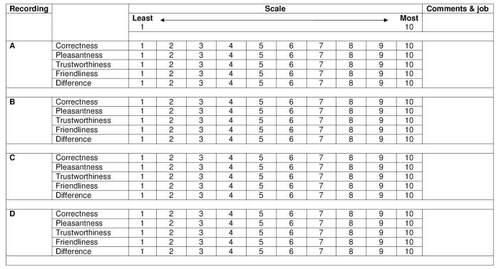
The final design of the free-choice task was simple: for respondents to place an ‘x’ on a blank map where they believed each voice sample’s provenance to be. As with ‘draw-a-map’ tasks, a location map was displayed for respondents to look at whilst completing the task (Montgomery 2006: 72); this ensures that there is some geographical consistency amongst respondents. As well as being asked to place voice samples on the map, respondents were also requested to rate each voice sample along a number of ten-point scales (‘Correctness’, ‘Pleasantness’, ‘Friendliness’, ‘Trustworthiness’, and ‘Difference’ in initial fieldwork (Montgomery 2006)). Voice samples were recordings of speakers reading the short story "The North Wind and the Sun" (around 30–40 seconds in duration), and these were played twice for each speaker. The speakers were chosen on the basis of willingness to participate in the study, and all had similar levels of education, in earlier studies (designed primarily to test the effectiveness of the method and processing techniques) the voices presented were both male and female; however in later studies only male voices were used.
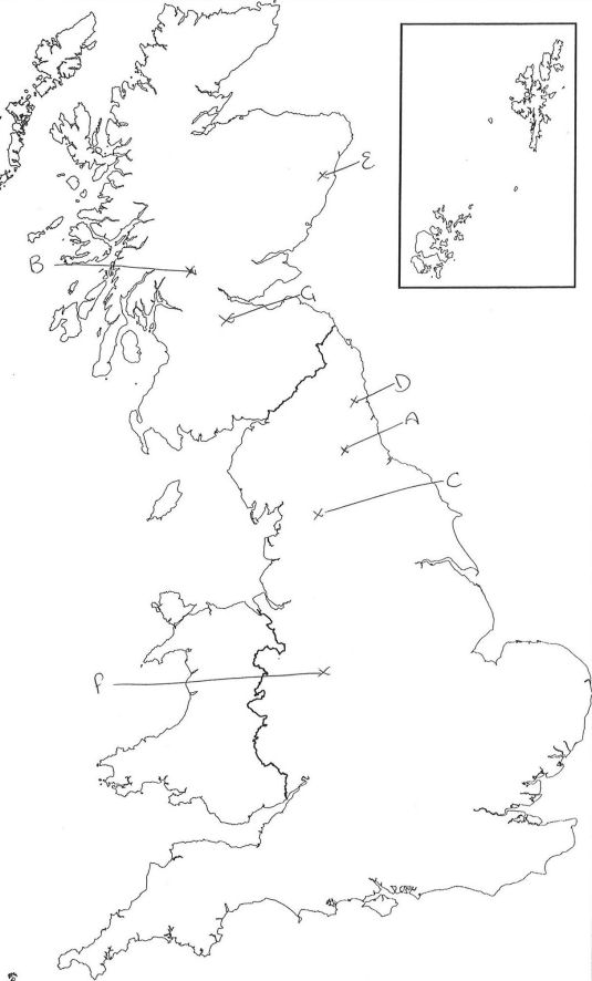
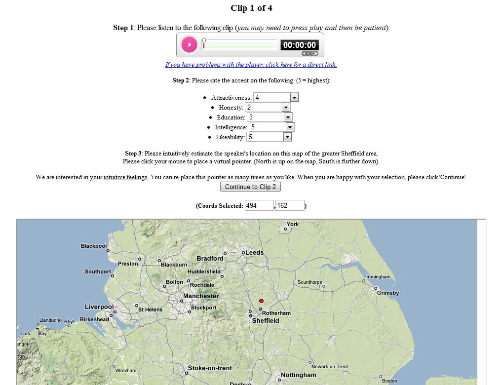
The free-choice listening task proved easy to understand for the respondents in numerous pilot studies. Even those respondents who did not wish to be involved in the ratings element of the task felt able to take part in the placement part and an example of a completed free-choice location map sheet can be seen in Figure 1. Some respondents did experience some difficulty in placing voice samples, which usually resulted in no placements marked on the map. Initially a concern, this ‘problem’ can actually indicate perceptual ‘black holes’ which were also uncovered by results from ‘draw-a-map’ tasks. Although initial fieldwork, which took place in 2005–2006, used the ten-point ratings scales (see Figure 2) mentioned above, in subsequent fieldwork (in 2009) these ratings elements have been adapted by changing some of the adjectives [1] and introducing types of ‘magnitude scales’ (see Figure 3). Such scales present respondents with two opposing adjectives (e.g. ‘Happy’ and ‘Sad’), with a line running between the two, on which respondents are requested to mark where along the continuum they believe the voice to be. This removes the discrete ratings categories found within the confines of a ten-point scale, and also appears to reduce the tendency for respondents to concentrate their ratings around middle values. Offering respondents the maximal amount of free-choice in ratings tasks seems to be welcomed by the majority of respondents.
The free-choice task method was designed so that data from the ratings element of the task would be able to be used alongside placement data with the hope that patterns in the data might be best explained. Ratings data has been shown to be beneficial in previous investigations into the perception of voice samples in Wales (Williams et al. 1999). In this research, explanations were found for the recognition (and, indeed, misrecognition) of voice samples through the phenomena of ‘claiming’ and ‘denial’ (Williams et al. 1999: 356). ‘Claiming’, in this case, is the way in which respondents will hear a voice sample and if they have rated it highly misattribute it to their ‘home area’. In a similar fashion, the respondents will ‘deny’ the voice samples which they rate lowest and place them further away. Williams et al. (1999: 356) claim that "the processes of claiming and denial … find a theoretical foundation in theories of social identity and self-categorisation".
2.2 Dealing with free-choice data: Starburst charts
Although the free-choice voice sample placement task is very simple for respondents to understand, as well as relatively easy to administer, the most difficult part of the method is to be found when processing and analysing results from the task. As has been found when attempting to work with ‘draw-a-map’ data (Montgomery 2006, Forthcoming), there are problems when digitising graphical data from free map drawing tasks. Digitisation is needed in order that the data can be worked with in order to investigate trends and patterns. It could be argued (and has been (Mackaness 2008 pers. comm.)) that in many cases the eye is an excellent judge of certain types of patterns, and the time spent digitising data could be better spent simply on analysis. However, my aims in digitising data from free-choice placement tasks are to make the process scalable, so as to ensure that it is as simple to investigate patterns of placement from 500 respondents as it is from 25. Thus, a way of working with the placement data needed to be found that permitted relatively swift processing time, and a way of easily displaying placement data from numerous respondents.
The principal aim of digitising each of the location crosses from each respondent for each voice sample and compile them in order that they could be analysed together was not easy to achieve. What was needed was the ability to examine the collated placements of each voice sample by every individual respondent in order to facilitate the investigation of the patterns of voice sample placements. The digitisation of results should permit the examination of many placements in a composite which would show their relative geographical position, as well as allowing the calculation and display of other statistical information (such as mean error in placement, mean co-ordinate location). The ability to composite voice placements in order that they be displayed on a map was also vital as one of the aims of the placement task is to examine the correlation with results of blank ‘draw-a-map’ tasks.
As can be seen from Figure 1, the raw data (crosses and labels indicating which voice sample is being referred to) is clear, which removes one possible obstacle to digitisation. Unlike ‘draw-a-map’ task data, responses from free voice placement tasks are simple as there is only ever one dot representing each voice sample displayed on a map. There are many possible ways of taking these placement dots from the paper maps and combining them in digital format. A digitising pad was used in pilot studies; with the pad used to place a dot in the ‘x’ for each voice sample, and the results saved as an image file for each respondent. Subsequently, the image files were overlaid and the dots for each area compiled on one map. The digitising pad method has several problems, however, not least that accuracy cannot be easily checked, as when overlaying dot data from each respondent, there was no map background with which to compare with. For this reason the digitising pad method was abandoned, although it is worth noting that if one wished to work with a Geographical Information Systems (GIS) program to digitise placements, a digitising pad could be particularly useful as the orientation of placement maps could be automated within the program.
The method which evolved from the digitising pad method took inspiration from the overlay stage of the process mentioned above. Using a combination of programs (principally Microsoft PowerPoint 2003, along with Jasc Paint Shop Pro 7/9, MWSnap and ImageJ), a way was found of overlaying maps, creating composite maps and charts, and extracting x and y data for placements. I will detail the steps in which I processed the data below, with supporting video files showing the stages in the process.
2.2.1 Creating dot maps
As explained above, one of the issues with any overlay method is orientational consistency: ensuring that all the maps are identically lined up with each other. In order to do this for all voice placement maps, it is important that all maps used in initial fieldwork are identical, and that all maps for a particular fieldwork site are printed in the same printing/photocopying run. This will reduce any errors that may arise from slight changes due to paper loading or other factors. The aim of the overlay method is to overlay numerous scanned map images, each of which will contain one respondent’s voice placements. In order to minimise any scanning error, it is best practice to use a hopper-based scanner, which will automatically feed each sheet to be scanned into the scanner. Using this method it is possible to reduce the chances of scanning error when placing individual map sheets onto a flat-bed scanner. Once all images are scanned, it is important to check each one in order to ensure there have been no errors in the scanning process, and that all images are of the same size/orientation (i.e. none are upside-down). This pre-checking is due to the next process being automated with PowerPoint, and ultimately saves a good deal of time.
When in PowerPoint, a blank base map should be loaded as a picture file; this should be identical to the scanned location map sheets (ideally from the same file that was printed from when creating final fieldwork materials). The required dimensions of the base map picture should be entered, and the image aligned centrally along both the vertical and horizontal axis. The base map picture should be made transparent and ‘bring to the front’ selected on the image properties, and the actual provenance of each voice sample then added to the base map and a grouped image created. After this stage, all of the scanned maps (only up to 100 at a time, depending on processing power) should be loaded into PowerPoint as pictures, resized according to the dimensions specified for the blank base map and then aligned centrally along the vertical and horizontal axes. The transparent base map should then be moved manually in order to line up with the group of scanned respondent maps, if this is not already the case, and then sent to the back of the image stack. The completion of these stages results in the orientation of all of the placement maps. These can then be combined using the draw function within PowerPoint. This is done by creating a small circle and placing it over the cross on the first map indicating the placement of one voice sample, and then deleting the first map before moving on to the next map in the sequence. Video 1 demonstrates this process, and the resulting dot map, an example of which can be seen in Figure 4. This dot map should then be captured using a screen capture utility such as MWSnap for a further process, detailed below. The process above should then be repeated for each survey location and voice sample in the experiment.

Video 1 (with audio). Creation of a dot map.
2.2.2 Using dot maps to create line charts
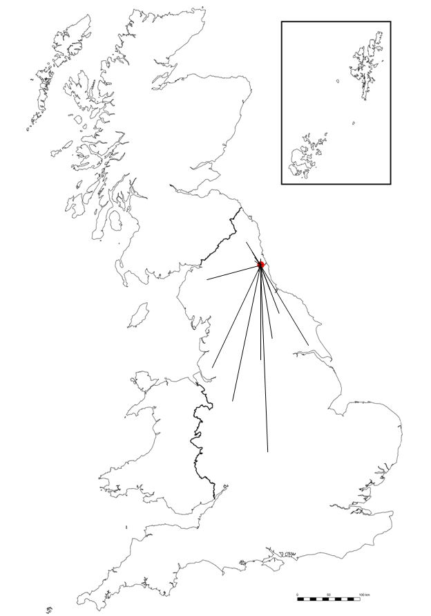
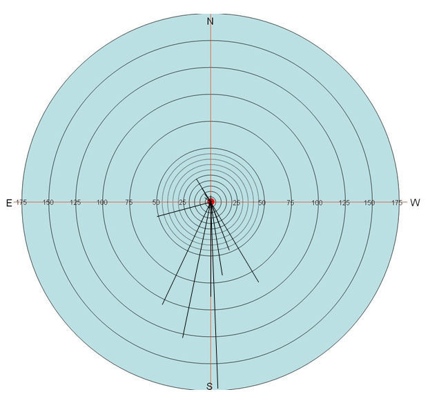
The next stage of the process involves preparing the compiled data for placement onto ‘starburst’ charts. Such charts permit the visual display of the directional skew of placements, along with the scale of errors in placement. Such charts take their inspiration from techniques used by Viereck & Ramisch (1997), as well as the Romanian Online Dialect Atlas (Embleton et al. 2005) along with work focusing on geographical perception (Pocock 1972). The starburst charts permit a clear view of the link between the actual provenance of the voice sample and each individual placement. The first stage in the creation of a starburst chart is to add lines emanating from the actual provenance of each voice sample to each of the dots created using the dot map creation process discussed above. Each placement dot should be removed from the map as a line is added. Once this step is completed a map with numerous lines radiating from the voice sample’s provenance will be displayed, as shown in Figure 5. Once the line map is created, the lines and provenance dot should be grouped together, copied from the map, and placed onto a circular chart. The circular chart should have been previously created in PowerPoint using the same scale as the base map. The chart should have a central point with concentric circles of regularly increasing diameters. The charts that I have created had circles increasing by a scale of five miles for the first 50 miles, with further circles at 25 mile intervals, up to 175 miles, although there is no reason why different intervals should not be used. Video 2 demonstrates this process and Figure 6 shows a basic starburst chart.
Video 2 (with audio). Creation of a starburst chart.
The basic starburst chart creation method described above fulfils one of the objectives of digitisation: the ability to examine the spread of responses to the voice sample placement task. From the resulting charts it can be clearly seen where the majority of respondents located each voice sample and an overall view of the distribution of responses gathered. The basic starburst chart method does not however completely fulfil a second objective of the computerising process; that of accurately measuring errors in the placements in the free voice placement test.
2.2.3 Co-ordinate placement data and placement errors
The earliest trials of the starburst chart method used charts in order to perform measurements, using the concentric circles as measuring tools. However, this proved to be a particularly time consuming method and one which is also susceptible to errors due to inaccurate estimation of placements with a greater error distance than 50 miles (due to the lack of a fine-grained five-mile scale after this threshold). Using the starburst chart to perform measurements also has the restriction of not permitting analysis of the co-ordinates of placements (this can be done by superimposing a grid on the starburst chart and reading the co-ordinates, although this is again very time consuming).
For these reasons, after being made aware of the image processing software ImageJ (Watt 2008, pers. comm.), it was decided that this would be used in order to calculate co-ordinate placements. From these co-ordinates a measurement of the actual distance of placement error could also be made. The process for doing this is relatively straightforward, and involves the use of the screen-captured dot maps from the first stage of starburst chart creation (see Figure 4), ImageJ, and a spreadsheet package such as Microsoft Excel for the calculations. Video 3 demonstrates this process, explained below, which involves the capture of the voice sample placement co-ordinates.
Video 3 (with audio). Measurement of placement error.
The first stage is to open ImageJ, before loading the appropriate image file (if these are numbered, open the first image in a sequence, as there is an ‘open next’ option which can be used after capturing the co-ordinates from the first file). The image will now be displayed, and can be examined using the ‘+’ and ‘-’ keys to zoom in and out. Pressing the ‘space’ bar grabs the image, which can then be moved using the mouse in order to focus on the appropriate area. The next stage is to select ‘point selections’ from the toolbar, which will permit the selection and storage of specific image points. The tool can select one point at a time, or if used with the ‘shift’ key depressed, will select multiple points. Each time a point is selected, a dot will appear on the image, and the tool will display the number of each dot selected. Using this multiple point selection tool, each of the voice placement dots from the image should now be selected. Once all of the points have been selected, the ‘Analyze’ drop-down menu can be selected, followed by ‘Measure’ (or the short-cut ‘Ctrl+M’ used), which will return a table detailing the number of points selected, along with x and y co-ordinate details. This table can then be copied and pasted into a spreadsheet in order to perform more calculations on the data.
The primary calculation to be performed on the data is that of distance calculation, as the placement co-ordinates are now known. In order to calculate the distance between the actual provenance of the voice sample and the individual placements, the co-ordinates of the real provenance need to be established. This is done by following the same steps detailed above (but using the single point selection tool), and copying the co-ordinates across to the spreadsheet. Once the actual provenance of the voice sample is known, we have (x1, y1) co-ordinates, and a range of (x2, y2) co-ordinates for each individual placement. To find the distance between the actual provenance and one placement the following formula is used:
d = √((x2−x1)2 + (y2−y1)2).
This formula gives the distance between two points in kilometres, which can be converted to miles, by multiplying the result by 0.62137. The formula can be applied to all the voice sample placements to accurately report the error in placement for each respondent. These numerical data can then be used for other analyses involving typical descriptive statistical tests. The voice placement co-ordinates captured in the first step of this stage can also be used in such tests, which allows a greater amount of data to be added to the starburst chart, such as mean co-ordinate placement error. Further data that can be added to the starburst charts is the location of the respondents listening to the voice samples, which can be used to investigate the phenomena of ‘claiming’ and ‘denial’ (Williams et al. 1999: 356).
2.2.4 Completing the starburst chart
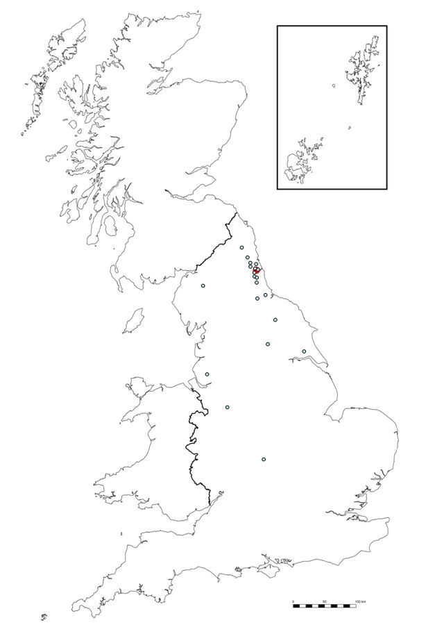
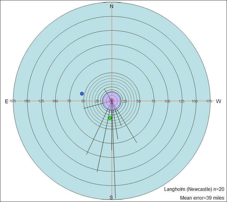
Another piece of data that can be added is an idea of the confidence with which one can view the placement data in the starburst chart. It was decided that this would be an important piece of data to add to the chart as it would demonstrate the amount of error that could be expected a typical respondent to make when placing points on a map relating to locations they had a prior knowledge of. This was achieved by completing a separate location task with a separate group of respondents (n=36), of a similar age, sex and social background to those respondents completing the free voice placement tasks. This task involved displaying the same location map as used for the free voice placement task but with the task changed to request the respondents to locate specific cities on their blank maps. From this, new starburst charts were created using the results, which can be seen in Figure 7. The mean errors in city placement were calculated to produce an overall mean (which was 11.5 miles) and this figure used for the radius of a new circle which was added to the starburst chart. This circle was added to the centre of each chart (which indicates the actual provenance of voice samples), in order that a visual representation of the possible error in placements be seen by those reading the charts. Figure 8 shows a completed starburst chart with all additional elements: the mean error circle (in light purple), the location of the respondents who made the voice sample placements (marked with a blue dot), and the mean co-ordinate error (marked with a green dot).
The completed starburst chart can then be used to display the directional skew of voice placements, with salient information such as the mean co-ordinate placement and the location of respondents to aid in examining the patterns of placement. Of course, the way in which the starburst charts are constructed allows the investigator to remove any outlying placement data, in line with standard practice in other areas of perceptual dialectology (Preston 1989; 2002b: 71). Removal of outlying placements produces much less diffuse starburst charts in which the major trends become more apparent.
2.3 Applications of starburst charts
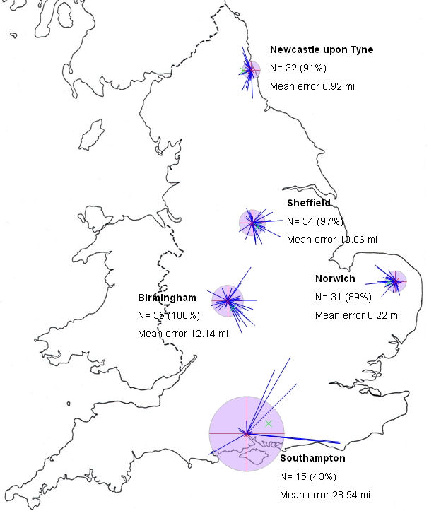
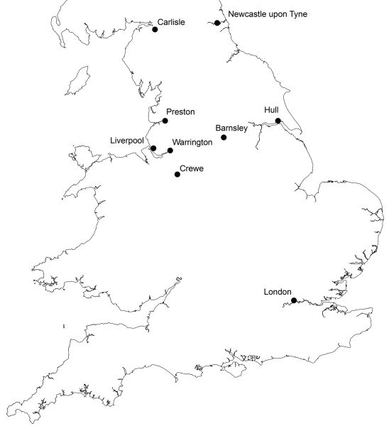
Starburst charts permit the combined visual display of any number of respondents’ placements for each sample in a free voice placement task. They do so without the use of the maps from which the placements have been taken, and as such present a different way of examining the data. Directional skew, the mean error in placement, and the extent of respondent agreement regarding placements of voice samples can be gleaned from a brief glance at the chart. However, when used together with the ratings data from the free voice placement tasks as a tool for accounting for the patterns in voice placement, starburst charts can be very beneficial, bringing the ability to analyse all of the data together. To illustrate this, I will use data from research undertaken in three locations in the north of England (Carlisle, Crewe, and Hull) in 2005–2006. These locations, and all others mentioned subsequently, can be found in Figure 9. 137 respondents took part in the research, 36 from Carlisle, 54 from Crewe, and 47 from Hull, the mean age of respondents was 21.6 years old and there were 93 females compared with 44 males.
As discussed above, the creation of starburst charts enables the calculation of the amount of error in voice sample placement. Table 1 shows the high, low and mean errors (in miles) for each sample placement by survey location.
Table 1. High, low and mean errors (in miles) for voice sample placements by survey location.
Sample |
Carlisle (n=36) |
Crewe (n=54) |
Hull (n=47) |
|
High |
Low |
Mean |
High |
Low |
Mean |
High |
Low |
Mean |
Barnsley |
124 |
6 |
66.7 |
222 |
11 |
51.2 |
122 |
0 |
46.1 |
Newcastle |
187 |
0 |
34.6 |
227 |
0 |
55 |
227 |
0 |
63.2 |
Warrington |
152 |
0 |
40.9 |
115 |
0 |
39 |
160 |
7 |
49.1 |
London |
186 |
8 |
77 |
224 |
3 |
51.4 |
177 |
0 |
58.4 |
Liverpool |
195 |
0 |
67.8 |
190 |
0 |
55.9 |
109 |
0 |
50.3 |
Hull |
170 |
11 |
87.5 |
177 |
11 |
90 |
258 |
0 |
82.8 |
Preston |
230 |
27 |
116 |
185 |
27 |
100.2 |
237 |
16 |
107 |
Carlisle |
295 |
130 |
170 |
282 |
0 |
110.6 |
285 |
0 |
109.6 |
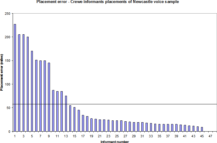
The figures in Table 1 demonstrate that most of the respondents were relatively successful in the majority of their voice placements. There are of course large degrees of error in the ‘high’ column, although as Chart 1 (Crewe respondents’ placement of the voice sample from Newcastle) demonstrates, the preponderance of placements is below the mean error of 55.02 miles (a fact also expressed in the low median value of 23 miles).
The horizontal line in Chart 1 is placed at the 55.02 mile point and indicates the mean error of placement of the Newcastle voice sample. The chart shows that only thirteen (27.08%) of the placements are above the mean error point, which indicates the skewing effect of the high error placements. The result of this high skewing effect is that some accurate voice placements can be masked when looking at the mean figure, and that other ways of analysing the data such as starburst charts can be effective.
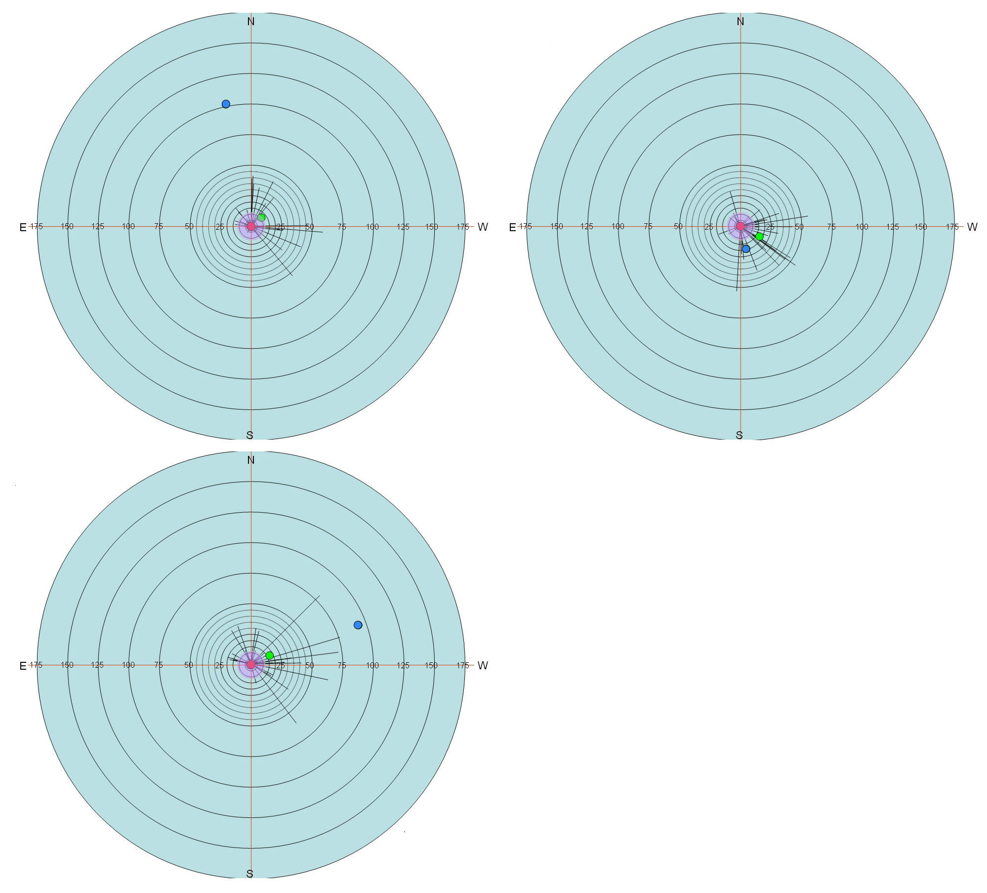
As starburst charts allow a greater appreciation not only of the error in voice sample placement but also the general direction of placement error, they can be of use when accounting for patterns in voice placements. Figure 10 shows three starburst charts, one from each survey location (Carlisle, Crewe, and Hull), indicating the placements of a voice sample from Warrington. The Warrington voice sample was the most accurately placed voice sample of the eight, with an overall mean error of just 42.9 miles. With this low overall mean error it is unsurprising that there are no significant differences between the mean errors of placement across individual survey locations. However, the placements by Crewe-based respondents seem to be affected by the town’s relative location, as do the mean ratings which are displayed in Table 2.
Table 2. Mean ratings for Warrington voice sample on ratings scales for each survey location, with significant differences flagged in bold.
|
Carlisle |
Crewe |
Hull |
Correctness |
5.37 |
5.83 |
5.47 |
|
CA-CW |
CW-HL |
CA-HL |
p |
NS |
NS |
NS |
Pleasantness |
5.29 |
5.47 |
4.58 |
|
CA-CW |
CW-HL |
CA-HL |
p |
NS |
0.05 |
NS |
Difference |
5.29 |
4.53 |
5.6 |
|
CA-CW |
CW-HL |
CA-HL |
p |
NS |
0.05 |
NS |
Friendliness |
5.17 |
5.51 |
4.67 |
|
CA-CW |
CW-HL |
CA-HL |
p |
NS |
0.05 |
NS |
Trustworthiness |
4.85 |
5.23 |
4.41 |
|
CA-CW |
CW-HL |
CA-HL |
p |
NS |
0.05 |
NS |
All (w/o diff.) |
5.17 |
5.51 |
4.79 |
|
CA-CW |
CW-HL |
CA-HL |
p |
NS |
0.05 |
NS |
The table displays the mean ratings for each scale in the row corresponding to each semantic scale (either ‘Correctness’; ‘Pleasantness’; ‘Difference’; ‘Friendliness’; ‘Trustworthiness’). The two rows beneath the mean figures show the results of the test for significant difference (Tukey HSD post-hoc tests after one-way ANOVA tests). The first row displays the results of the comparison between two of the survey locations (thus, CA-CW = Carlisle compared with Crewe), with the second row showing the result of the Tukey HSD test for significance of mean difference. The result is expressed either as NS (not significant) or the significance level (p < 0.05, 0.01). Significant differences are displayed in bold type in order to assist the reader. The final section of the table contains the mean of the ratings for all scales with the exception of ‘Difference’ along with the results for the test of significant difference. The reason for the exclusion of the ‘Difference’ ratings is the way in which this scale was designed. All scales were completed following the instruction that 1 = least and 10 = most. Thus, if a respondent gave a sample a score of 1 for ‘Correctness’, 1 for ‘Pleasantness’, 1 for ‘Friendliness’ and 1 for ‘Trustworthiness’ and 10 for ‘Difference’, the respondent would be giving the sample a very low rating on all scales as well as rejecting the sample as similar to his or her variety (10 = highly different). The exclusion of ‘Difference’ from the combined mean acknowledges this differing function to that of the other rating scales.
The starburst charts in Figure 10 reveal a ‘lightbulb effect’ for the Crewe-based respondents, with placement of the sample skewed towards the location. The mean co-ordinate error is also close enough to the actual geographical location of Crewe (marked with the green dot) to be within the margin of error (11.5 miles), as are many of the individual placements. This appears to demonstrate a case of ‘claiming’ (Williams et al. 1999: 356) as it seems from the starburst chart that Crewe-based respondents perceive the sample as an example of a ‘home’ variety. Support for the claiming of the Warrington voice sample can also be found in Table 2. There are no significant differences between the mean ratings from Carlisle and Crewe. However, when comparing the mean ratings from Crewe-based respondents with those from Hull, there are significant differences for all ratings with the exception of ‘Correctness’. The mean for all ratings (excluding ‘Difference’) is also shown to be significantly different between ratings from Crewe and Hull (p < 0.05). This indicates that the Warrington voice sample was judged significantly more favourably by respondents from Crewe than those based in Hull. Not only was the sample viewed more favourably by Crewe-based respondents but they also judged it to be significantly more similar (less different) to their own variety (p < 0.05). The results in the starburst charts, taken with the ratings data from Table 2, create a strong case for the ‘claiming’ of the Warrington voice sample by respondents from Crewe.
The utility of starburst charts is that, taken with other data from the same task, they can go some way towards investigating how listeners perceive samples of speech. They can help understanding of how attitudes towards voice samples can affect where listeners think that they are from, and in doing so add to the work that has already been performed in this area (Williams et al. 1999). The radiating lines of the starburst construction provide a visual link to the provenance of voice samples and can therefore be used to produce overall composite maps, as well as investigating the ability of respondents to place voice samples within composite areas from ‘draw-a-map’ tasks.
3. Conclusion
Starburst charts are of course not without their problems. Despite one of the aims of the method being to create a compositing process that would be swift to complete, as has been shown the method is rather laborious with many different stages and using numerous pieces of software to achieve the best results. It is however, I believe, currently the best way of compiling numerous respondents’ placements of voice samples if one wishes to use the free-choice voice sample task. Processing data and creating the charts is, once the circular chart has been created with the appropriate scale and concentric circle distance, not especially time consuming, especially when compared to transcribing spoken data and analysing tokens. The resulting charts are relatively flexible and permit investigation of the affect of any number of social factors on voice sample placements (not just the affect of voice sample ratings), as well as providing graphical data for comparison with draw-a-map tasks.
There has been some criticism of the starburst charts, especially in relation to the use of aggregated ratings data from the voice sample ratings alongside them (van Hout 2008, pers. comm.). This is due to starburst charts displaying individual placements, not aggregate placement data (in the main). van Hout further argued that this is not an appropriate way of using the data sets together. I do not believe that using aggregate ratings data is inappropriate; however the reliance of starburst charts on individual data is perhaps problematic. Although it is my belief that starburst charts do provide an excellent way of viewing numerous placements and the general skewing of placements, the next stage of the method should be some way of aggregating placement data, preferably automatically.
3.1 Future developments
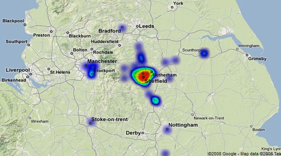
Automatic aggregation of placement data is very possible with existing technology, and is something which has been done on a small scale by Smith (2008) in a piece of undergraduate research at the University of Sheffield. Taking the basic idea of the free-choice voice samples task, Smith adapted the task in an online setting. Using a cropped map (Smith was interested only in the placement of voices in and around the city of Sheffield), which is shown in Figure 11, Smith requested that respondents listen to voice samples and complete a ratings and placement exercise on screen. Voice sample ratings and placements were recorded automatically, which allows for "higher degree of accuracy of analysis on the digital map, as users exact mouse-click coordinates were recorded" (Smith 2008: 3). All data was saved to a database, which meant that although Smith’s study was very small in scale the "methodology is practically infinitely scalable, and tens of thousands of responses could have been analysed" (Smith 2008: 3) with ease.
As well as storing the exact co-ordinates of the voice sample placements by respondents (which means that there is no need to scan, place dots, and analyse the placement of dots as per the starburst creation method detailed above), Smith’s (2008) method also produced an automatic ‘click heat’ map. The ‘click heat’ map is essentially an aggregate of all respondents’ placements for each voice sample, an example of which can be seen in Figure 12. The ‘click heat’ map indicates where the majority of respondents believed a sample to originate, and creates an image that is directly comparable to composite ‘draw-a-map’ tasks aggregate results. The extent of the ‘click heat’ locations for each click can of course be changed, which would give some indication of the error factor (or ‘fuzziness’) one could expect in placement tasks (so, for the data discussed above, the radius of the ‘click heat’ dots would equal 11.5 miles).
One possible drawback of the ‘click heat’ method as proposed by Smith (2008) is that it is web-based, and there are potential problems with getting accurate biographical data from respondents on the web. This should, I believe, be seen as a minor issue that is far outweighed by the ability of the method to gather far more accurate placement data from a wider selection of respondents than would be possible with the current pen and paper free placement task. The method should be refined, of course, and its efficacy for use using a larger of a whole country be assessed, but as it stands the ‘click heat’ could prove to be extremely valuable in the investigation of this branch of perceptual dialectology.
3.2 Summary
In this article, I have discussed the background to the starburst chart methodology, and demonstrated the usefulness of this type of analysis to the study of perceptual dialectology. Far from being an area that should be left to independent study, and voice location and rating being "ill placed in a folk linguistic setting" (Niedzielski & Preston 2003: 82), I believe that both voice sample and rating have a place at the heart of a successful perceptual dialectology method. It would surely be odd if the researcher could not assess whether the lines drawn by respondents indicating dialect areas in ‘draw-a-map’ tasks bore any relation to the same respondents’ ability to locate voice samples within or without these hand drawn areas.
The relationship between ratings and placement is an important area of study, and starburst charts help to visualise this link and provide comparisons for numerical ratings data. The ability of starburst charts to investigate the affect of social factors on voice sample placements is also important, as this could shed new light on the nature of listeners’ perceptions.
The ability of the method to be developed and automated has also been discussed. It is important for the study of perception that as many respondents as possible are sought to participate in studies. The web-based nature of the ‘click heat’ method could make this possible, and the resulting ability of the utility to automatically create ‘click heat’ maps or provide a list of co-ordinates indicating individual placements would enable swift analysis of many responses. This would permit far more wide-ranging analyses to take place, with no significant increase in the time pressures of dealing with large amounts of data.
The investigation of rating and placements of voice samples in a free-choice placement task has, I believe, a major role to play in perceptual dialectology investigations. Whether using pen and paper free-choice tasks (which is currently the only option widely available), or building on these and using a version of ‘click heat’ tasks, it is hoped that this article has provided a necessary guide to the steps needed in order to process and work with data from such tasks.
Acknowledgement
Many thanks to Sam Smith for allowing me to reproduce figures from his Undergraduate Dissertation, and for letting me have access to the method of analysis shown in the figures.
Note
[1] These adjectives were generated in a separate experiment in which respondents of a similar age and social background to those who would eventually take place in fieldwork were played the same voice samples to be used in the final fieldwork. These respondents were asked to supply as many adjectives about each voice sample as they could. These adjectives were then used as part of the magnitude scales in the final experiment. The final scales were: ‘Unfriendly–Friendly’; ‘Boring–Lively’; ‘Common–Posh’; ‘Uneducated–Educated’; ‘Completely different to me–Identical to me’.
Sources
Accents of the Greater Sheffield Area Study, http://www.samsmith.co.uk/socioling [link no longer available, see https://web.archive.org/].
ImageJ, https://imagej.nih.gov/ij/.
MWSnap, http://www.mirekw.com/winfreeware/mwsnap.html.
References
Bloomfield, Leonard. 1944. "Secondary and tertiary responses to language". Language 20: 45-55.
Boughton, Zoe. 2006. "When perception isn't reality: Accent identification and perceptual dialectology in French". French Language Studies 16: 277-304.
Bucholtz, Mary, Nancy Bermudez, Victor Fung, Lisa Edwards & Rosalva Vargas. 2007. "Hella Nor Cal or Totally So Cal? The perceptual dialectology of California". Journal of English Linguistics 35: 325-352.
Clopper, Cynthia G. & David B. Pisoni. 2002. "Perception of dialect variation: Some implications for current research and theory in speech perception". Research on Spoken Language Processing: Progress Report no. 25. Indiana: Indiana University. [No pagination.]
Clopper, Cynthia G. & David B. Pisoni. 2004. "Some acoustic cues for the perceptual categorization of American English regional dialects". Journal of Phonetics 32: 111-140.
Clopper, Cynthia G. & David B. Pisoni. 2006. "Effects of region of origin and geographic mobility on perceptual dialect categorization". Language Variation and Change 18: 193-221.
Embleton, Sheila, Dorin Uritescu & Eric Wheeler. 2005. "Data capture and presentation in the Romanian Online Dialect Atlas". Paper presented at Methods in Dialectology Conference, Université de Moncton, August 2005.
Giles, Howard & Richard Y. Bourhis. 1975. "Linguistic assimilation: West Indians in Cardiff". Language Sciences 38: 9-12.
Giles, Howard & Richard Y. Bourhis. 1976. "Voice and Racial Categorisation in Britain". Communication Monographs 43: 108-114.
Giles, Howard & Peter F. Powesland. 1975. Speech Style and Social Evaluation. London: Academic Press.
Lambert, W., E. R. Hodgson, R. C. Gardner & S. Fillenbaum. 1960. "Evaluation reactions to spoken languages". Journal of Abnormal and Social Psychology 60: 44-51.
Markham, D. 1999. "Listeners and disguised voices: The imitation of dialectal accent". Forensic Linguistics 6: 289-299.
Mase, Yoshio. [1964] 1999. "Dialect consciousness and dialect divisions". Handbook of Perceptual Dialectology, ed. by Dennis R. Preston, 71-99. Amsterdam: Benjamins.
Montgomery, Chris. 2006. Northern English dialects: A Perceptual Approach. Unpublished PhD Thesis, University of Sheffield.
Montgomery, Chris. Forthcoming. "Perceptual dialectology: Methods for gathering, processing, and using geographical data".
Niedzielski, Nancy & Dennis R. Preston. 2003. Folk Linguistics. Berlin: Mouton de Gruyter.
Paltridge, J. & Howard Giles. 1984. "Attitudes towards speakers of regional accents of French: Effects of rationality, age and sex of listeners". Linguistische Berichte 90: 71-85.
Pocock, Douglas Charles David. 1972. "City of the mind: A review of mental maps of urban areas". Scottish Geographical Magazine 88: 115-124.
Preston, Dennis R. 1981. "Perceptual dialectology: Mental maps of United States dialects from a Hawaiian perspective (summary)". Methods IV, ed. by Henry Warkentyne, 192-198. British Columbia: University of Victoria.
Preston, Dennis R. 1989. Perceptual Dialectology: Non-linguists' View of Aerial Linguistics. Dordrecht: Foris.
Preston, Dennis R. 1999a. "Introduction". Handbook of Perceptual Dialectology, ed. by Dennis R. Preston, xxiii-xxxix. Amsterdam: John Benjamins.
Preston, Dennis R. 1999b. "A language attitude approach to the perception of regional variety". Handbook of Perceptual Dialectology, ed. by Dennis R. Preston, 359-75. Amsterdam: John Benjamins.
Preston, Dennis R. 2002a. "Language with an attitude". The Handbook of Language Variation and Change, ed. by Jack K. Chambers, Peter Trudgill & Natalie Schilling-Estes, 40-66. Oxford: Blackwell.
Preston, Dennis R. 2002b. "Perceptual dialectology: Aims, methods, findings". Present-Day Dialectology: Problems and Findings, ed. by Jan Berns & Jaap van Marle, 57-104. Berlin: Mouton de Gruyter.
Preston, Dennis R. Forthcoming. "The South: Still Different". Language and Variety in the South III, ed. by Michael Picone and Catherine Davies. Tuscaloosa, Ala.: University of Alabama Press.
Purschke, Christoph. 2009. "Concepts of Hessian?: Cognitive prototypes and subjective language areas". Paper presented at Production, Perception, Attitude workshop, Katholiek Universitiet Leuven, March 2009.
Rensink, W.G. [1955] 1999. "Informant classification of dialects". Handbook of Perceptual Dialectology, ed. by Dennis R. Preston, 3-7. Amsterdam: John Benjamins.
Ryan, Ellen Bouchard & Howard Giles, eds. 1982. Attitudes Towards Language Variation: Social and Applied Contexts. London: Arnold.
Smith, Sam. 2008. Sheffield Accents: A Small Scale Sociolinguistic Survey. Unpublished BA Dissertation, University of Sheffield.
Viereck, Wolfgang & Heinrich Ramisch, eds. 1997. The Computer Developed Linguistic Atlas of England. Tubingen: Niemeger.
Weijnen, Antonius A. 1999. "On the value of subjective dialect boundaries". Handbook of Perceptual Dialectology, ed. by Dennis R. Preston, 131-4. Amsterdam: John Benjamins.
Williams, Angie, Peter Garret & Nikolas Coupland. 1999. "Dialect recognition". Handbook of Perceptual Dialectology, ed. by Dennis R. Preston, 345-58. Amsterdam: Benjamins.
|