Visualisation of text corpora: A case study of the PCEEC
Harri Siirtola, Tampere Unit for Computer-Human Interaction, University of Tampere
Terttu Nevalainen, Research Unit for Variation, Contacts and Change in English, University of Helsinki
Tanja Säily, Research Unit for Variation, Contacts and Change in English, University of Helsinki
Kari-Jouko Räihä, Tampere Unit for Computer-Human Interaction, University of Tampere
Abstract
Information visualisation methods have a relatively modest role in corpus linguistics nowadays. There are good reasons for this: many of the information visualisation tools in the past have been targeted mainly at technical users, making them unusable for non-specialists; and the publishing tradition in corpus linguistics has favoured textual and tabular data presentations over graphics. However, we believe that the information visualisation community has a lot to offer corpus linguistics if only the domain was better understood.
To support our claim, we survey information visualisation as a cognitive tool for corpus linguists and present a selection of text corpus visualisations. We use the Parsed Corpus of Early English Correspondence (PCEEC) as our material to demonstrate techniques of text corpus visualisation.
1. Introduction
Information visualisation is a general approach to data summarisation that usually builds on top of human visual perception. There are good reasons for this. About 70% of our body cells devoted to perception are related to vision, and as a consequence, we acquire more information through vision than we do via all the other senses combined (Ware 2004: 2). In addition, the human visual system has a sophisticated pre-attentive stage that operates in parallel and makes visual information acquisition highly efficient. It would be foolish to ignore it and to rely only on the slow and serial alphanumeric data representations instead of images of data.
The advent of personal and graphics-capable computers in the 1980s had a major effect on the field of information visualisation. Instead of having a static visualisation, the data could be animated for easier utilisation, and the users could interact with a visualisation and produce any number of graphical representations they needed to support their work. The power of information visualisation is often described by the hackneyed and fabricated proverb “a picture is worth a thousand words”, to which visualisation guru Ben Shneiderman retorted “[but then] an interface is worth a thousand pictures”. Both aphorisms are at least questionable, as a picture might be worth any number of words, and many interfaces are absolutely worthless, but the general ideas are sustainable.
The crux of the information visualisation approach is to transform data into images that are easier and quicker to interpret than the data itself. Perhaps the best encapsulation of the philosophy of information visualisation is by Herbert A. Simon, who remarked that “… solving a problem simply means representing it so as to make the solution transparent” (1969: 77; Simon commented that this idea was originally expressed by Saul Amarel in a panel discussion in 1966). However, selecting the appropriate graphical encoding for data is often a challenge, and decent solutions require a fairly good understanding of the task, user, and context of the problem. In addition, the notion of a problem in this context must be taken in the broadest sense, as it can be anything between “show me the lengths of words” and “visualise how this theme evolves”.
In information visualisation, the elementary data types are usually classified into nominal (“Audi”, “Volkswagen”, “Honda”…), ordinal (“small”, “medium”, “large”), numerical, relational, and textual. The visualisation of quantitative data has a long history as a field known as data graphics. Many of the methods developed for numerical data extend to ordinal and nominal data as well by simply converting the ordinal and nominal values into numbers. The visualisation of relationships, or connections between data items, is an offspring of a thriving field known as graph layout. Finally, text visualisation has gained a lot of attention in recent years as more text archives are becoming available on the web, and text visualisation is gaining a more prominent position in the roadmaps of visualisation research (e.g. Thomas & Cook 2005; Kerren et al. 2007, 2010). The linguistic community, too, has recognised the benefits of the information visualisation approach and has begun to accept it as a scholarly methodology (Jessop 2008).
2. Text visualisation
There are many reasons to visualise text. The primary reason for text visualisation is often just to avoid reading, i.e., to understand the structure of text and gain an overview of its content without actually reading it. This motivation became critical when text archives went online since the number of available texts is simply overwhelming, and is growing at an exponential rate. A slightly more specific motive for text visualisation is to visually analyse the text for spotting weaknesses, such as overly complex sentences or other grammatical problems. Taking this even further is to show users what aspects of their interest are present in the text, which might vary from a visualisation of the result of a textual or thematic search to a sophisticated visualisation of some linguistic aspect of the text.
Text is a challenging data type from the visualisation viewpoint. Using the text itself in a visualisation is difficult as text processing is attentive, not pre-attentive, and does not lend itself to effective techniques. There are some opportunities to augment text with interaction for pre-attentive processing, such as colouring the words of interest to distinguish them from the others, but this approach applies only to the simplest of visual queries. Visualisations often use metaphors to represent information in more effective form, but in the case of text this is difficult, because text consists of abstract concepts that are difficult to visualise. Another hindrance is that text often represents similar concepts by many different means, synonyms being the simplest manifestation of this problem. A good illustration of complex references and abstractions in text visualisation was provided by Marti Hearst (2003) in her text fragment “How do we visualise this?”
As the man walks the cavorting dog, thoughts arrive unbidden of the previous spring, so unlike this one, in which walking was marching and dogs were baleful sentinels outside unjust halls. (Hearst 2003: Slide 159)
The fundamental problem with text is that it does not contain its complete meaning. Most of the meaning lies in our minds and in common understanding, making it difficult to produce a visualisation simply from text input.
The design of effective visual metaphors for text corpora is also difficult because of the unstructured and high-dimensional nature of text. If each word of a text is considered a ‘dimension’, then even relatively short texts may contain thousands of dimensions, and a collection of such texts may reach tens or even hundreds of thousands of dimensions. A high-dimensional data set can be flattened into a two-dimensional image, but a lot of information is lost in the process. Unfortunately this is the most common approach to text visualisation in the visualisation community. A text corpus is processed with a ‘bag of words’ model that disregards word order, sentence structure, and the rest of the grammar – an untenable approach from the linguistic perspective.
3. Visualisation in corpus linguistics
It is useful to examine how the most common data graphics are used in linguistic publications. Unquestionably, the line, bar, and pie chart, and the scatterplot must be at the top of the list of most used data graphics.
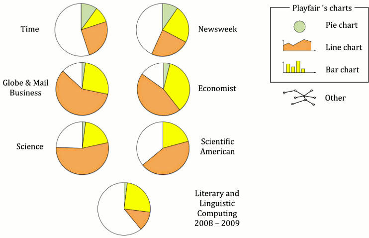
The development of line, bar, and pie charts is generally attributed to William Playfair (1759–1823) (Spence & Wainer 2005: 71-79). His Commercial and Political Atlas (1786) and Statistical Breviary (1801) were the first appearances of these now omnipresent data graphics. Spence (2005) did a study in which he counted the relative proportions of Playfair’s graphics in six publications from 1998: two news magazines (Time and Newsweek), two business-oriented publications (Toronto Globe & Mail and The Economist), and two science or science-popularisation publications (Science and Scientific American). Figure 1 shows the distributions of statistical graphics in these six publications plus a similar analysis for two volumes of Literary and Linguistic Computing from 2008 and 2009. Spence observed that Playfair’s three inventions account for about 50% to 80% of total use. The pie chart is fairly rare in scientific publications, a bit more common in business-related magazines, while about one in ten data graphics in news magazines is a pie chart. The proportion of bar charts is fairly similar across the genres, but the line chart appears to be most popular in economic and scientific publications.
The proportion of Playfair’s graphics in Literary and Linguistic Computing is somewhat different. The proportion of bar and pie charts is fairly similar to other scientific publications, but that of line charts is considerably smaller and that of other data graphics is larger. The other data graphics include trees (9%), graphs (12%) and a collection of data graphic types that are of a more ad hoc type (25%) and thus difficult to classify. Other images used purely as illustrations were excluded from the analysis.
The fourth common data visualisation is the scatterplot, developed into its modern form mainly by Herschel (Friendly & Denis 2005), and still under active development (e.g. Keim et al. 2010). The scatterplot was an important step in statistical graphics as its use led to the discovery of correlation and regression, and to a significant part of present multivariate statistics. The proportion of scatterplots in the sample of Literary and Linguistic Computing data graphics is 16%. Unfortunately, Spence did not count the proportion of scatterplots in his data.
Overall, the use of data visualisations and data tables in Literary and Linguistic Computing can be characterised by dividing the 67 papers into four classes. About 37% of papers did not include any data tables or graphics at all, the results being described verbally only. At the other extreme, about 28% of papers used both tables and data graphics. Finally, 24% of papers used data graphics, but no tables, and 11% of the papers used data tables only.
In the rest of this paper, a number of examples of corpus visualisation are presented, such as visualising the associations between variables, visualisation of word frequencies and relationships, and visualisation of changes over time. Interactive visualisation of text corpora is discussed in the final sections.
3.1 The PCEEC and its origins
We use the Parsed Corpus of Early English Correspondence (PCEEC) to demonstrate techniques of corpus visualisation. Based on the unpublished Corpus of Early English Correspondence (CEEC), which was compiled from edited letter collections, the PCEEC is a part-of-speech tagged and syntactically parsed version of those collections in the CEEC for which permission to publish could be obtained, amounting to c. 2.15 million words, or over three-quarters of the original CEEC. This consists of 4,969 letters written by c. 660 informants between 1415 and 1681. In addition to the PCEEC, we use an extended version of its Associated Information File (AIF) containing sociolinguistic information on the letters, writers, and recipients. While the AIF is provided with the corpus, the extended version is currently in use by members of the CEEC team only, as it is still under construction.
The CEEC, a corpus of personal letters written in English (as used in England) compiled in the 1990s by the “Sociolinguistics and Language History” project team at the University of Helsinki, was designed with historical sociolinguistics in mind. The genre, which in certain respects can be regarded as close to spoken interaction, was kept constant, the sampling unit being the individual letter writer, with at least ten medium-length letters sampled from each writer where possible. The aim was to include writers of both genders and all social ranks from each successive 20-year period covered by the corpus. Regional coverage was also taken into account, with the focus on four main areas, comprising approximately half the material in the corpus: (1) London; (2) the Royal Court, many of whose members lived at Westminster; (3) East Anglia; and (4) the North, consisting of the counties north of Lincolnshire.
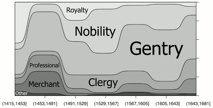
The people living during these centuries can be divided socially in various ways (see Nevalainen 1996; Nevalainen & Raumolin-Brunberg 2003: Ch. 7). The CEEC uses a tripartite division mirroring the literacy of the population, comprising (a) the upper ranks, or royalty, nobility, gentry, and clergy; (b) the middle ranks, consisting of merchants and professionals; and (c) the lower ranks, including other non-gentry such as yeomen, craftsmen, labourers, cottagers, and paupers. Despite efforts to create a socially balanced corpus, the dominance of men from the upper ranks was unavoidable as they were the most literate group, were considered important enough that their letters were preserved, and their letters were later considered important enough to be published. Temporal coverage is likewise uneven, with more material from the later periods than the earlier ones. The regional foci were selected partly out of necessity, as the majority of people living in rural areas were illiterate; the four areas mentioned above provided reasonably good continuity of material throughout the periods, e.g. from the Paston and Bacon families in East Anglia.
The letters in the corpus were selected from printed editions, digitised, and proofread by the team; in a fair number of cases, it was possible to check the letters against the originals in various archives and libraries. Good original-spelling editions were preferred, but to achieve a better coverage of women and the lower ranks, a few less reliable editions had to be included. Holograph letters in good original-spelling editions comprise c. 71%, letters written by a scribe or copied by someone other than the author c. 22%, and letters of doubtful authorship or from problematic editions c. 7% of the corpus. The status of each letter is documented in an authenticity code in its header. Some editions have modernised punctuation and expanded abbreviations, which means that spelling cannot be reliably studied in the CEEC (cf. 3.3.1), but the corpus has proved useful for many other types of linguistic research. For more information on the CEEC, see Nevalainen & Raumolin-Brunberg (2003), Raumolin-Brunberg & Nevalainen (2007), Nurmi et al. (2009), and the entry for the CEEC in the Corpus Research Database (CoRD).
3.2 Visualising the associations between variables
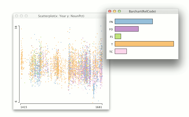
It has been estimated that about 70–80% of graphs used in scientific publications are scatterplots (Friendly & Denis 2005). It can be said that the scatterplot is the canonical display whenever the relationship between two continuous variables is examined. Basically, a scatterplot (or scatter diagram) is a 2D display with orthogonal axes in which the values of two variables for each observation are plotted, revealing the form of association between the variables. With text data, the variables are either those giving metadata about the text, such as the year a letter was written, or something that was counted or computed from text, such as the proportion of nouns in the text sample.
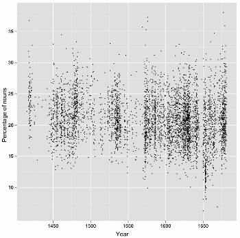
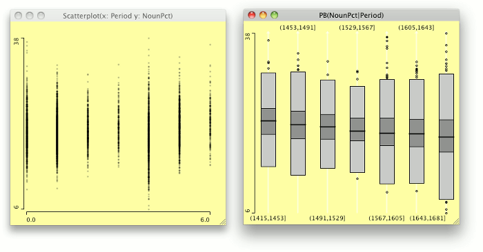
As an example, Figure 2 shows two scatterplots of the variables “Year” and “Percentage of nouns” from the PCEEC, with the purpose of determining whether there is a trend over time in the proportion of nouns which could reveal changes in the letters along the involved/informational dimension of register variation (Biber 1988). Each observation, or dot, is a single letter from the PCEEC.
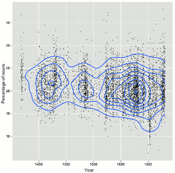
The scatterplot on the left in Figure 2 characterises the PCEEC in many ways. In general, it shows that there are gaps in the data, and that the number of observations (letters) increases toward the end of the corpus. It is also apparent that the association between year and the proportion of nouns varies a great deal, and does not have a clear shape in their association, or a strong correlation. This is to be expected, as the length of the letters varies, and the language in a short note is bound to be different from a letter of several hundred words. As a visualisation, the scatterplot on the left suffers from over-plotting or occlusion – there may be many letters from a single year that have the same proportion of nouns, but their points are plotted on top of each other. The scatterplot on the right in Figure 2 is a remedy for this problem. It is otherwise the same as the scatterplot on the left except that a 2D density plot has been overlaid on it. The density plot is not used here to estimate density, but to show the shape of the data. The density plot is like a topographic map of the data, revealing the locations of highest data densities. Interestingly, the blob of data at the bottom right with an especially low percentage of nouns is due to a single author in the PCEEC: Dorothy Osborne, a gentlewoman writing to her future husband in the 1650s, who has proved to be an outlier in terms of nearly every change studied in the CEEC family of corpora.
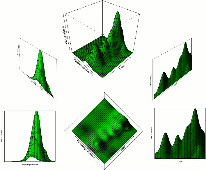
If the scatterplot on the right is imagined as a 3D landscape, then there are three ‘mountains’ on it, indicating that the bulk of the data is concentrated in these three areas (Figure 3). The peaks of the mountains have a linear trend, suggesting that the proportion of nouns is declining over time (visible in Figure 2, the scatterplot on the right). Figure 3 shows the 3D landscape from various directions.
It is difficult to interpret a 3D landscape of data from cross-section images or perspective views like those shown in Figure 3. If the user were allowed to inspect the data landscape much as one would inspect a physical object, i.e., by rotating it and by looking at it from various angles, understanding would be easier. Movie 1 video clip shows how the user might see the data landscape while rotating it interactively.
3.3 Visualisation of word frequencies
One of the simplest measures that can be used to characterise a text is to show the frequencies of the words it contains. In linguistics, frequency counts usually present words in their immediate contexts, or with the sequences of words that they occur with, but in popular visualisations of word frequency the context is usually omitted. The most common visualisation of word frequency is a tag or word cloud.
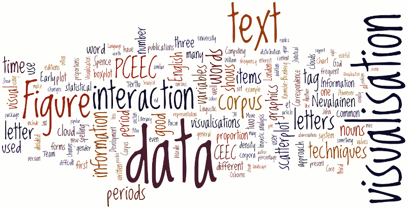
Wordle (Feinberg 2009) is a popular word cloud visualisation tool that is available free online. There are five visual variables in a Wordle tag cloud assigned to words: size, value (or grey scale), colour, angle, and 2D position. Only the size of the text is assigned to the data, depicting the relative frequency of the word, the rest of the visual variables being used for aesthetic purposes only. As a default, Wordle will remove the most common (English) words from the tag cloud, but users can change the language or disable this setting. Other user-changeable settings include the text font, layout, and colour scheme. Wordle implements two simple interactions with the tag cloud: the “Randomize” command will create a new version of the text instantly, making it possible to search for a more appealing layout, and right-clicking a word will remove it from the visualisation. As an example, Figure 4 shows a Wordle tag cloud of this article.
Another popular word cloud visualisation tool is Tagxedo (Leung 2010). The main difference from Wordle is that Tagxedo provides slightly more control over the data variable assignment of the tag cloud. It is possible to assign a colour and an angle to each word. Tagxedo tag clouds will be used in the word-frequency visualisations of the PCEEC data in 3.3.1 and 3.3.2.
The division of a diachronic corpus into time periods can be justified in a number of ways. From the statistical point of view, the methods often expect data to be sliced into periods of equal length, but this may produce unbalanced data as historical data sets usually have gaps in them. Visually, Figure 2 suggests that the PCEEC could be divided into about 7 equally long periods that have a fairly equal number of observations in them. Another possibility is to slice the PCEEC by taking the three ‘mountains’ of data revealed by the scatterplot on the right in Figure 2.
Adopting this latter approach, Figure 3 shows that the CEEC divides into three major segments, 1415–1519, 1520–1559 and 1560–1681. For sociolinguistic research, which operates with successive generations and periods as short as 20 years, this periodisation is of course arbitrary. However, most conventional divisions of historical data into periods are equally arbitrary, including the beginning and end points of corpora (Nevalainen & Raumolin-Brunberg 2003: 29–30).
We can use tag cloud visualisations to explore various aspects of form and content by anchoring them in their linguistic and genre contexts. The tag clouds shown in this section exclude 334 frequent items, marked as stop words, which typically consist of function words such as and, the and to. Excluding the modern spellings of such items leaves us with their spelling variants, and is of interest for the study of spelling regularisation of these frequent items, and of grammatical forms that have not survived to the present. The other major issue of interest that can be explored using tag clouds is their lexical content. This increasingly popular approach to text visualisation takes us to the realm of “culturomics”, albeit in a more down-to-earth manner than in the recent discussions of data derived from Google Books (Michel et al. 2011).
3.3.1 Spelling practices, medieval and modern
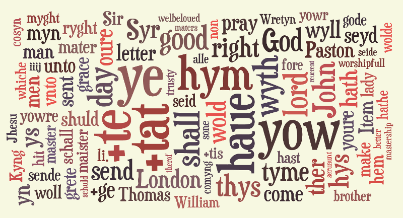
Let us first consider the tag clouds for the three periods in Figures 5, 6 and 7 to find out what they can tell us about change in spelling practices. If we concentrate on the most frequent items, reflected in character size, we can see that the first period, shown in Figure 5, is dominated by a set of function words: the three pronoun forms ye (“ye” = 2nd p. nominative pl. of “you”), yow (“you”) and hym (“him”); the polyfunctional item +tat (pronoun and complementiser þat “that”), and the definite article +te (þe “the”); as well as the verb haue (“have”). They show common 15th-century spellings of items whose modern forms are included among the stop words. Those with the letter thorn <þ> are reproduced by the combination of <+> and <t> in the basic ASCII character set used in the corpus, which was created in the 1990s.
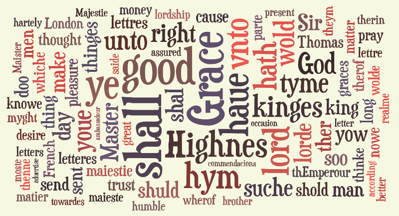
Moving on to the middle period (Figure 6), we still find ye, hym and haue among the frequent word forms but yow is now much less prominent, less so in fact than its alternative spelling youe. However, the forms with the initial thorn are no longer attested in the tag cloud for this 40-year period. This comparison suggests that thorn was on its way out around the turn of the 16th century at the latest but does not answer the question of when exactly it went out of use. For more accurate results, the previous period of over 100 years ought to be divided into shorter stretches of time.
A variety of forms of the verb have appear in all three periods: haue, hath, hathe, hadde (“had”) in the first; haue, hath and hathe in the second; and hath and haue in the third. Although spelling variation is reduced over time, the u-form of “have” persists, along with the outgoing 3rd person singular inflection hath (“has”). At the time, the use of <u> was quite regular word internally for both <v> and <u>. It is however worth bearing in mind that many printed editions of manuscript material which otherwise reproduce original spellings modernise this early spelling convention and hence deviate from manuscript practice in this respect.
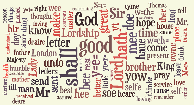
The third period tag cloud (Figure 7) tells us that, except for haue and yow, none of the forms predominant in the first two periods surfaced in the data for 1560-1681. By that time, ye, for example, had been replaced by “you” in the subject function. What looks like a form of “you” in the third period, y=e=, is not a pronoun but a way of representing the common abbreviation ye, a variant of the definite article “the”, in basic ASCII. The abbreviation goes back to the use of the letter thorn in the definite article (and still continues life as ye in mock-archaic shop names).
Other similar abbreviations also make their appearance in Figure 7, including yo=r= (“your”), w=ch= (“which”), w=th= (“with”), S=r= (“Sir”), and M=r= (“Mr”). It is interesting to find that the abbreviation for Master, itself of considerable frequency in the corpus, shows up in as many as three variants: M=r= (for Mr), Mr., and Mr, which is the most frequent. However, as with the <u>/<v> convention, a caveat is in order when dealing with printed editions of manuscript data. Although the corpus compilers took great care to include only original spelling editions in the CEEC, even these treat abbreviations in different ways. The most faithful ones reproduce them as such, while some lower superscripts for ease of printing, and others, expand common abbreviations for ease of reading. Hence we cannot draw firm conclusions on the use of abbreviations by analysing the tag clouds. We can however confidently infer that abbreviations constituted a dominant practice in early English correspondence.
3.3.2 Continuity of content?
Another way to ‘read’ the tag clouds is to focus on content words. These represent cultural key words as well as the shared experience and particular concerns of the correspondents. The letter-writing genre is prominently present in the tag clouds: letter and its variant forms surface in all three periods. The central role that religion played in late medieval and Renaissance culture is reflected in the frequency of God. God’s name was typically incorporated into many conventional phrases (e.g. I thank God, I trust to God, I pray God, I commit you to God, God bless you, God help me, as knoweth God, God willing). Earthly rulers were as topical then as they are now, as indicated by king and majesty, and their various spellings throughout the period. The frequent use of Lord partly refers to God, and partly to the nobility in titles and forms of address. Grace could refer to God’s grace or could be used in addressing the sovereign or an archbishop. The much rarer Lady is used with reference to a noblewoman or, increasingly with time, to a gentlewoman who was lower down on the social scale (Nevalainen 1994). Forms of address and person reference figure prominently in personal correspondence. Besides those mentioned, they include Master and Sir and their variants, and kinship terms such as brother, and in the third period father, mother, daughter, sonne (“son”) and sister. The self-effacing servant is commonly used by the letter writers to refer to themselves in the subscription (cf. below, and Nevala 2004).
The place name London appears in all three sections. This unanimity confirms the central position of the capital city in the lives of early English letter writers. The most common male names of the period are also in evidence: John, Thomas, William and Richard (Nevalainen 2006: 49). That women’s names do not appear in the tag clouds is partly a reflection of the low level of female literacy and consequently the relative scarcity of female correspondents. Women contributed less than one-fifth of the material to the corpus and were in the minority as letter recipients (Säily et al. 2011). The skewed gender distribution is further reflected in the position that man/men occupy in all three periods. However, man can also signify ‘a male servant’ or generically ‘a human being’ (as in man or beast).
One of the most common words in the CEEC is the all-purpose positive qualifier good. This comes in a number of contexts, ranging from open combinations (as good as, be good) to person reference (my good Lord/Lady, good master, our good friend) and fixed phrases (good fortune, good example, good hope, good tidings, good will, good works; in good faith, in good time). The adjectives that surface in the tag clouds have basically positive meanings and include variant forms of items such as great, well-beloved and humble. The latter two are related to letter-writing conventions, as is trusty, which appears in the first period data. Affectionate and dear emerge in the third period, notably in its second half. Dear became increasingly popular in salutations (Dear Mother, Dear Sir) and affectionate in subscriptions (your most affectionate sister, your most humble and affectionate servant).
Many lexical verbs that characterise the tag clouds are connected with tasks typically mediated through correspondence. Send is found in all three periods and relates closely to the goods and services (to be) transmitted or provided by the correspondents. Another verb shared by the three sections is pray, which had a more extensive meaning than the religious sense of saying a prayer. It was commonly used as a polite way of requesting or entreating (I praye you send me worde) or, towards the end of the period, as a pragmatic particle meaning ‘please’ (Pray write to my mother). The verb come shows up in periods 1 and 3, and make and know(e) in periods 2 and 3. All three were used throughout the time span covered by the CEEC, but with a variety of spellings (cf. know~knowe) they failed to be recorded among the most frequent items in all periods.
Although a considerable degree of regularisation took place between the 15th and late 17th centuries, the spelling of the letter corpus does not conform to present-day standards. The tag clouds in Figures 5, 6 and 7 were based on the original spelling version of the CEEC (with the typical editorial exceptions discussed above). This means that the results of our content analysis are more accurate overall for the third period than for the first, which displays a number of variant forms even for common words. However, it is worth bearing in mind that the Tagxedo stop word list excludes the modern spellings of the most frequent words. (For some reason shall is not on the list and shows up in each period.) For the study of the top frequency items, the stop word list would need to be disabled. In any case, the accuracy of content analysis will improve when the normalised spelling version of the CEEC becomes available.
3.4 Visualisation of relationships
Text corpora often have a number of categorical background variables that characterise the samples in the corpus. Typical examples of these in sociolinguistic corpora are variables that describe the gender, domicile, and socio-economic status of the text author. To understand what kind of analysis can be performed on a text corpus, it is necessary to understand the relationships between texts characterised by these categorical variables.
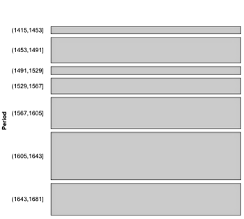
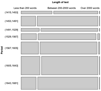
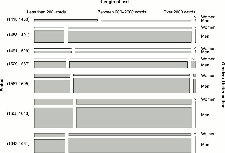
Relationships can be visualised by using a mosaic plot (Hartigan & Kleiner 1984), which is an area-proportional visualisation of a table of expected frequencies based on a sample. It is constructed by dividing a square recursively, into horizontal and vertical directions in turns. Figure 8 shows a mosaic plot of three categorical variables of the PCEEC: the time period of the letter, the length of the letter, and the gender of the author. First, the square representing all letters in the PCEEC is divided vertically in the proportions of the number of letters written in each of the seven time periods (Figure 8, left), then the rectangles are divided horizontally in the proportions of text lengths (Figure 8, right), and finally, the set of rectangles is divided again vertically according to the gender of the letter author (Figure 9).
Another approach to visualising relationships or proportions of data items is to create a conditional density plot, which describes how the conditional distribution of a categorical variable changes over some numerical variable. Figure 10 shows the proportions of different ranks in the PCEEC over seven time periods.
3.5 Visualisation of changes over time
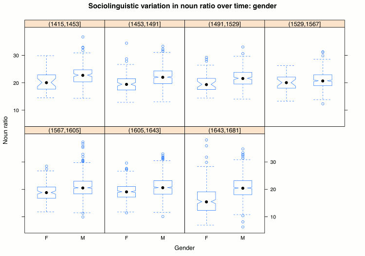
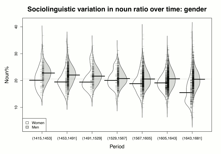
The study of diachronic corpora is mainly about variation and change in something that is counted or computed from the texts. Such corpora are divided into temporally ordered stages or time periods on a more or less arbitrary basis. In earlier examples, the PCEEC was divided according to clusters of similar cases (the scatterplot) or split into evenly spaced, 38 year long periods (the density plot). This section uses the seven evenly spaced stages. Furthermore, the figures in this section use a slightly modified version of the PCEEC known as the ReCEEC (Säily et al. 2011), with improved classification and tokenisation of nouns and other parts of speech.
If the scatterplot is the recommended first step in looking into associations of two continuous variables, the boxplot (Tukey 1977: Section 2C) is the method of choice for inspecting and comparing distributions of continuous variables. The idea of a boxplot is to simplify a set of numbers into a visual shape that facilitates judgements about the normality of data distribution as well as comparisons with other such sets. A boxplot for a set of numbers shows the median, the first and third quartiles, and the smallest and largest values of the set visually. Figure 11 shows boxplots for the percentage of nouns in the PCEEC for each of the seven periods and two genders. In each boxplot, the black dot indicates the median, the box extends from the first to the third quartile, and the smallest and largest values are connected to the box if the distance is less than the size of the box multiplied by 1.5. The idea is that values further away should probably be deemed outliers. The wedge in a boxplot is a visual tool for finding statistically significant differences when compared to other boxplots. If the wedges do not intersect, then there should be a statistically significant difference between the values.
Figure 11 shows that the percentage of nouns has fairly similar distributions across the seven periods. The data is normally distributed, but some periods have a fair number of outliers. The gender difference in the noun percentage seems to be statistically significant in all periods but one (1530–1567).
The ubiquitous boxplot has been challenged by a number of new techniques, but none of them has endured so far. The main criticism of the boxplot is that it is too abstract for a non-specialist, and that it hides the possible multimodality of the data. The beanplot (Kampstra 2008) is a boxplot replacement that does show the shape of the distribution explicitly and is perhaps slightly easier for non-specialists. A beanplot is a combination of a one-dimensional scatterplot (i.e., only one axis) and a density plot that shows the shape of the data distribution. Figure 12 shows the same data as Figure 11 as a beanplot. In the last period, the shape of the distribution for women is bimodal, the lower peak being due to the outlier mentioned above, Dorothy Osborne. Thus, the beanplot may facilitate the identification of outliers that are invisible in a boxplot, enabling researchers to remove them if desired.
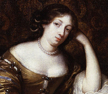
The gender difference in the use of nouns is illustrated in examples (1) and (2), both love letters written by 17th-century members of the gentry in their late twenties. Our female example, (1), is provided by Dorothy Osborne, who uses conspicuously few nouns in comparison with (2), the gentleman painter Nathaniel Bacon. Even though both letters are written to a future spouse with whom the writer has a close relationship, they are quite different in style. As noted above, Osborne is a rather extreme example of her gender, but the same tendency is present in women’s letters as a whole: the writing is, in Biber’s terms (1988: 107), “involved” rather than “informational” in focus (cf. Säily et al. 2011), with frequent reference to the writer and recipient using personal pronouns and recurrent use of the generalised pronoun it. Bacon’s letter, on the other hand, clearly bears the hallmark of the informational style, a profusion of nouns, along with other features such as long words, high type/token ratio and a large number of attributive adjectives.
Sr
I did receive both your letters, and yet was not sattisfyed but resolved to have a third: you had defeated mee strangly if it had bin a blank. not that I should have taken it ill, for ’tis as imposible for mee to doe soe, as for you to give mee the occasion, but though by sending a blank with your name to it, you had given mee a power to please my self, yet I should ne’er have don’t half soe well as your letter did, for nothing pleases mee like being assured that you are pleased. Will you forgive mee if I make this a short letter? in earnest I have soe many to write and soe litle time to doe it, that for this once I think I could imploy a Secretary if I had one; yet heer’s another letter for you though I know not whither tis such a one as you desyr’d, but if it bee not you may thank your self. if you had given larger instructions you had bin better obayed, and notwithstanding all my hast I cannot but tell you, ’twas a litle unkinde to aske mee if I could doe it for your sattisfaction, soe poor a thing as that. if I had time I would chide you for ’t extreamly, and make you know that there is nothing I cannot doe for the sattisfaction of a Person I esteem and to whome I shall alway’s bee a
faithfull freind & servant
(Dorothy Osborne to William Temple, 1653; OSBORNE_016)
Sweet Madam,
The pretiousness of a faier winde & a good ship, especially at this tyme of the year, hath constrayned to me (by the suddayneness of the occasion offered) to transgress all the bounds of loue & ciuillitye in that I haue not bin able to kyss yoe sweetest hands before my departure; but these circumstances, I do not doubt shall sufficiently satisfie yoe discretion and howld me excused. Deare Madam, all my happyness hath bin purchased by yoe fayth to what I haue proffessed, wherefore farther protestations ar altogether unnecessarye; onely lett constancie still seeme my cheifest vertue, wch I do persewade my self shalbe easilye able to make good, or better yoe greatest expectations. My retourne shall rest altogether vppon yoe command & the conueniencye of farther proceedinges, vntill when I leaue you wth Mrs Cooke & yoe pretty sonne, wth my best seruisse, and prayers for all blessinges temporal and spirituall most religiously attended. From Grauesend, ready to depart for Flushing, this 29 Nouembre. Yours absolutelye,
Nath. Bacon.
[…]
(Nathaniel Bacon to Jane Lady Cornwallis, 1613; CORNWAL_010)
In addition to the gender difference, it seems that there is a declining trend in the percentage of nouns over time, at least for men. Going back in time, example (3) shows a 15th-century male letter with a somewhat higher proportion of nouns than (2) from the 17th century. Here the context is different, however – a wool merchant writing to his brother about business matters, making the informational focus even clearer.
Ao lxxvj
Welbelouyd brother, I recomaund me herttely to yow, fferthermore informynge yow that the xiij day of Aprell the ȝeere aboue sayd, I Robard Cely haue ressayuyd off Wylliam Eston, mersar of London, xij li. ster. to pay at Andewarpe in Sencyon martte the xxiiij day of June, for euery nobyll of vj s. viij d. ster., vij s. x d. Fllemeche, and I pray yow to delyuer to the sayd Wylliam Eston xij li. starlynge at the same ratte, takynge a byll of ys honde to paye at London the sayd xij li. at a day as longe hafter þe day as I toke the mony wp beffore. In wettnes herof I sette my seell at London the xiij day of Aprell.
per Robard Cely.
(Robert Cely to his brother George Cely, 1476; CELY_002)
4. Interactive visualisation
Historically, the focus of visualisation practitioners and researchers has been on the static and representational aspects of information visualisation, mainly because of technical limitations. For centuries, the medium of choice was paper, but the availability of personal computers eventually changed the circumstances. Even before computers there were pioneers who implemented interactive visualisations with re-orderable paper strips and woodblocks resembling dominoes (Bertin 1983: 169). However, these ingenious devices were difficult and awkward to interact with.
A personal computer with a graphical user interface provides an ideal platform to create visualisations that the user can manipulate. The manipulable medium is the key in information acquisition as the useful insight generally emerges from the experience of manipulating information (Pike et al. 2009). Changing the form of the data or exploring it from different angles will help to accumulate insight. This interplay between human and visualisation can be seen as a dialogue in which the visualisation may present patterns or features of data that generate new questions (and answers) instead of just answering the initial one. But where does this leave all the very useful static visualisations if interaction is needed for a “useful insight”? As Spence (2007: 141) pointed out, there is an interaction mode that he calls passive interaction, which simply describes a process by which the user can derive considerable insight by just watching a visualisation, and in which the interaction between user and visualisation is purely a cognitive activity. The other interaction modes relevant to visualisation are stepped interaction (as in web browsing: select a link and a new page is shown), continuous interaction (e.g. move a slider and the visualisation changes, immediately and smoothly), and composite interaction, the combination of all of the above. Composite interaction is generally the predominant mode.
The design of interactive visualisations is a formidable task as there are no step-by-step instructions or guidelines which would guarantee even an adequate result (Spence 2007: 180). Perhaps the most quoted general starting-point for designing interactive visualisations is Shneiderman’s visual information-seeking mantra, “Overview first, zoom and filter, then details-on-demand” (1996: 337). This mantra is accompanied by a categorisation of seven general interaction tasks, at a high level of abstraction:
- Overview: Gain an overview of the entire collection.
- Zoom: Zoom in on items of interest.
- Filter: Filter out uninteresting items.
- Details-on-demand: Select an item or group and get details when needed.
- Relate: View relationships among items.
- History: Keep a history of actions to support undo, replay, and progressive refinement.
- Extract: Allow extraction of sub-collections and of the query parameters.
If these general interaction tasks are supported in a design, then the chances of success are supposedly improved. While the mantra is useful for designing some (search) interfaces, it does have its limitations (see Craft and Cairns 2005) and it is not really empirically verified. Another seven-item categorisation for general interaction techniques for visualisation is based on a review of 59 papers and 51 visualisation systems, covering 311 individual interaction techniques that were clustered by using the affinity diagramming method (Yi et al. 2007):
- Select: Mark something as interesting.
- Explore: Show me something else.
- Reconfigure: Show me a different arrangement.
- Encode: Show me a different representation.
- Abstract/Elaborate: Show me more or less detail.
- Filter: Show me something conditionally.
- Connect: Show me related items.
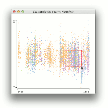
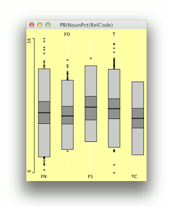
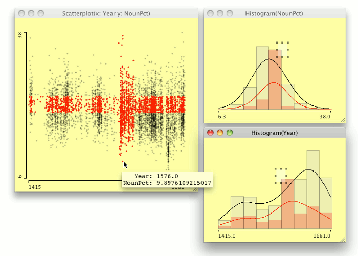
Select interaction techniques allow the user to make data items visually distinct to keep track of them (Figure 13, Movie 2; Figures 13, 14, 15, 16, 17 and Movie 2 were created with the Mondrian interactive data visualisation system, Theus 2002). The distinction is usually achieved with a pre-attentive feature (such as a different colour), which makes observing where the items of interest are effortless, especially if the encoding of the data is changed. In addition, the Select techniques function as an input designator for other operations: a selection is made and another operation is applied to the selected items.
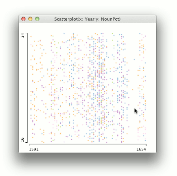
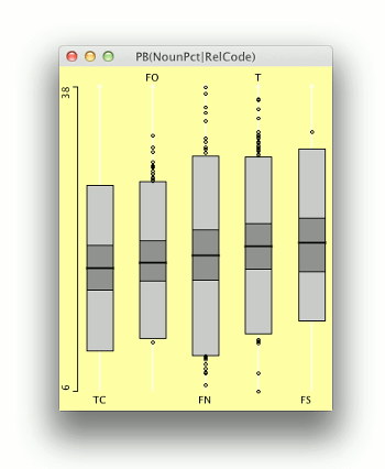
Explore interaction techniques allow a different subset of data cases to be examined (Figure 14). Typically, only a portion of a large information space can be visualised at a time owing to limitations of screen estate, data size, and the inherent limitations of human cognition. The data being viewed can change all at once, but it is more usual that data items move smoothly out of focus as new data items are being explored.
Reconfigure interaction techniques change the spatial arrangement of representations (Figure 15). Typical reconfigure techniques are sorting and rearranging columns and rows in matrix-like representations, such as Bertin’s reorderable matrix (Bertin 1981: 32), or changing the attributes that are mapped on the axis, as in Spotfire (Ahlberg 1996). Overall, the idea of reconfigure interaction techniques is to change the spatial arrangement of data to render it more suitable for the user’s mental model.
Encode interaction techniques allow the user to change the fundamental visual representation of the data, i.e., how the data is mapped into a visual structure (Figure 16). At one end, this is about choosing the visual representation (e.g. pie chart vs. bar chart) and at the other it is about the visual appearance of elements representing data in the visualisation. At the lowest level, this is a matter of choosing the appropriate visual variables to encode the data (Bertin 1981: 186).
Abstract/Elaborate interaction techniques allow adjustment of the level of abstraction of a data representation, typically drilling down from overview to details of individual data cases (Figure 17). There are many varieties of abstract/elaborate techniques, perhaps the simplest being changing the scale of a representation, or ‘zooming’ (Figure 14).
Filter interaction techniques allow users to specify conditions on which data items are included or excluded from a representation. Typically, the interaction involves slider-like dynamic controls that set the limits for inclusion/exclusion.
Connect interaction techniques are about showing associations and relations between data items, often by using changes in one of the visual variables of data item representations (Figure 17).
The categories of interaction techniques by Shneiderman (1996) and Yi et al. (2007) overlap a great deal, but there are some significant differences as well. Shneiderman’s Overview and Details-on-demand are together approximately equal to Abstract/Encode, Zoom is a subset of Encode, Relate corresponds to Connect, and both have a class of Filter interaction techniques, although Shneiderman’s filter class is related to the Explore class as well. Shneiderman’s mechanism for recording the past operations, History, and the task of Extracting a subset of data, are not included in Yi et al.’s taxonomy. On the other hand, Reconfigure, which is one of the most important information acquisition tasks, does not have an equivalent in Shneiderman’s taxonomy.
These ‘reverse-engineered’ categories of interaction techniques are useful in designing new information visualisations, characterising the design space and providing checklists of approaches that are known to be worth trying.
5. Conclusion: Interactive corpus visualisation
When something is occasionally visualised in the linguistic context, the prevailing mode of interaction is passive: something is counted or computed from the text, a visualisation is created, and then inspected. Even the examples given in this article support this mode of interaction only. While this approach is useful, it is not even close to the ideal of playful dialogue between the visualisation and the user, and the easier discovery of new insights. As noted earlier, interaction is needed to create more effective visualisations and to support the discovery of new insights.
Even static visualisations can be enhanced through simple interaction (Dix & Ellis 1998). This approach has proven to be a success even with classic data visualisations, such as Playfair’s data graphics, or the scatterplot, which was turned into a highly interactive data analysis tool known as Spotfire (Ahlberg 1996); cf. Hilpert (2011). The same approach could be applied to the static visualisations in this article as well, since each mosaic in a mosaic plot could be a link to the underlying text, or each element in a lattice of boxplots or beanplots could be connected to the text it was computed from, and so forth.
In general, the Connect interaction techniques are highly relevant to text visualisation. Connecting the elements of a visualisation to the parts of the text it was computed from allows rapid movement between the full details of text and the visualisation, resembling the Abstract/Elaborate interaction pattern as well. In addition, the Select interaction techniques are closely related to connecting, as the connected elements need to be visually distinct for effortless inspection.
The Explore interaction techniques for text visualisations are important as well, because the nature of text is linear and serial whereas the visualisations can support non-linear and parallel exploration. By using a visualisation as an interface, the user can move rapidly through the items of interest like browsing a hyperlinked text.
The Filter interaction techniques can be utilised at different levels of text visualisation. Interactive filtering can be part of the initial data table construction phase, the transformation from the raw data to the data tables. The raw data might contain metadata and markup that would interfere with the encoding of a visualisation.
It is challenging to combine a large text corpus and its various measurements in an effective interactive visualisation. The connection between the text and the visualisation is usually lost, and only the visualisation is shown. If the text is omitted from the process, then linguistic analysis is like any other data analysis, and there are many appropriate tools available, both open source and commercial. We are developing a tool called Text Variation Explorer (Siirtola 2011) in which the text and the visualisation are shown side by side, and manipulation of an object in either one will highlight the corresponding object in the other. Interaction realises the missing connection between text and visualisation, which is possible if the medium supports manipulation.
Sources
Tools and resources:
General information:
References
Ahlberg, Christopher. 1996. “Spotfire: An information exploration environment”. SIGMOD Record 25(4): 25–29. http://dl.acm.org/citation.cfm?doid=245882.245893
Amarel, Saul. 1966. “On the mechanization of creative processes”. IEEE Spectrum 3(4): 112–114. http://ieeexplore.ieee.org/document/5216589/
Bertin, Jacques. 1981. Graphics and Graphic Information-Processing. Berlin: Walter de Gruyter.
Bertin, Jacques. 1983. Semiology of Graphics. Madison, Wis.: University of Wisconsin Press.
Biber, Douglas. 1988. Variation across Speech and Writing. Cambridge: Cambridge University Press.
Briggs, Asa. 1983. A Social History of England. London: Weidenfeld and Nicolson.
CEEC = Corpus of Early English Correspondence. 1998. Compiled by Terttu Nevalainen, Helena Raumolin-Brunberg, Jukka Keränen, Minna Nevala, Arja Nurmi & Minna Palander-Collin at the Department of English, University of Helsinki. http://www.helsinki.fi/varieng/CoRD/corpora/CEEC/
Craft, Brock & Paul Cairns. 2005. “Beyond guidelines: What can we learn from the Visual Information Seeking Mantra?” Proceedings of the Ninth International Conference on Information Visualisation (IV ’05), 110–118. Los Alamitos, Calif.: IEEE Computer Society. http://ieeexplore.ieee.org/document/1509067/
Dix, Alan & Geoffrey Ellis. 1998. “Starting simple: Adding value to static visualisation through simple interaction”. Proceedings of the Working Conference on Advanced Visual Interfaces (AVI ’98), ed. by Tiziana Catarci, Maria Francesca Costabile, Giuseppe Santucci & Laura Taranfino, 124–134. New York: ACM. http://dl.acm.org/citation.cfm?doid=948496.948514
Friendly, Michael & Daniel Denis. 2005. “The early origins and development of the scatterplot”. Journal of the History of the Behavioral Sciences 41(2): 103–130. http://onlinelibrary.wiley.com/doi/10.1002/jhbs.20078/abstract
Hartigan, J. A. & Beat Kleiner. 1984. “A mosaic of television ratings”. The American Statistician 38(1): 32–35. http://www.jstor.org/stable/2683556
Hearst, Marti. 2003. Information Visualization: Principles, Promise, and Pragmatics. CHI 2003 Tutorial. http://bailando.sims.berkeley.edu/talks/chi03-tutorial.ppt
Jessop, Martyn. 2008. “Digital visualization as a scholarly activity”. Literary and Linguistic Computing 23(3): 281–293. http://llc.oxfordjournals.org/content/23/3/281
Kampstra, Peter. 2008. “Beanplot: A boxplot alternative for visual comparison of distributions”. Journal of Statistical Software 28: Code Snippet 1. https://www.jstatsoft.org/article/view/v028c01
Keim, Daniel A., Ming C. Hao, Umeshwar Dayal, Halldor Janetzko & Peter Bak. 2010. “Generalized scatter plots”. Information Visualization 9: 301–311. http://ivi.sagepub.com/content/9/4/301
Kerren, Andreas, Catherine Plaisant & John T. Stasko. 2010. “10241 executive summary – information visualization”. Information Visualization (= Dagstuhl Seminar Proceedings, 10241), ed. by Andreas Kerren, Catherine Plaisant & John T. Stasko. Dagstuhl, Germany: Schloss Dagstuhl. http://drops.dagstuhl.de/opus/volltexte/2010/2760/
Kerren, Andreas, John T. Stasko, Jean-Daniel Fekete & Chris North. 2007. “Workshop report: Information visualization – human-centered issues in visual representation, interaction, and evaluation”. Information Visualization 6: 189–196. http://ivi.sagepub.com/content/6/3/189
Michel, Jean-Baptiste, Yuan Kui Shen, Aviva Presser Aiden, Adrian Veres, Matthew K. Gray, The Google Books Team, Joseph P. Pickett, Dale Hoiberg, Dan Clancy, Peter Norvig, Jon Orwant, Steven Pinker, Martin A. Nowak & Erez Lieberman Aiden. 2011. “Quantitative analysis of culture using millions of digitized books”. Science 331(6014): 176–182. http://science.sciencemag.org/content/331/6014/176
Nevala, Minna. 2004. Address in Early English Correspondence: Its Forms and Socio-Pragmatic Functions. (= Mémoires de la Société Néophilologique de Helsinki, 64.) Helsinki: Société Néophilologique.
Nevalainen, Terttu. 1994. “Ladies and gentlemen: The generalization of titles in Early Modern English”. English Historical Linguistics 1992 (= Current Issues in Linguistic Theory, 113), ed. by Francisco Fernández, Miguel Fuster & Juan José Calvo, 317–327. Amsterdam & Philadelphia: John Benjamins.
Nevalainen, Terttu. 1996. “Social stratification”. Sociolinguistics and Language History: Studies Based on the Corpus of Early English Correspondence, ed. by Terttu Nevalainen & Helena Raumolin-Brunberg, 57–76. Amsterdam: Rodopi.
Nevalainen, Terttu. 2006. An Introduction to Early Modern English. Edinburgh: Edinburgh University Press.
Nevalainen, Terttu & Helena Raumolin-Brunberg. 2003. Historical Sociolinguistics: Language Change in Tudor and Stuart England. London: Pearson Education.
Nurmi, Arja, Minna Nevala & Minna Palander-Collin, eds. 2009. The Language of Daily Life in England (1400–1800). (= Pragmatics and Beyond NS, 183). Amsterdam: John Benjamins.
PCEEC = Parsed Corpus of Early English Correspondence, tagged version. 2006. Annotated by Arja Nurmi, Ann Taylor, Anthony Warner, Susan Pintzuk & Terttu Nevalainen. Compiled by the CEEC Project Team. York: University of York and Helsinki: University of Helsinki. Distributed through the Oxford Text Archive. http://www-users.york.ac.uk/~lang22/PCEEC-manual/
Pike, William A., John Stasko, Remco Chang & Theresa A. O’Connell. 2009. “The science of interaction”. Information Visualization 8(4): 263–274. http://ivi.sagepub.com/content/8/4/263
Playfair, William. 2005 [1786]. Commercial and Political Atlas: Representing, by Copper-Plate Charts, the Progress of the Commerce, Revenues, Expenditure, and Debts of England, during the Whole of the Eighteenth Century. London: Corry. Re-published in The Commercial and Political Atlas and Statistical Breviary, ed. by Howard Wainer & Ian Spence. Cambridge: Cambridge University Press.
Playfair, William. 1801. The Statistical Breviary. London: T. Bensley.
Raumolin-Brunberg, Helena & Terttu Nevalainen. 2007. “Historical sociolinguistics: The Corpus of Early English Correspondence”. Creating and Digitizing Language Corpora (Vol. 2), ed. by Joan C. Beal, Karen P. Corrigan & Hermann L. Moisl, 148–171. Houndsmills: Palgrave Macmillan.
Säily, Tanja, Terttu Nevalainen & Harri Siirtola. 2011. “Variation in noun and pronoun frequencies in a sociohistorical corpus”. Literary and Linguistic Computing 26(2): 167–188. http://llc.oxfordjournals.org/content/26/2/167
Shneiderman, Ben. 1996. “The eyes have it: A task by data type taxonomy for information visualizations”. Proceedings of the 1996 IEEE Symposium on Visual Languages (VL ’96), 336–343. Los Alamitos, Calif.: IEEE Computer Society. http://ieeexplore.ieee.org/document/545307/
Simon, Herbert A. 1969. The Sciences of the Artificial. Cambridge, Mass.: MIT Press.
Spence, Ian. 2005. “No humble pie: The origins and usage of a statistical chart”. Journal of Educational and Behavioral Statistics 30(4): 353–368. http://jeb.sagepub.com/content/30/4/353
Spence, Ian & Howard Wainer. 2005. “Playfair, William”. Encyclopedia of Social Measurement, ed. by Kimberly Kempf-Leonard, vol. 3, 71–79. New York: Elsevier. http://www.sciencedirect.com/science/article/pii/B0123693985005223
Spence, Robert. 2007. Information Visualization: Design for Interaction. 2nd edition. Harlow: Pearson Education.
Theus, Martin. 2002. “Interactive data visualization using Mondrian”. Journal of Statistical Software 7(11). https://www.jstatsoft.org/article/view/v007i11
Thomas, James J. & Kristin A. Cook, eds. 2005. Illuminating the Path: The Research and Development Agenda for Visual Analytics. IEEE Computer Society. http://vis.pnnl.gov/pdf/RD_Agenda_VisualAnalytics.pdf
Tukey, John W. 1977. Exploratory Data Analysis. Reading, Mass.: Addison-Wesley.
Ware, Colin. 2004. Information Visualization: Perception for Design. 2nd edition. San Francisco, Calif.: Morgan Kaufman.
Wei, Furu, Shixia Liu, Yangqiu Song, Shimei Pan, Michelle X. Zhou, Weihong Qian, Lei Shi, Li Tan & Qiang Zhang. 2010. “TIARA: A visual exploratory text analytic system”. Proceedings of the 16th ACM SIGKDD International Conference on Knowledge Discovery and Data Mining (KDD ’10), 153–162. New York: ACM. http://dl.acm.org/citation.cfm?doid=1835804.1835827
Yi, Ji Soo, Youn ah Kang, J. T. Stasko & J. A. Jacko. 2007. “Toward a deeper understanding of the role of interaction in information visualization”. IEEE Transactions on Visualization and Computer Graphics 13(6): 1224–1231. http://ieeexplore.ieee.org/document/4376144/
|
|


