From page to screen: The relevance of encoded visual features in the Lampeter Corpus
Claudia Claridge
University of Duisburg-Essen
Abstract
Visual aspects of texts are potentially relevant for both textual interpretation and for general linguistic insights. Contemporary evidence shows that Early Modern English writers and printers were aware of this, and thus may have taken special care with at least some of these aspects. The visual aspects treated here, as represented in the Lampeter Corpus, are titlepage layout and typography, typographical changes in running text, in particular the change to blackletter type, and end-of-line hyphenation or word separation. While the latter two are reliably retrievable from the Lampeter Corpus annotation, page layout cannot be comprehensibly studied on the basis of the existing corpus annotation scheme.
1. Introduction: The printed page and historical corpora
“Our understanding of a text is ultimately influenced by the physical form of its presentation”, as John Feather put it (quoted in Maruca 2003: 323). This is nicely illustrated by Riedinger’s (1989) example of two modern editions of John Dryden’s play All for Love, one using uncial type (accompanied by decorative Egyptian symbols), the other using Cloister light roman and italic – thus producing two highly divergent impressions of the work: a romantic, exotic tragedy vs. a neo-classical, refined tragedy. Reader expectation, and thus perhaps ultimately interpretation, is therefore influenced by the visual characteristics of the text. Psychological research has proved such impressions to be not just subjective. Lewis and Walker (1989: 254), for example, have shown “that typefaces possess a range of perceptual qualities” and that “subjects agreed as to their nature”, i.e., typefaces have fairly consistent connotations. Typefaces are processed alongside the meaning of the words and “can intrude on verbal processing” (Lewis and Walker 1989: 253). Apart from typefaces the whole visual image presented by the page (of a book, a pamphlet, a letter ) may have an influence on the reading process and on the ultimate effect of the text as well. [1]
Accordingly, an early work on the printing trade – Moxon’s Mechanick Exercises (1677) – cautions both compositors and authors on the appropriate care to be taken with the appearance of the text. With regard to the compositor Moxon writes (The Compositor’s Trade, 1677: 220):
A good Compositor is ambitious as well to make the meaning of his Author intelligent to the Reader, as to make his Work shew graceful to the Eye, and pleasant in Reading: Therefore if his Copy be Written in a Language he understands, he reads his Copy with consideration; that so he may get himself into the meaning of the Author, and consequently considers how to order his Work the better both in the Title Page, and in the matter of the Book: As how to make his Indenting, Pointing, Breaking, Italicking, &c. the better sympathize with the Authors Genius, and also with the capacity of the Reader. (italics original)
Moxon makes a clear link between the visual aspects and two other points: (i) the author’s meaning, which can be supported or enhanced, and (ii) the reader’s comprehension process, which needs to be aided. He proceeds in his work to give detailed instructions on various aspects of textual treatment to the compositor. Nevertheless, the task of the compositor does not in his opinion relieve the author of thinking of these matters as well. The author should not completely
trust either to his [the compositor’s, CC] Care or Abilities in Pointing, Italicking, Capitalling, Breaking, &c. Therefore it behoves an Author to examine his Copy very well e’re he deliver it to the Printer, and to Point it, and mark it so as the Compositor may know what Words to Set in Italick, English Capitals, &c. For his Italick Words he draws a line under them thus: For English Words he draws two lines under them thus; and for Capitals a line of Pricks thus, or else draws a line with Red Inck. (Moxon 1677: 265, all highlighting original)
What is the significance of this for historical corpora? Older texts often use visual styles which are unfamiliar to the modern reader, and they also show a considerable variety in visual characteristics. If these characteristics are assumed to have meaning and/or an impact on text processing, then it is important to encode them in a digital corpus. The Lampeter Corpus of Early Modern English Tracts (1640–1740) was the first historical corpus (back in the 1990s) to use sgml-encoding based on the TEI guidelines to capture at least some of these original textual features. It could be argued that corpus markup is not necessary given the possibility of making image scans of corpus texts available (cf. for example the texts on EEBO). Apart from potential copyright problems, using images has another disadvantage: it does not allow automatic retrieval of the encoded features. While such retrieval is not possible or useful for all such features (e.g. title-page layout, which needs to be looked at individually), it may be enlightening for others, in particular also linguistically relevant ones. Researchers could, for example, retrieve all typographical errors (including, but not limited to, the ‘official’ errata), all spelling variants in catchwords (both potentially relevant to orthographical history), referencing practices (footnotes and marginalia uses), or all typeface changes of a particular nature in order to systematize their function.
The full extent of the Lampeter Corpus encoding is documented in the corpus manual (Claridge 2003), and thus will not be described here. In the following I rather want to discuss three aspects in more detail with regard to both their significance and the usefulness of the way they have been treated in the Lampeter Corpus coding scheme. These aspects are: (i) page layout/overall visual impression, with the focus on title-pages, (ii) typographical change, with the example of English/black-letter type, and (iii) end-of-line hyphenation, i.e. word separation.
2. Page layout and design
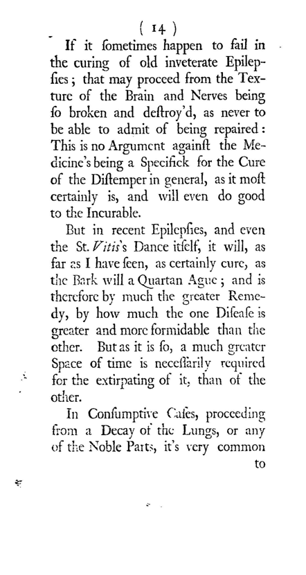
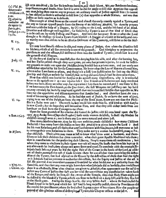
Comparing Images 1 and 2 below, sample pages from a scientific and a political pamphlet respectively, shows strikingly different impressions. While Image 1 shows a page with adequately sized text with sufficient white space, the page in Image 2 seems crammed and overloaded with fairly small-sized text. The latter text is certainly much harder to read – which has to be seen against the background of a semi-literate society and also the practice of reading aloud to others. This difference is only partly and indirectly recoverable from the Lampeter encoding. The size of the pages is given in the headers, not in the texts themselves; it is quarto for Image 2 and the smaller octavo for Image 1. On the textual level, page-breaks, paragraphs, and marginalia are provided by the mark-up; the exact position of marginalia is not indicated, as they are simply inserted in place of their anchor or after the end of the sentence to which they refer. The size of the lettering is not encoded, nor are the line-breaks (with the exception of separated words, cf. section 4). The amount of text from one page-break tag to the next is of course apparent: it is a mere 164 words in Image 1, but as many as 1,038 words in Image 2. While the information provided in the mark-up does not allow a full ‘reconstruction’ of the page, enough detail for an understanding of the text is nevertheless provided.
More detail is needed for title-pages, however. Title-pages are special since they serve as both advertisements and content indicators for the pamphlet or book. They are advertisements proper in the sense that they were also printed separately and posted in public places, similarly to playbills for example (Stern 2006: 78–80). This explains why there is often a note such as “sold at X” on them: somebody whose interest was awakened by the title-page could then proceed to buy the whole work. As to the textual significance of title-pages, one can look at Moxon’s instructions for the compositor again:
He, as aforesaid, judiciously reads his Title Page, and considers what Word or Words have the greatest Emphasis in it. If many Words precede the Emphasis, he considers whether it be best to make one or two Lines, or more of them, by electing a Body bigger or less to Set the precedent Matter in, and whether any of these Lines ought to be Indented, either at one end or both, viz. Set in the middle of the Line. And what Words of Emphasis come in that precedent Matter; that he may Set them either in Capitals, Roman, Italick, or English; and at last bring the great Emphasis, which is generally the Title or Name of the Book in a Line by it self, and just fill it if he can; which he has some helps to do, by the great Bodied Letters of the Lower Case, or else by Capitals, Roman, Italick or English, of a proper Body, which best pleases his fancy, or is in present mode. (Moxon 1677: 221, italics original)
According to this, three aspects play a role in designing a title-page: (i) content / meaning (cf. “emphasis”), (ii) aesthetic considerations on the part of the individual compositor, and (iii) fashion of the time. All three of them together account for the great variety of letter shapes, cases, sizes and spacing, as well as line and paragraph arrangement on title-pages, which is typical for the Early Modern English period. The latter two aspects, as well as the advertisement function, explain why it often seems to the modern observer as if there was no functional regularity. Some items, like typefaces, may simply be exchangeable means of display with no fixed specific function (Dane & Djananova 2005: 95, n.17). In other contexts, however, they may very well carry substantial meaning. Let us have a look at how things work in a few Lampeter Corpus title-pages.
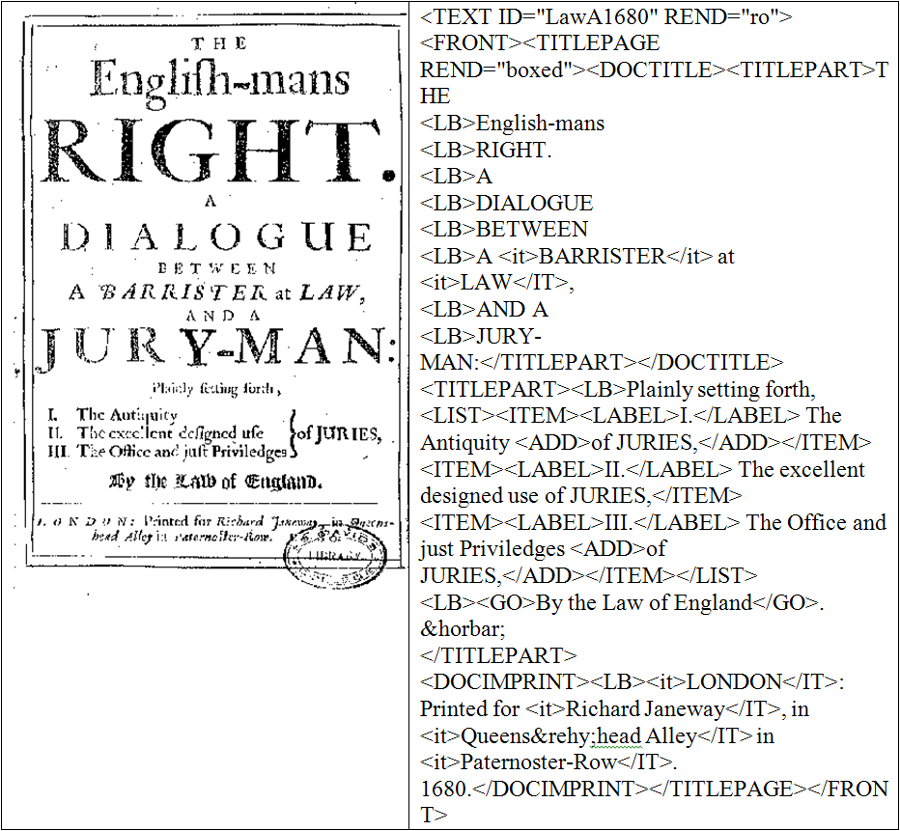
The title-page of text LawA1680 (Image 3) makes use of roman, italic and black-letter (English) types, different letter sizes, letter spacing, centering of text, lines, and bracing. Going by Moxon’s description, the words right and jury-man must have been seen as the most important ones by the compositor (and/or the author), as they received the most prominence. In the context of text as advertisement, these also pick out a potential reading audience: everybody who is in principle eligible for juryman service (i.e. male persons of property) and everyone who is interested in what rights English citizens have (note also the relative prominence of English-mans). [2] Dialogue is also prominent, as are many genre/text-type terms used on title-pages; possibly these were regarded as important information for readers with specific textual preferences. Interestingly, Barrister at Law is in much smaller type, even though in the text this ‘character’ is the dominant ‘speaker’ with the text in fact turning more or less into a monologue in its latter part. Thus the title-page does not reflect prominence with regard to the text content but the importance of reader expectations. However, the barrister is given a different kind of highlighting, being the only part in italics in the title proper. Black-letter for By the Law of England may have been chosen due to this type’s links to the legal sphere and its creation of an authoritative impresssion. The part of the title printed in the smallest size provides a kind of abstract of the pamphlet in clear list format, thus being very informative for the reader.
If we now look at the Lampeter Corpus encoding, we will see that the subtle degrees of emphasis are unfortunately not adequately represented there. Everything that is capitalised in the original is also capitalised in the transcript, but as height and width of lettering is not accounted for, Right, A, and Dialogue appear as if they were equally prominent. Also, bold-face mark-up, which might have set apart Right here, has not been used for title-pages, as it could not be clearly separated from letter size. What is even more distorting is that Barrister at Law, because of its italics, now stands out more than the remaining upper case words in contrast to the true state of affairs. Thus, this representation is actually misleading, which could have been avoided with much more detailed encoding than we opted for.
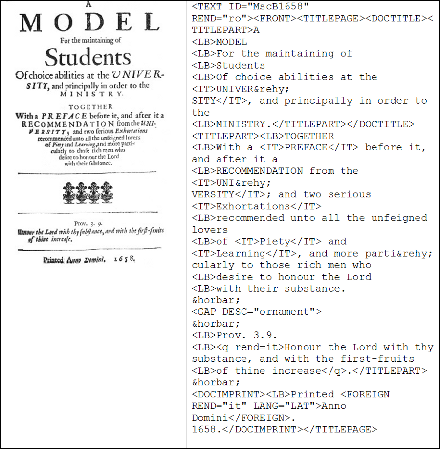
MscB1658 in Image 4 illustrates another typologically interesting feature. The text is centred and arranged in such a way as to create a pattern, thus being reminiscent of pattern poetry (cf. George Herbert as an almost contemporary poet using this style) and more generally of the concept of iconicity. [3] Van Peer (1993) discusses such cases under the label of typographic foregrounding. The particular shapes visible on the page are not re-creatable from the type of encoding used. The pattern may be there for purely decorative and attention-catching reasons, thus serving an advertising effect, but otherwise having no deeper meaning. Among the 120 Lampeter title-pages, however, this is the only one with such an intentional arrangement of paragraphs, so it would seem there is more to it than just ornamentation. The downward, narrowing ‘movement’ is repeated three times, thereby producing the albeit imperfect impression of arrows, from which one might conclude that its purpose is to lead the reader into the text. Paying attention to the text (in particular: “those rich men who desire to honour the Lord with their substance”), however, would show another representation in the last ‘arrow’: it might represent a bowl or container for donations, like the ones used in churches – i.e. the place where the ‘substance’ of rich people could be placed. Regardless of the likelihood of this speculation, one can only make it if one sees the original, because the encoded transcription does not allow a reconstruction of this shape.
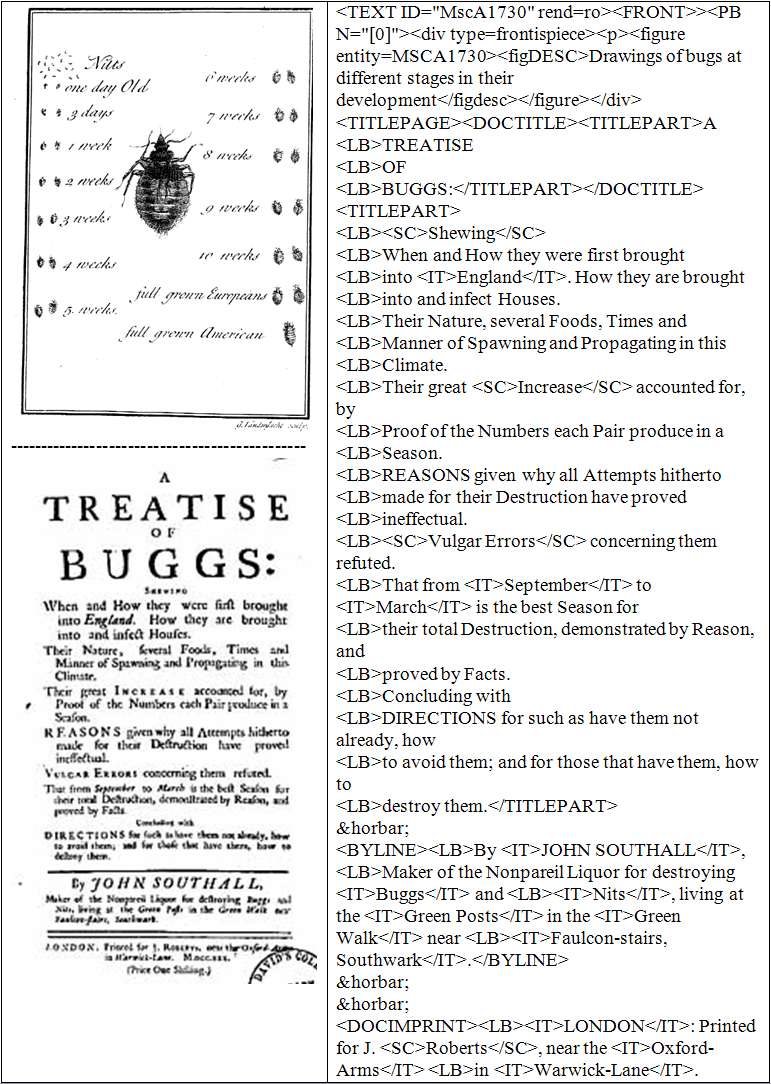
The title-page of MscA1730 in Image 5 shows a more successful encoding in the Lampeter Corpus than the previous ones, at least as far as the text of the title proper is concerned. The title-page contains a rather large amount of text and fairly little variety in highlighting. The difference in importance between A Treatise of Buggs and the rest is dealt with less by indicating different sizes through the mark-up than by allocating the variously-sized parts to different title types, thus indicating the main title and subtitle(s). The difference between upper case words and those in small capitals is represented adequately by the mark-up. The hanging style of the paragraphs, visualizing the listing, is not represented in the corpus transcription, however. Indentation has generally not been encoded (cf. also the text pages above), and paragraph mark-up was generally not used on title-pages, although it might have been useful in this case. The horizontal bars, which here serve the function not only to set apart and highlight the author, but also as an advertisement for his insecticide, have been represented in the mark-up (entity reference: ―), as was the case on all title-pages, even if such bars do not always have a very clear function. In the frontispiece preceding the title-page we find an intricate connection of text and picture, which has been rendered by a rather minimal description, unfortunately dispensing with the text completely. This text is printed in a kind of italic that looks akin to handwriting, thus perhaps trying to evoke the idea of a work-sheet by a ‘natural philosopher’ in the context of empirial research. Maruca (2003: 333) views italics used in prefatory material (e.g., address to the reader, dedication) as an authenticating device that, as it were, personalizes the mass-produced print product and establishes a closer link between author and reader. The idea could also apply in this case. Attempts at describing pictorial content in general recur throughout the Lampeter Corpus, and, with hindsight, are often somewhat too frugal.
In sum, one can say that the Lampeter Corpus made a reasonably good start at encoding the visuals of the page, but often did not go far enough. In many cases therefore it is not possible to re-create the original page layout from the encoding and the interested researcher will have to examine the originals (or equivalent prints) available on EEBO or ECCO.
3. Typography
The dominant typographical choice of all Lampeter Corpus pamphlets consists of types that can summarily be called ‘roman’. It is so dominant that practically all texts start with the rendition code “ro” (cf. Images 3, 4, and 5), so that only deviations from this need to be marked. Other occurring options are bold-face (bo), italic (it), small capitals (sc), and black-letter or “English”, as it was called then, which is encoded by gothic (go). These tags occur either on their own (e.g. <it>….</it>) or within another element, for instance in the form of rend=it (e.g. <head rend=it>). Additionally, foreign text also printed in foreign type is encoded for this in the foreign-element, where lang=GKGK and lang=HBHB (i.e. doubling of the language code) stand for Greek/Hebrew in their respective original scripts. The different forms of encoding make the automatic retrieval of typographic choices a bit more difficult than with the use of one standard format, but they do not make it impossible.
Moxon is again useful for this point, as he indicates certain typical uses for different types and fonts. Moxon (1677: 224–227) lists the following: (i) proper names are set in another type or font than the surrounding text (usually italic, sometimes roman), (ii) emphasis is indicated by the use of italics or by initial capitalisation, the latter expressing a lower degree of emphasis than the former, (iii) English obsolete words are printed in black-letter, and (iv) foreign text is printed in its appropriate foreign type (as far as available). These are guidelines, doubtlessly based on experience, and it would be interesting to see whether the pattern found in texts is really as Moxon indicates. Regarding (i), a distinctive font is indeed used for proper names in most cases in the Lampeter Corpus (above 90%), but nevertheless not always. Do the ‘deviant’ cases mean anything or are they just compositor errors? With regard to (iv), the question arises whether it is only a question of availability of type or of authorial intent, and how to distinguish between the two. For example, not all Greek text in the Lampeter Corpus is written in Greek script: there are 175 instances of Greek, 19 of which were printed in roman transliterated lettering. The author may also have taken the intended audience into account in deciding to mark a text and/or script as foreign.
From among the various types and aspects that one could investigate in this area, I will concentrate on the choice of black-letter in the following. This is a minority choice in the Lampeter Corpus as only 3,026 words are printed in this type (0.25% of the whole Lampeter Corpus text). This is in stark contrast to the situation in the sixteenth century, as up to about 1590 the use of black-letter for whole texts was predominant in English printing (Galbraith 2008: 23). Black-letter stands out among other types as it is larger and more voluminous, which means that text segments printed in this type are put into more prominent focus than would be the case with italics or capitalisation. The distribution of black-letter in the corpus is shown in Tables 1 and 2.
| Domain |
No. of texts |
Black-letter occurrences* |
Highest number found in a single text |
| economy |
6 |
64 |
55 |
| law |
8 |
24 |
13 |
| miscellaneous |
5 |
7 |
3 |
| politics |
6 |
68 |
62 |
| religion |
5 |
58 |
35 |
| science |
2 |
2 |
1 |
| Total |
32 |
223 |
|
* several instances within one sentence were counted as one occurrence
Table 1. The occurrence of black-letter type in the Lampeter Corpus.
| |
1640s |
1650s |
1660s |
1670s |
1680s |
1690s |
1700s |
1710s |
1720s |
1730s |
| Occurrences |
- |
- |
37 |
5 |
101 |
63 |
13 |
2 |
1 |
1 |
| Number of texts |
- |
- |
3 |
3 |
9 |
8 |
6 |
1 |
1 |
1 |
Table 2. Chronological distribution of black-letter in the Lampeter Corpus.
Black-letter is found in 32 corpus texts, which comes to only 27% of all 120 texts and means that comparatively few printers and/or authors used this type. Of those, only three texts used it relatively extensively, namely EcB1696 (55 instances), PolA1684 (62), and RelB1667 (35). It is used very sparingly in the domains of science and miscellaneous. In all domains it occurs in (far) less than half of the twenty texts per domain; in the subdomain RelA (sermons) it occurs only once. The chronological distribution is also uneven, with clear peaks in the 1680s and 1690s (with 9 and 8 texts each from the total of 12 per decade), no occurrences in the first two decades, and a dwindling away in the last three. The curious peak might indicate a fashion at the time (cf. Moxon’s reference to “present mode” above), which is supported by the diverse nature of the texts ‘affected’ and by the fact that many different authors, publishers, and printing shops were involved in the production of these texts. Another case in point may have been the connotations attached to black-letter through its previous uses (cf. Lewis & Walker 1989: 243). We have seen that Moxon linked it with obsolete English words; in fact, it might have been the most English of all types: it was used for older/medieval English in the seventeenth century (Dane & Djananova 2005: 89) and for English text in multilingual works (Galbraith 2008: 18). [4] [5] Thus, black-letter has national, even nationalistic associations and could be used accordingly; Galbraith (2008) makes the point that Spenser, for example, used it intentionally in the Shepherd’s Calendar to style himself as an English poet. It could now be argued that the 1680s and 1690s were a time of intense national sentiment surrounding the crucial events of the Glorious Revolution, but that might be too speculative after all. The sharp drop in use in the eighteenth century may have to do with the discarding of distinctions as described above and the typographical choice turning into a merely aesthetic one (Dane & Djananova 2005: 90).
Let us now have a look at where in the corpus texts black-letter occurs and what functions it may fulfil. In thirty-four instances it is found on the title-page, of those twenty-five times in the title of the work (main title: 20, subtitle: 5), once in the byline, and eight times in the imprimatur section (see examples 1–8).
| (1) |
a. |
THE CASE OF Sureties in Baptism. In which is shewn, That SCHISMATICKS Ought not to be admitted as Godfathers and Godmothers In the Ministration of that Holy Sacrament. (RelB1701, main title) [6] |
|
b. |
The second Edition with Additions. (EcB1700, part of title) |
|
c. |
Licensed and Entered according to Order. (LawB1688, imprimatur) |
|
d. |
Published by Command of the most Learned President [of the College of Physicians, CC] (SciA1683, imprimatur) |
While it is always possible that black-letter serves as a mere display type on title-pages (e.g. the informative case of author initials being thus highlighted), it can here also be linked to emphasis/highlighting, singling out the most important or relevant part of titles (a, b), and to the use as an authentication device (c, d), which may be borrowed from its frequent association with legal texts. In six cases black-letter is found in headlines, usually repeating parts of the title-page content and thus putting the crucial content points (2a) or an intellectual opponent (2b) in focus (Flying-Post was the name of a newspaper).
| (2) |
a. |
THE Royal Apology: OR, AN ANSWER TO THE Rebels PLEA. (PolA1684) |
|
b. |
TO THE Author of the Flying-Post (RelB1718, preface) |
The remaining examples are found in the running text. A few of these occur in fairly prominent positions, i.e. at the very beginning (5 instances) or end (7) of the text. Both texts illustrated in (3) end with an impassioned passage, one an insulting address to another pamphleteer against whom the whole text has been directed (3a) and the other a strong assertion of the inviolability of the pamphleteer’s own position.
| (3) |
a. |
No Sir, Why rais'd you the question then? If you speak the truth, I doubt you can give no very good account on't. In earnest, I hear of several that are gone off with very clear and good Estates, but I think it not Manners to expose their Names to our Authors Curiosity. Judg no man? and yet after the rate you have done, condemn and contrive their Ruine.
Give me leave to end with an Enquiry too, What shall be given unto thee? Or, What shall be done unto thee, thou False Tongue? (EcA1676) |
|
b. |
And tho others may prompt you, to be an Enemy to the Church of England, yet their Fall would be your Ruin. But God be Thanked we have no need to Fear, for the King will not with-draw his Favour from us, neither shall Men or Devils prevent it.
And so GOD Save the KING. (RelB1687) |
The type used lends extra authority and perhaps even a certain self-righteousness to the content expressed. Note also that it surpasses highlighting by means of italics in the close vicinity.
For specific uses within the running text I want to concentrate on the three texts where the practice is especially common, namely EcB1696, PolA1684, and RelB1667. EcB1696 is “A discourse (by way of essay) humbly offer'd to the consideration of the Honourable House of Commons, towards the raising moneys by an excise...”, which already on the title-page highlights in black-letter raising moneys, more precisely one million annually, through an excise on commodities. At the beginning of the text excise, raising money and duties are again highlighted accordingly, thus graphically imprinting the topic (and the cause argued for) in the mind of the reader. In the remaining text, the relevant commodities the author thinks useful for the purpose are printed in black-letter, e.g. salt, beer, silk (cf. also Image 6). In this way, typography serves a text-structuring (listing) and coherence-creating function. The aspect that qualifies black-letter for this task is that it is more striking than, for example, italics and thus stands out better from the surrounding text.
PolA1684, entitled “The royal apologie: or, an answer …to the rebels plea…”, uses black-letter for emphasizing important points of content, for marking quotations, and for (foreign) legal terms. The phrase three estates, for instance, is highlighted several times; it occurs first in the quoted argument of the people the pamphlet is directed against (4a) and then again in the answer or refutation (4b), where the understanding of three estates is in fact the crux of the argument.
| (4) |
a. |
THE Government of England is a mixt Monarchy, consisting of Three Estates King, Lords and Commons: And therefore the King of England is not an Absolute, but a limited Monarch |
|
b. |
For, The Supreme Power is solely in the King; and consequently the King is not, by way of Coordination, One of the Three Estates, but the HEAD and Soveraign of them all. |
Similary, the phrase officer of trust is discussed in detail, in particular the meaning of trust, with the relevant items highlighted in black-letter. Also, in the parallel texts of Doleman, Bradshaw and Sidney appended in three columns at the end of the pamphlet the crucial words for the comparison are marked by black-letter as in (5). [7]
| (5) |
a. THERE can be no doubt but that the Common-Wealth hath Power to chuse their own fashion of Government, as also to change the same upon reasonable Causes. (Doleman) |
b. THE People of England, as they are those that at the first (as other Countries have done) did chuse to themselves this Form of Government even for Justice sake, that Justice might be administred, that Peace might be preserved; (Bradshaw) |
c. GOD hath left Nations unto the Liberty of setting up such Governments as best pleased themselves. (Sidney) |
Most quotations in the running main text (e.g. from the legal work of Bracton) are marked by italics, but those from legal texts such as petitions and parliamentary rolls are rendered in black-letter as in (6):
| (6) |
And 25 H. 8. It is Declared; That This Realm, recognizing NO SUPERIOR UNDER GOD, BUT ONLY THE KING, hath been, and is free from Subjection to any man's Laws, but only to such as have been devized within the same. |
Similarly, legal terms are both printed in italics and in black-letter, e.g. coram rege. Notably, legal/administrative French, here the phrases used by the king with regard to laws (Le Roy le veult, Le Roy ne veult, Le Roy avisera), is rendered in black-letter. The last two uses may be in line with what Moxon meant by ‘obsolete’ English, i.e. the use of black-letter for documenting older texts and usage (whether in English or other languages of the realm). [8]
The text “Indulgence and toleration considered: in a letter unto a person of honour” (RelB1667) commonly highlights individual words and short phrases, often more than once within a sentence, as in (7):
| (7) |
But suppose the Peace and Prosperity of the Nation to be much Secured and Advantaged by an Indulgence, as undoubtedly under the Protection and Blessing of God, it will be; yet I have heard some say, and it is commonly pleaded, That the Church will not be able to keep its Station, or to retain its Members in compliance; but they will many, if not most of them, make use of the Liberty desired; especially if it be for and unto Protestants, which must be prevented. Now this I confess seems strange to me, that any such events should be feared or expected. |
In this way the author (presumably not just the compositor) directs the reader's attention to the terms crucial to express his own point of view. Longer stretches of black-letter in this text are usually reserved for passages that contain some kind of conclusion or evaluation, as in (8):
| (8) |
The Advantages which have already ensued unto the Nation, in the Expectation of Indulgence have been also remembred, and repeated by him with an uncontrouleable Manifestation of its conducibleness for the future, unto the Peace and Prosperity of the Kingdom. And it seems very strange, that so Noble and Royal Dispositions, such Thoughts and Counsels of Wisdom and Au&rehy;thority, such Projections of Care and Solicitude for the King&rehy;doms Good, should be all Sacrificed to the Interest of any one Party of Men whatsoever. I cannot but hope, that His Majesty will re-assume those blessed Counsels of Peace: |
|
See section 4 for an explanation of the &rehy; encoding in Au&rehy;thority and King&rehy;doms |
One last text to mention, LawA1673, takes a different approach, as it uses different types to distinguish between textual sections of the pamphlet, a practice that was apparently fairly common, at least in the sixteenth century (Galbraith 2008: 23). The first and the third textual parts (in roman and black-letter respectively) are discussions of the proceedings of a particular legal case between Sir William Courten and the Dutch East-India Company, while the second text (in italics) contained a copy of the royal letters patents. The only aspect that is perhaps somewhat surprising here is the fact that it was not the legal/administrative text in the middle for which black-letter was chosen.
What can be concluded from the preceding discussion is that there is not one single, clear use of black-letter in pamphlets. But some functional reason can be found in most cases; there is hardly any instance where this is not possible and thus a purely decorative use can be excluded for most instances in the Lampeter Corpus (with the exception of perhaps some title-page instances). In various cases, such as the multiple highlighting within one sentence, it is probable that this goes back to the author. Thus, the intentionality and meaning behind this typographical choice would be lost if it was not encoded in the corpus.
4. Breaking the line: word-separation regularities
The division of words is a necessity that can only arise in writing, and it will probably be even more prominent in printed than in hand-written text due to right-justified typesetting. The hyphen, whether it is used as a “uniter” (hyphen for linking) or “breaker” (end-of-line separation, both in Mulcaster’s words), is thus a written phenomenon and one whose proper use was apparently not that easy to acquire. [9] According to Salmon (1999: 41), many incorrect uses of hyphenation (in any position), such as a-part, threw-off, are found in the early seventeenth century. Mulcaster (1582: 153) explains that the “breaker” parts the words “by full syllabs” and gives the examples con-tra-rie and ma-gi-strate. The anonymous Treatise of Stops, Points, or Pauses (1680: 11–12) calls the hyphen a “note of continuation”, which is placed “at the end of a full Syllabl, which you must always be carefull to do, and never to part the Letters of a Syllabl at the end of a Line, with the Hyphen”. The author’s example is the word justified, separable in the following ways: ju-stified, jus-tified, just-ified, justi-fied, and justifi-ed. Although both writers refer to a syllabic basis for word separation, their examples point to a less clear definition. It is not always clear where precisely the syllable boundary is, for example (cf. ju-stified vs. jus-tified), while justifi-ed works rather on a morphemic than a syllablic boundary. In fact, it seems to be a mixed set of criteria that determine word separation today and most probably also in the past. Huddleston and Pullum (2002: 1760) mention morphological, phonological, etymological, and visual criteria as well as different regional preferences. They further mention a few other guidelines, which will be discussed below. Investigating word division in Caxton and Dryden, Hladký (1985) noted the following regularities: division between two consonants (C-C rule), before a consonant followed by a liquid (the -CL-rule), variable division with st (-st, vs. s-t), separation after an open syllable (CV-CV-rule) in Caxton, all of which are still present and partly strengthened (coherence of CL, st-, ct-pairs) in Dryden. In Dryden’s texts there is also evidence of a morphological division rule being applied.
The Lampeter Corpus encoding allows the investigation of word separation, as all end-of-line hyphens have been encoded, most commonly by the entity reference &rehy; or in some cases by putting the page-break mark-up into the middle of a word. This practice means that it will be hard to automatically search for all word divisions, but a restriction to &rehy; will nevertheless retrieve the great majority of them by far. It needs to be stressed here again that the Lampeter Corpus texts are based on original prints (not editions), so that all separations are orginal. As word separation is a rather frequent phenomenon, it was necessary to restrict the corpus base; for this purpose all MscA-texts have been selected. The domain miscellaneous is the smallest one of the corpus, but thematically, and therefore potentially also lexically, the most varied. 1,520 cases of word divisions were found and investigated as to potential regularities and/or variations. Let us look first look at the type of boundary where the hyphen was placed:
| |
Morpheme |
Syllable |
Other |
Occurrences |
307 |
1,210 |
245 |
Table 3. Word-separation boundaries in the Lampeter Corpus MscA texts.
The total of occurrences providing evidence of word separation adds up to more than 1,520, as morpheme and syllable boundaries coincided in 244 cases and were thus counted twice (“Other” does not overlap with the other two categories).
Syllable-based division is clearly dominant, even more so if one assumes it to have perhaps been the decisive aspect in the overlapping cases. This would confirm the stress put on this phonological criterion by Mulcaster and the anonymous author quoted above, and also indicate that the morphemic rule identified by Hladký in Dryden’s works was a minor one and/or had not made much progress in usage by then. Syllabic-morphemic instances are agree-ment, chief-ly, dark-ness, free-dom, potentially also dis-couraged, en-chant, as well as many compounded forms such as ever-greens, gentle-men, and him-self. [10] Instances where only morphemic considerations can have played a role in word separation amount to only 63 cases. In all of those it is the suffixes -ing, -ed, -ly, -est and nominal –er which are separated from the remainder of the word. The morphemes -ing and -ed account for the majority of these cases (90 per cent). According to Huddleston & Pullum (2002: 1760), monosyllabic words should not be divisable, but nevertheless this is found in some few cases (ca. 14–19 examples). [11] Most of them, such as judg-ed, plea-ed, are morphemically separated, but a few are not, e.g., cal-led, pla-ced, chan-ged. These latter were placed in the category “Other”. The majority in the category “Other” on the whole (60%) pattern like cal-led (e.g. fol-low, ar-rive, oc-casion, pas-sage), i.e. division occurs between two identical consonants (which is a special case of Hladký’s C-C rule). As double consonsants in modern English are purely orthographic, not phonetic, the underlying regularity here is a purely visual one. What we also find in the category “Other” are instances of consonant+liquid, ct, and st (cf. Hladký 1985) which are not separated (partly contrary to syllabic considerations), e.g. pra-ctised, que-stion, sin-gle. In most cases non-separation is more likely than separation in the data: -ct 11 instances vs. c-t 5, -st 34 vs. s-t 3, -bl 12 vs. b-l 7; only gl is separated more often (5 vs. 3 -gl). The unity of ct and st is also indicated by many ligature renderings in contemporary texts. Another pecularity concerns the ending -tion:while one might expect it to be treated as a unit, separation of -on sometimes occurs, e.g. additi-on, facti-on, occasion. However, really surprising separations, i.e. those for which no possible motivation can be found, are rare. Cases in point are se-ldom and po-wer, where the first produces an unpronouncable form and the second looks as if w had consonantal force.
There are various other points of note. According to Huddleston & Pullum (2002: 1760), words that already contain a hyphen in the usual orthography are not separable or not in a place other than this hyphen. There are 25 such instances in the data, e.g. arch-bi-shop, mar-riage-portion, self-inte-rest, gen-tleman-usher. Additionally, there are about the same number where it is not clear whether we actually have a hard hyphen which just happens to occur at the end of the line, e.g.canopy-beds, brother-commoner; in most such instances, the second element is actually capitalised, making this more likely, e.g. Breeding-Season, Prison-Keeper. The most unusual case in this respect is Hat-and-fea-ther-Gallant, a word that already contains three hard hyphens and is nevertheless separated elsewhere. There is also a tendency to avoid (types of) separation that would lead to units looking like another, unrelated word (Huddleston & Pullum 2002: 1760), as this might lead to confusion in the reading process. In more than 200 cases, the second unit presents a word in its own right, but as it is simply the second part of a compound in most cases, this does not present problems. In some instances (55) division yields units consisting of one letter only, which according to the visual criterion is aesthetically not desirable, even if it is (as usual) in line with syllabic (e.g. o-pen) or even morphemic (e.g. a-days?) rules. This occurs with initial letters of words, i.e. one letter plus hyphen at the end of the line, with one exception, namely ever-y. An interesting case is also presented by a-nother (occuring twice), which is phonetically possible, but with regard to morphemic analysis shows a faulty segmentation, similar to but reversing cases such as adder, apron known in language history. In very few cases, the end-of-line hyphen itself seems to be a typographical error, e.g. violent-upon, perhaps also Thursday-night.
Another interesting aspect to look at is variation in word division, i.e., the same word being separated in various ways in the corpus, which occurs 79 times. In some cases, the word is simply separated in two completely different places, but with the same underlying logic applying; for example, ad-vantage and advan-tage both follow syllabic segmentation. There are also cases which show competing rules of separation, e.g. syllabic accor-ding vs. morphemic accord-ing, visual ap-pearance vs. morphemic appear-ance. In addition, there are cases that contrast more usual types to irregular ones found, e.g. sel-dom, pow-er, eve-ry.
Word separation is normally designed in a manner to facilitate reading (Huddleston & Pullum 2002: 1760), and one can argue that to a large extent this is the case in the data investigated here. There are fairly few unusual cases and/or those which seriously disrupt the reading process. In particular the great dominance of syllable-based division is of interest, given that the time in focus is one where reading aloud was still very common and where even the individual reading process, in particular in ‘weaker’ readers, may still be closely linked to the sound image. Syllabic division rules favour these aspects, while morphemic division would not be helpful in these respects.
The Lampeter Corpus mark-up in this, as in the previous, section proved sufficient for a full-scale investigation of the phenomenon. As only ten texts and thus the same number of printers have been looked at here, a larger-scale investigation might be of interest.
5. Conclusion
By highlighting three fairly different aspects, I hope to have shown that corpus mark-up (including more extensive mark-up than that used in the past) can open up interesting research avenues or make it easier to pursue them. Such corpus-linguistic efforts may fall on fruitful grounds now, given the recently increasing interest in texts as visible/physical objects that is found in cultural, literary and linguistic studies. A notable example in linguistics is the “Pragmatics on the Page” project at the University of Turku (cf. Carroll et al. forthcoming).
Notes
[1] Cf. Williams (forthcoming, chap. 6) for an example of varying handwriting styles for different purposes.
[2] During the eighteenth century, juries were drawn from the middle social ranks, i.e., they were gentlemen, merchants, professionals, and wealthier shopkeepers, tradesmen, and artisans (cf. http://www.oldbaileyonline.org/static/Judges-and-juries.jsp).
[3] Pattern poetry is a type of poetry where the shape of the text created by specific typographical arrangements plays an important role. The shape usually interacts with the verbal content and contributes substantially to the overall message of the text.
[4] It was even called “English” at the time.
[5] With French text in roman and Italian text in italics, for example.
[6] Typographical choices in all examples in this section are original.
[7] As to page layout, the column structure is encoded, but because the three columns are reproduced in full one after the other, it is impossible to reconstruct which lines of each text are adjacent.
[8] This is in line with Dane & Djananova’s (2005: 90) statement that the use of black-letter was restricted to legal and religious texts, as well as antiquarian documents. (Dane & Djananova 2005: 89–90)
[9] Note that “breaking” in the quote from Moxon in the introduction refers to paragraphs, not lines, i.e. “breaking” is potentially polysemous at the time.
[10] Instances such as agree-ment, chief-ly, dark-ness, free-dom, and potentially also dis-couraged and en-chant are tricky because they depend on the morphological model one adheres to; they are morphemic in the word-based model with affix replacement, for example. More importantly for the time period in question, however, it might be that from an etymological point of view they could have been identified as morphemic by educated speakers. There are also the occasional examples of division choice that can primarily or even exclusively be called etymological, e.g. inter-est, cf. Lat. inter-esse.
[11] Depending on the analysis of words involving a potential syllabic consonsant, e.g. double, as consisting of one or two syllables. Of course, it is not possible to be absolutely sure about the number of syllables in general, but the assumption made here is at least highly likely. For instance, judged as past tense or past participle (not as adjective) is most likely monosyllabic in the prose texts of the Lampeter Corpus.
Sources
ECCO = Eighteenth Century Collections Online. Gale Group. http://gale.cengage.co.uk/product-highlights/history/eighteenth-century-collections-online.aspx
EEBO = Early English Books Online. Chadwyck-Healey. http://eebo.chadwyck.com/home
Lampeter Corpus of Early Modern English Tracts. 1999. Compiled by Josef Schmied, Claudia Claridge & Rainer Siemund. (In: ICAME Collection of English Language Corpora (CD-ROM), 2nd edition, ed. by Knut Hofland, Anne Lindebjerg & Jørn Thunestvedt, The HIT Centre, University of Bergen, Norway.) http://www.helsinki.fi/varieng/CoRD/corpora/LC/.
TEI guidelines: http://www.tei-c.org/.
References
Carroll, Ruth, Matti Peikola, Hanna Salmi, Mari-Liisa Varila, Janne Skaffari & Risto Hiltunen. Forthcoming. “Pragmatics on the page: Visual text in late medieval English books with special reference to the Polychronicon”. European Journal of English Studies. (Cf. also: http://www.hum.utu.fi/oppiaineet/englanti/research/projects/pop.html)
Claridge, Claudia. 2003 [1999]. ‘Life is ruled and governed by opinion’: The Lampeter Corpus of Early Modern English Tracts. Manual of Information. ICAME Website: http://khnt.hit.uib.no/icame/manuals/index.htm
Dane, Joseph A. & Svetlana Djananova. 2005. “The typographical gothic: A cautionary note n the title page to Percy’s Reliques of Ancient English Poetry”. Eighteenth-Century Life 29(3): 76–97.
Galbraith, Steven K. 2008. “‘English’ black-letter type and Spenser’s Shepheardes Calender”. Spenser Studies 23: 13–40.
Hladký, Josef. 1985. “Word division in Caxton and Dryden”. Philologica Pragensia 28(3): 135–141.
Huddleston, Rodney & Geoffrey Pullum. 2002. The Cambridge Grammar of the English Language. Cambridge: Cambridge University Press.
Lewis, Clive & Peter Walker. 1989. “Typographic influences on reading”. British Journal of Psychology 80(2): 241–257.
Maruca, Lisa. 2003. “Bodies of type: The work of textual production in English printers’ manuals”. Eighteenth-Century Studies 36(3): 321–343.
Moxon, Joseph. 1677. Mechanick Exercises: Or, The Doctrine of Handy-works. Applied to the Compositors Trade, Vol. II. London. Wing M3013.
Mulcaster, Richard. 1582. The first part of the elementarie vvhich entreateth chefelie of the right writing of our English tung,…. t London: Thomas Vautroullier. STC / 18250.
Peer, Willie van. 1993. “Typographic foregrounding”. Language and Literature 2: 49–61.
Riedinger, Edward A. 1989. “The tales typography tells”. Visible Language 23(4): 369–374.
Salmon, Vivian. 1999. “Orthography and punctuation”. The Cambridge History of the English Language, Vol. III: 1476–1776, ed. by Roger Lass, 13–55. Cambridge: Cambridge University Press.
Stern, Tiffany. 2006. “‘On each Wall and Corner Poast’: Playbills, title-pages, and advertising in Early Modern London”. English Literary Renaissance 36(1): 57–89.
Anon. 1680. A Treatise of Stops, Points, or Pauses… London.
Williams, Graham T. Forthcoming. Women’s Epistolary Utterance: A study of the letters of Joan and Maria Thynne, 1575–1611. Amsterdam & Philadephia: Benjamins.
|
|