Some reflections on Early Modern printed title-pages
R. W. McConchie
University of Helsinki
Abstract
Not all that appears in a printed book is the creation of the author, least of all the title-page, over which the author may have no control at all. My chapter deals with elements of the title-pages of earlier printed books, and the way in which they might be outright language elements, relate to language in some way, or suggest a linguistic meaning or interpretation. A complex of features is employed by publishers and printers, ranging from words to typography and to images, all of which might find a place in a taxonomy of such features. While title-pages are often very conventional in their presentation, they also introduce a new and often unique work to a reader, and are thus intended to have an impact beyond that of a typical page of the work they introduce. Not only that, owners of books also leave their own individual markings and annotations on title-pages particularly. This chapter surveys at least some of these features, suggesting the ways, both obvious and subtle, in which they convey meaning. The corpus annotator who wishes to account for more than simply words as linguistic items and syntactic structures will need to be sensitive to the paratext of a book.
1. Introduction
This chapter concerns an area which is already very well known in that there have been at least three or four generations of bibliographers engaged in the minute description and understanding of all aspects of the early printed book. There is no shortage of research, much of it monumental. This has been more directed, however, to understanding the printing press, printing-house procedures, conventions, types, the Stationers’ Company, and so on, and not so much to illuminating the languages(s) which are thus printed. The present volume allows bibliography and printing history and corpus linguistics to edge a little closer to each other – a connection which can only be productive in the long run. The present article has given me an opportunity to bring together work I had previously done in philology and corpus linguistics with a more recent interest in book history. What I am dealing with here is, first, a particular part of what Tanselle aptly calls “the physicality of books” (2009: 2), all aspects of which have the potential to reveal some part of the past to us and which will demand consideration in corpus research. A second underlying concept which proves useful is illocutionary force, about which title-pages raise very particular issues. [1] What we are discussing here is the complex of features which go to make up one part of what Genette calls the ‘publisher’s peritext’ (1997: ch. 2). [2] I have taken “early modern” here to mean approximately 1500 to 1700, although two of my examples actually date from 1708 and 1709, and the earliest is 1549. Looking across this period, the typographical complexity and information density of title-pages reached their peak in the seventeenth century.
Some obvious questions arise. First, how closely are the formalites of text related to actual meaning? Do non- or quasi-linguistic features support or work against linguistic ones, and what are the principles underlying their use in the first place? What is the illocutionary force of the non- or quasi-linguistic (non-locutionary) features particularly, and how is this to be evaluated and classified? To whom are any or all of these features to be ascribed?
We also run the gauntlet of the perennial problem of classification, a process which is convenient, but also inherently reductive. Not only does theory present its own problems, but its application may prove to be cruelly seductive. A timely warning is that classification often means exclusion:
it is appropriate to stress that, in addition to problems caused by our relatively vaguely defined theoretical approach, we are creating another set of problems by marginalising particular properties of historical texts (Meurman-Solin, this volume).
Whatever the answer is – and I do not pretend to have it – it will be a compromise of sorts, and will still present inherent problems. If we do not taxonomise, we fail to order our data at all, since all tokens will belong in a class of one, which defeats the purpose. If we do taxonomise, we may create potentially artificial and misleading distinctions which confound our efforts, so that it is essential to describe accurately and relevantly in order to minimise poor parameter values. This volume is concerned with this problem. The present article merely attempts to describe some of the problems we might encounter in dealing with the title-page, a specialised part of the paratext of a published work.
All this obviously raises the point sometimes overlooked that not all that appears in the artefact which is the book is directly attributable to the author of the text. Indeed, not all that appears in the printed text – spellings, punctuation, type faces, and so on – can necessarily be attributed to the author either, being generally the responsibility of the publisher and printer. This means that talking specifically about the community that produces the work makes good sense. [3]
2. The title-page and its discourse community
Title-pages emerged as an independent feature of the printed book in the late fifteenth and early sixteenth centuries (Smith 2000), and reached the extremes of their complexity later in the seventeenth. As has often been pointed out, of all the components that go to make up a printed book, the title-page is the one which is predominantly the responsibility of the printer, not the author (Smith 2000: 11; Genette 1997: 16). How the information they contained and the ways in which such functions as marketing were served obviously determined its appearance and layout, but part of this was the organisation and management of various linguistically significant elements. A balance had to be struck between linguistic functions and those serving both commercial appeal to the reader and aesthetic considerations. Distinguishing between the functions of these elements is not always easy, as we shall see. The balance, while often struck within highly conventional and indeed stylized parameters, could sometimes produce results which look paradoxical to the modern eye.
A discourse community consists of those who share an understanding of the means, conventions, and patterning of communication of a specified kind. It might be worthwhile to distinguish further between the community which creates a title-page, and that which reads and makes use of it. The former might consist of the very few individuals employed by a printing house, while the latter is potentially far larger, much more passive in its use of the title-page, and exercises no direct influence on its construction. While there is obviously an indirect connection between what the one produces and the other consumes, the relationship is asymmetrical, is governed by conventions, and it by no means follows that what the one produces is what the other really wants. In many respects, the title-page will simply be what the recipient community expects, but does not contribute to. Indeed, the title-page is primarily the responsibility of the publisher who produces the book (the text) rather than the author (Smith 2000: 125). It may also include the author, but this is still a remarkably restricted notion of discourse community from the point of view of the creation of the title-page, hence the use of the expression “text community” to describe those people concerned with producing the communicative act embodied by the title-page by reference to its established conventions. [4]
The questions of what is conventional and what is not, what is linguistic to some degree and what has illocutionary force it may have are also significant here. Many of the standard features of title-pages may have little linguistic significance. Any assumption that they are devoid of such meaning, however fuzzy, would however be a mistake. At the same time, the practices involved are highly regular, as compared to the “lack of systematicity” in matters like capitalisation which Meurman-Solin (this volume) points out in the material of corpora such as the CSC. The question here, however, is not whether there is systematicity, but how far the components are linguistically meaningful. Meurman-Solin describes these features in general as “visual prosody” (this volume). [5]
3. The material for this study
The material for this study is a very small and relatively random selection of title-pages chosen to illustrate some of the recurring and frequently unexceptional features which go to make them up. Because so much is potentially available, it seemed quite unrealistic to try to be representative in a short article, or to attempt to describe everything which should be taken into account. Most of the characteristics described below, as well as many others, can be found on any number of title-pages, the point of this article simply being to suggest the kinds of things a corpus compiler and annotator should perhaps be aware of, especially in making the move from a more conventional linguistic corpus. I have chosen seven title-pages only from among the hundreds of thousands potentially available, which come from the following works:
- Percyvall, Richard (1591) Bibliotheca Hispanica: containing a grammar with a dictionarie in Spanish, English, and Latine. London: John Jackson for Richard Watkins.
- Holbein, Hans (1549) Images of the Old Testament lately expressed, set forthe in Ynglishe and Frenche, vuith a playn and brief exposition. Lyons: Johann Frellon.
- Antony of Guevara (1574) The Familiar Epistles of Sir Antony of Gueuara, Preacher, Chronicler, and Councellour, to the Emperour Charles the fifth. Translated out of the Spanish toung, by Edward Hellows, Groome of the Leash. London: for Raufe Newbery.
- Calvin, John, et al (1585) Flores Calvinistici decerpti ex vita Roberti Dvdlei comitis Lecestriae in Anglia; Hollandiæ ac Zelandiæ pro Elizabetha Angliæ Regina Gubernatoris. Ioannis Calvini, Thomae Cranmeri, Ioannis Knoxij; aliorumque Protectorum & Apostolorum sectæ Zvvinglianæ & Caluinianæ in Anglia, Scotia, Gallia, Belgia & Germania. Per Iulium Briegerum diligenter & fideliter collecti ex varijs Scriptoribus tam Latinis, quam Gallicis & Italicis. Neapoli: Apud Ioannem Baptistam Zangarum.
- Camden, William (1625) Annales the true and royall history of the famous empresse Elizabeth Queene of England France and Ireland &c. True faith's defendresse of diuine renowne and happy memory. Wherein all such memorable things as happened during hir blessed raigne ... are exactly described. London: [George Purslowe, Humphrey Lownes, and Miles Flesher] for Benjamin Fisher.
- Blancard, Stephen (1708) The Physical Dictionary fifth edition. London: for Samuel Crouch.
- Ker, John (1709) Selectarum de Lingua Latina Observationum Libri Duo. London: John Hartley.
Numbers 1,2, 3, 5, and 7 illustrate the printed features of title-pages, while numbers 4 and 6 nicely exemplify a few of the individual additions which may appear as marks of ownership.
4. The language elements of title-pages
We should first consider what components of an early modern title-page have some degree of linguistic significance, and thus might require taxonomisation. The words on the title-page are the most obvious, and can, within some limits, be considered as straightforward linguistic phenomena. Lexical and grammatical features are often familiar as those we find in the running text, although there are some characteristics of title-page language which set it aside as a particular genre, such as some degree of compression, titles which are characteristically verbless, a tendency to list-making, conventional forms for information such as date and place of publication, the names of the author, publisher, and printer – these often associated with code-switching – conventionally polite and honorific forms of address, and so on.
4.1 Some examples of title-pages
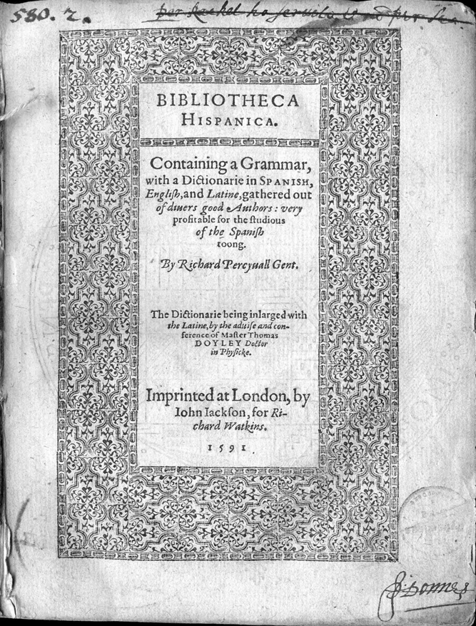
The title-page of Richard Percyvall’s Bibliotheca Hispanica exhibits a number of typographic features which relate to the language. Most obviously, proper nouns and the most important other nouns are marked. “Hispanica” has a full capital <H>, and preserves its proper noun status by being in small capitals, Apart from the conventional capitalisations, “grammar”, “dictionarie”, “authors”, the titles “gent”, “master” and “doctor”, and the word “physicke” are capitalised, the latter also being part of a title. The author’s name is picked out by being given a separate line, printed in italics, and employing swash capitals. Thomas D’oyley’s surname is also marked out in small capitals. [6] “Authors” similarly gets a rather prominent swash <A>, as do the initial letters of the author’s name and the “By”. There is thus consistency in highlighting proper names, but less in the means of doing it, which seems to be adjusted according to the matrix font in which the name occurs. The text from “Containing” to “toong” employs some complex conventions. It first picks out “Spanish” in small capitals, and the format then swaps to an alternation between roman and italic lines, and has double-tapered indentation from lines 5–8. The point size also decreases across the whole block, a technique which was extremely frequently used, especially on title-pages. [7]
The point size is raised and normal line length resumed for the author’s name, which is also set apart as significant by the blank line above it. This line also employs italics and swash capitals. More blank space supervenes before the comment on the origin of the dictionary itself. This is an acknowledgement of the contribution of Thomas D’Oyley (c.1548–1603) to the dictionary, a matter explained at more length in the preliminaries. [8] Deference to D’Oyley is indicated first, again, by the use of italics and then by using small roman capitals for the surname. The last part gives particular prominence to the place of publication, the same as the first line of the sub-title. Finally, the difference between roman and italic distinguishes the publisher and printer. A point which is awkward to resolve is the division of the “Richard” of the publisher’s name – while the name is italicised for emphasis, the break suggests that the physical appearance of tapering was regarded as prior to the integrity of the name. One would need a large-scale study of such features to determine their general and relative significance. The extremely prominent title-border, while attractive and striking, seems to have no further significance than just that.
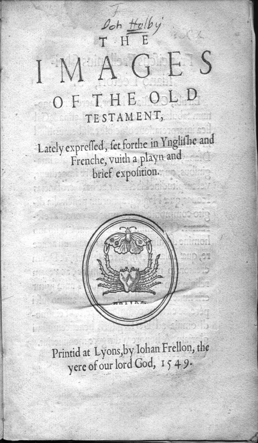
This work is one of a longish series of published editions of woodcuts by Hans Holbein. His famous images of the dance of death, published first in Lyons in 1538, were especially popular, surviving into the seventeenth century. These editions appeared in French, Latin and English at various times, and later even in Dutch. The title-page of the 1549 Lyons edition is comparatively simple, straightforward and visually uncluttered compared with what we have seen so far, containing only the title and sub-title, Frellon’s device, and the bibliographical details. There is no title-border at all. The font is consistently the same, varying only in point size and lower and upper case. Double-tapering is used, but swash letters are entirely absent.
Printers’ devices have been the subject of a lot of research over the years. First, they may contain the initials or an acronym of the printer’s name; second, they may actually stand for a known motto or proverb. The use of Frellon’s crab and butterfly device on this title-page raises some further questions. Should devices be seen as linguistic in any sense? Where the device is used alongside the information it signifies, as here, it is perhaps superfluous to ascribe to it anything more than the sense of visual assurance of authenticity, some degree of publicity, and perhaps a guarantee of quality (Smith 2000: 93–4 ). Where however the actual text information is missing, it might be necessary to interpret the device, which here would mean something like ‘printed in Lyons by Johan Frellon.’ Emblems incorporating these particular animal elements have also been associated with mottoes like festina lente ‘hasten slowly’), which illustrates the potential for a dual linguistic sense; that is, as a single code for both the publisher’s identity and for the motto. [9] It is essential in all cases however to be certain that this is indeed how the device was being used – as Smith points out, Wynkyn de Worde used Caxton’s device for a while after Caxton’s death (Smith 2000: 94).
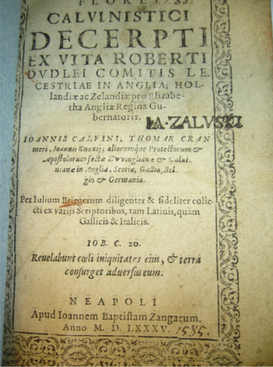
A fairly obvious strategy used on title-pages is shifting the appearance of the font, often from word to word and line to line. Shifts occur from one font to another and from one form of a font to another, as well as between capitals, small capitals and lower case. Swash letters are a frequent and visually obvious convention. Some shifts merely mark the ends of lines, while others indicate a shift from what we would now call the title to the sub-title, or point up names or other important terms, as is apparent three times in Image 6 below at lines 5–6, 6–7, and 10–11. Since in each of these cases a name is split (“Lecestriæ”, “Hollandiæ”, and “Cranmeri”), it is obvious that the appearance created by graphically justified lines and a descending order of types is prior on this title-page to the integrity of the name, thus reducing its linguistic significance.
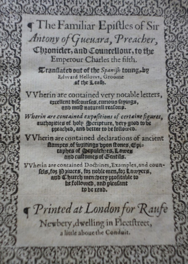
In this area we are often dealing with conventions the significance of which is as yet unknown, and which require closer examination. The edition of Antony of Guevara’s The Familiar Epistles of Sir Antony of Gueuara, Preacher, Chronicler, and Councellour, to the Emperour Charles the fifth, a work translated by Edward Hellows, shows a use of forms of the letter w which became conventional in the course of the sixteenth century.
Early founts, all of which were imported into England, often contained no <w>, especially those of French or Italian origin. The problem was initially solved in England by printing <VV/vv>. The mid-fifteenth-century French solution <vu> appears in Image 2. Later in the century, however, the use of <VV>, especially in large capitals on title-pages had become conventional, and was presumably reminiscent of Latin monumental lettering, thus adding visual prestige. The title-page of the translation of Guevara, to take an example, contains the expected <VV> (‘foreign’) form in the capitals, and English <w> in the smaller lower case forms. There is also an intermediate form, however, which looks like a single letter because it takes roughly an em space, but was not a conventional <w>. This was in reality two <v>’s filed down a little to fit more closely together (McKerrow 1928: 153, 312), a letter form which also appears on the Guevara title-page. Compare the filed down <vv> in “Hellows” with the genuine <w> in “Newbery” and “dwelling”, as well as with the undoctored <VV> in “Wherein”. This practice, which was in fact quite unnecessary, was clearly employed to retain the prestige appearance of the <vv>, rather than use the characteristic English <w> in which the inner ascenders either merged or crossed at the top, and was often marked by the left side being a little more than x-height, at least in blackletter. This <vv> effect must have been felt to be desirable, rather than simply being a way of covering a lack of type. Distinguishing between these variants, especially the filed-down one, is obviously desirable in a taxonomy of letter forms. It is a sacrifice of time and expense by the printer in order to preserve and perhaps enhance appearance. [10]
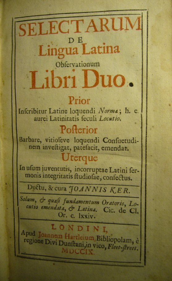
An eighteenth-century title-page, that for John Ker’s Selectarum de Lingua Latina Observationum libri duo, involves the element of colour as well, which derived from the traditional rubrics of the manuscript and was long-established as a means of indicating importance which persisted into the eighteenth century. [11] In this instance, the use of rubrication seems to be a matter of patterning rather than in any sense linguistic, the significance of the rubrication changing in each third of the page. Red lines in large types alternate with small ones in black in the top third, despite the obvious relevance of “Observationum” as a key term. In lexical terms, this word might have demanded more visual stress. The “de” in line 2 is in upper case, which would normally suggest more emphasis than is used for “Observationem”, in lower case. In all, then, the patterning of font size and colour in the first section seems to be more decorative than linguistic. The red lines form a list-heading device in the second third, however, so that rubrication is now apparently motivated by lexical meaning, although not ‘key-word’ meaning. In the last section, it is used to point up the three vital bibliographical details, place, publisher and date; hence it is again linguistic. Thus the rubrications fulfil three separate discourse functions on this page. Borders are also used on this page to distinguish information, in this case, the author’s name.
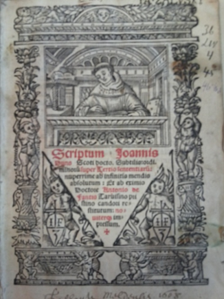
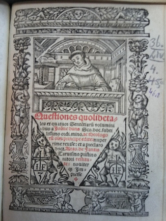
An early example of rubrication showing considerable ambiguity between a lexical function and a decorative function occurs in a 1530 edition of two works by John Duns Scotus published by Jean Crespin. In this instance, a double-tapered text block is inserted into the triangular central factotum, and red in large type is used to introduce the text. However, the author’s name is split between large and smaller type in red and black commences in the second word of line two (“Duns” in red), apparently treating “Scoti” (in black) as descriptive, rather than part of the name. In any case, rubrication is not confined to the name. Further down, Antonio de Fantis’s name is rubricated, as “nouiter”, for which there seems no obvious justification. This arrangement is closely but not exactly paralleled on the title page of the Questiones quodlibetales by the same author. “Ioae duns” is rubricated, “Scoti” is not, while the second word of the title is split, “les” being in black, and beginning the second line. De Fantis’s name is again rubricated, but this time “nouiter” is not, while the previous word, “restitute”, is. The rubrication here is also one line higher than on the other title-page.
Adverting once again to the division of the name Richard Watkins on the title-page of Percyvall’s dictionary, further light might be shed on this matter by more extensive research into whether the names of authors, publishers, and printers were divided at line ends to the same degree, or were treated differentially, how far line-end division was seen as compromising the integrity of a name or word, and how important the practice of double tapering was for the layout of the title-page. [12]
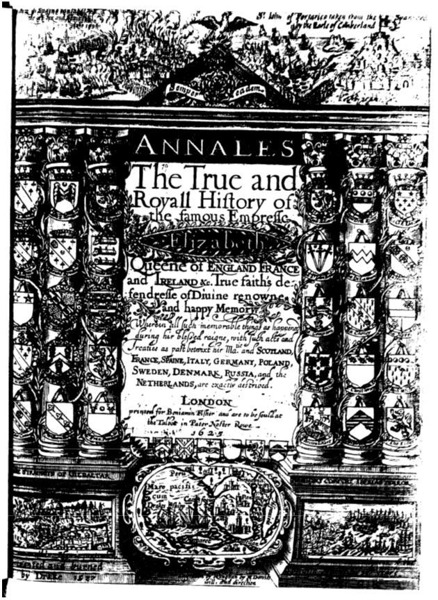
A spectacular example of the complexity achieved by title-pages is the first English edition of the history of Queen Elizabeth by William Camden 1551–1623, published in 1625. [13] This historiated title-page represents a truly overwhelming visual surfeit. It is also a title-page in which genre is clearly of the highest importance, unlike Image 2 above. First, the text is surrounded by a huge area of graphic representations, ranging from the map in the centre-bottom cartouche to the thirty large and seven small eschutcheons, which in general terms probably reflect both the fact that the Queen stood at the apex of the heraldic hierarchy, and the fact that Camden was the Clarencieux King of Arms at the College of Arms, and specifically represent the families and names of those heraldically depicted. Each of the thirty large ones are to be named, but the small are not. Most of the eschutcheons therefore have a very specific linguistic as well as graphic meaning. This title-page is complex enough that a poem has been inserted on its verso explaining the events depicted, as well as some of the symbolism. This is quite an exceptional strategy, since most title-pages, even those containing symbolic and pictorial elements, leave the interpretation entirely to the reader.
The queen is exemplified by the motto at the top centre, “semper eadem” ‘always the same’ which is, appropriately, Elizabeth’s personal motto. The ribbon on which the motto appears supports a Tudor rose, which in its coloured form encloses a stylised white rose within a red one, signifying the union of the houses of York (the white rose) and Lancaster (the red rose) in the marriage of Henry the Seventh and Elizabeth of York. This emblem was so familiar in the sixteenth century that its shape alone would identify it in black-and-white print. Elizabeth is also emblematically depicted as the ‘phoenix-queen’ at the apex of the triangle at the top-centre, the phoenix being a symbol often associated with her, as in the ‘Phoenix Portrait’ attributed to Nicholas Hilliard (National Portrait Gallery 2012) The six columns of coats of arms represent the ‘pillars’ of the society as ennobled by the Queen during her reign, and those families to whom she had restored honours, as the poem on the verso page explains.
Her conquests over Spain are represented by the two scenes on either side, which show on the left, the Capture of Cadiz in 1596, an English-Dutch action led by the Earl of Essex and the Earl of Nottingham, and on the right the Earl of Cumberland’s action at the Battle of San Juan in 1598 in Puerto Rico. At least two of those represented by the coats of arms, Sir Francis Popham and Sir Christopher Hatton, had been knighted by Essex as a result of that action.
The layout and type of the text of this title-page itself is almost overwhelmed by the detail, especially the elaborate cartouche in which the queen’s name appears. Other obvious features include a plethora of swash letters (some very elaborate), italics, descending point size, apparently irrespective of the salience of the words themselves, small capitals, and so on. The central panel at the bottom shows Drake’s ship in the Pacific, having negotiated the Straits of Magellan during his circumnavigation of the globe. The roundel also appears to depict Drake’s most famous prize, the Spanish galleon Nuestra Senora de la Conception, popularly known as the Cacafuego.
On its left is a panel illustrating the action against the Spanish fleet at Gibraltar “burned by Drake 1587” and on the right, the defeat of the Spanish Armada in 1588: “The famous ouerthrowe of the Spanish Navie”.
4.2 Later additions to title-pages
I now move on to consider some of the many other paratextual features which title-pages may accumulate in the course of the years. These may include marks of ownership, including signatures, identification of libraries and collections, as well as hand-drawn symbols of various kinds, bookseller’s identification marks, dates of acquisition, verses, and so on (see Pearson 1998).
Here is an example from the collections of the National Library of Russia (St. Petersburg):
Apart from its printed features, this title-page contains a number of other marks and inscriptions. [15] There are two ownership marks, the most obvious being the stamp of I. A. Załuski, the Polish collector and bibliophile (see McConchie 2012). Załuski and his brother Andrzej founded the first public library in Poland in the eighteenth century. Before determining how exactly to deal with this, it is also essential to know that there was a hierarchy of Załuski ownership marks. The most common but least obvious is the small slanted brown crayon mark under the author’s name. Another, usually introduced by the letter <J>, is the mark at the top right hand corner of the title-page made by Jan Janocki (1720–1786), one of the Załuskis’ most trusted librarians. This is probably what appears at the very top of the image. [16] Finally, there was a system of asterisks, from one to four, usually at the top of the title-page, which indicate the Załuskis’ sense of the rarity of the book – a slippery notion in itself. The asterisks did not appear on all the Załuski books by any means. The date at the bottom of the present image is probably in Jacob Załuski’s hand. Some notion can now be established of where this volume stood in the Załuskis’ hierarchy of significance and rarity, obviously a very subjective measure.
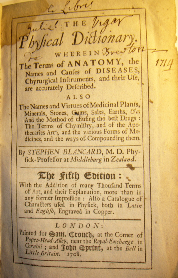
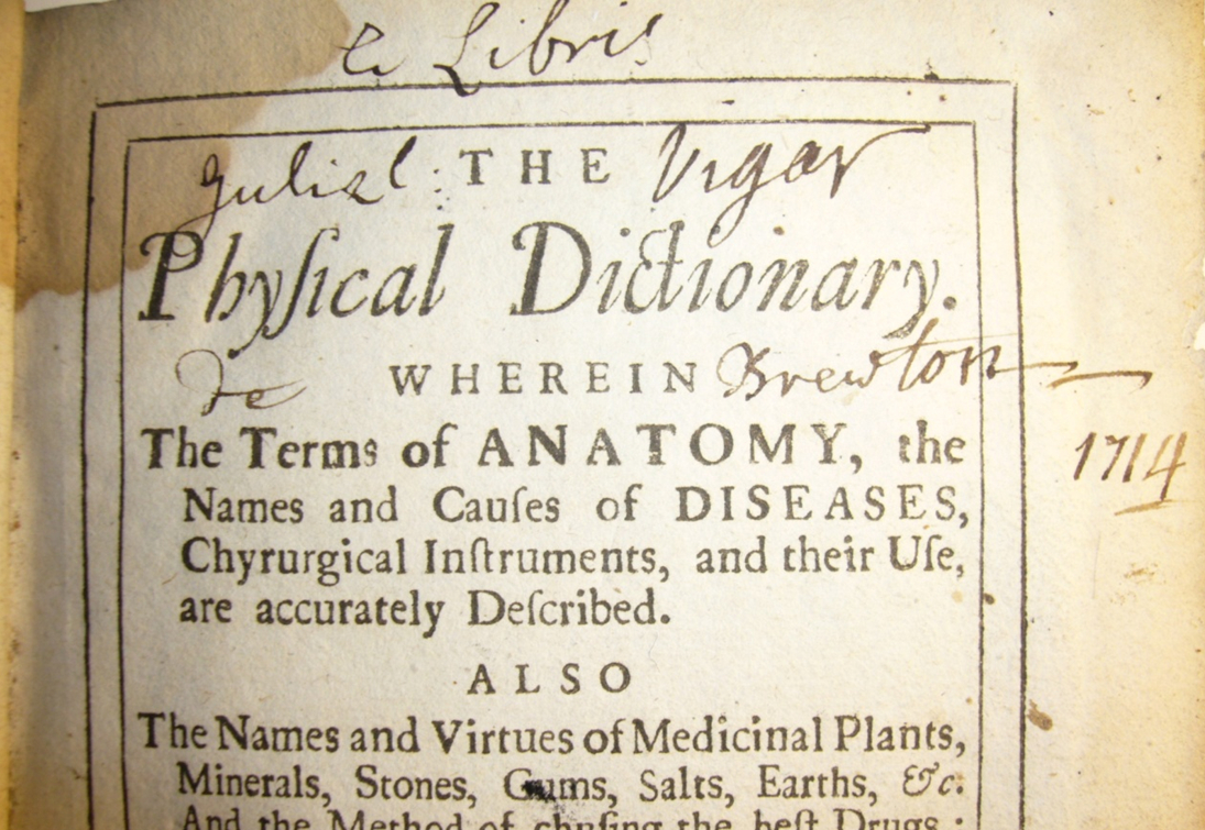
The owner’s signatures occupy various positions, a very common one being straddled across the centre of the title-page, often on each side of the central device or where the words of the title permit. They also occur at the top and the bottom, whether left, right or centred. An example of the thoughtful and slightly more complex distribution of the ‘ex libris’ elements around the title-page elements occurs in a copy of Blancard’s The Physical Dictionary once owned by William Vigar of Brewton in Somerset. [17] In this case, the ‘ex libris’ is centred at the top while the elements of the name and place straddle the main title. The date, presumably the year in which he acquired the book, stands alone in the outer margin. Annotation would need to account for the distribution of this hand-written text around the title itself while still maintaining its integrity as a text separate from the title. Other and more obvious characteristics here are the Latinised Christian name, rendered as “Guliel”, and the French place-name ascription “de Brewton”, rather than the more consistently Latinate “Brewtonensis”, or some more Latinised form. There may be a local reason for the variant actually used.
5. Conclusions
Summing up, we have seen that title-pages over this period may incorporate a great range of linguistic and non-linguistic features – indeed we have seen that there is sometimes considerable overlap between these categories. Several tricky problems arise which require the taxomonist’s judgement to resolve. This brief survey shows that features such as position on the page, type face and size, swash lettering, rubrication, italics and small capitals may underscore illocutionary force, although not necessarily consistently. We have also seen that some graphic elements such as heraldic symbols and printer’s devices may involve linguistic meaning, even at more than one level. Title-pages also force us to consider the input of people other than the author. Finally, owners, either individuals or institutions, may add further layers of linguistic meaning to title-pages.
Notes
[1] See the introductory discussion in Genette (1997: 10–13). Genette is largely concerned here with the illocutionary force of linguistic elements alone.
[2] While Genette’s account of the actual title-page (1997: 32–3) is perfunctory, the elements which go to make up the title-page are discussed and evaluated in much greater detail throughout the work. On early title-pages and their development, see Smith (2000).
[3] The variety within title-pages may well represent differences between genres. This is important, but not a matter which I could canvas here. A large-scale survey would be needed before conclusions could be drawn. Although it may not be possible to discuss “discourse community” without reference to genre, this is not a conclusion which should be drawn without further research. Genre differences may well be important, but considerations such as intended market and book format may be just as important.
[4] A concept developed by John Gumperz, John Swales and others, particularly in the context of research on academic discourse; see Gumperz 1982, Swales 1990.
[5] Whether systematicity is the right word here is an interesting point. Systematicity and regularity are somewhat different: Systematicity implies not merely patterning, but an internal logic and coherence, whereas regularity refers more to the reiteration of features which may become familiar or conventional. Title-pages may exhibit more regularity than systematicity, and further research is obviously called for.
[6] Thomas Doyley, as Percyvall explains in the preface, had also been compiling such a dictionary, but had stood aside for Percyvall, who was further advanced, and allowed him to use his material as well.
[7] This practice has sometimes been referred to as “half-diamond indentation” (Smith 2000: 60), but perhaps a term like “double-tapered indentation” would make it a little clearer, especially since I can think of no example of what would be “full-diamond indentation”, although something which approaches that appears on the title-page of Concerninge the true beleefe of a Christian man by Abraham Fleming, printed by Thomas Purfoote, possibly in 1582(?).
[8] “Thomas Doyley doctor in Phisicke; who had begunne a dictionary in Spanish, English, and Latine; and seeing mee to bee more forward to the presse then himselfe; very friendly gave his consent to the publishing of mine” (A3r).
[9] Deonna, Waldemar. 1954 The Crab and the Butterfly: A Study in Animal Symbolism. Journal of the Courtauld and Warburg Institutes 17(1/2), 47–86.
[10] Spaces between words may also have code-switching significance – for an extreme and apparently rare case in early English printing, see McConchie (2011).
[11] For a particularly striking example of rubrication on a seventeenth-century title-page, see National Gallery of Art Library 2010, no. 11.
[12] For a brief discussion of practice in the incunable period, and some further references, see Smith (2000: 80–81).
[13] For a text and introduction to this work, see Sutton (2001).
[14] This volume, inscribed “Neapoli : apud Ioannem Baptistam Zangarum”, is thought by Allison to have been published in Cologne by Maternus Cholinus. This despite most library catalogues accepting Naples as the place of publication. See A. F. Allison 1989. 1, n. 115-11; Istituto Centrale per il Catalogo Unico delle biblioteche italiane e per le informazioni bibliografiche - ICCU at http://edit16.iccu.sbn.it/web_iccu/ihome.htm. Some of the scurrilous material in the Flores derives from the writings of Jerome-Hermes Bolsec in the 1570s (Shuger 2006: 21-23).
[15] For a comprehensive list and description of these, see Pearson (1998).
[16] There were also several elaborate Załuski bookplates, none of which appeared in this volume, but which were usually reserved for books regarded as important.
[17] The parish records indicate that a William Vigar, apothecary, was buried in 1729.
References
Primary sources
Antony of Guevara. 1574. The Familiar Epistles of Sir Antony of Gueuara, Preacher, Chronicler, and Councellour, to the Emperour Charles the fifth. Translated out of the Spanish toung, by Edward Hellows, Groome of the Leash. Printed at London for Raufe Newbery, dwelling in Fleetstreet, a little aboue the Conduit. 6.29.2.31
Blancard, Stephen. 1708. The Physical Dictionary. Wherein the Terms of Anatomy, the Names and Causes of Diseases, Chyrurgical Instruments, and their Use, are accurately described. Fifth edition. London: for Samuel Crouch.
Calvin, John, et al. 1585. Flores Calvinistici decerpti ex vita Roberti Dvdlei comitis Lecestriae in Anglia; Hollandiæ ac Zelandiæ pro Elizabetha Angliæ Regina Gubernatoris. Ioannis Calvini, Thomae Cranmeri, Ioannis Knoxij; aliorumque Protectorum & Apostolorum sectæ Zvvinglianæ & Caluinianæ in Anglia, Scotia, Gallia, Belgia & Germania. Per Iulium Briegerum diligenter & fideliter collecti ex varijs Scriptoribus tam Latinis, quam Gallicis & Italicis. Neapoli: Apud Ioannem Baptistam Zangarum.
Camden, William. 1625. Annales the true and royall history of the famous empresse Elizabeth Queene of England France and Ireland &c. True faith's defendresse of diuine renowne and happy memory. Wherein all such memorable things as happened during hir blessed raigne ... are exactly described. London: [George Purslowe, Humphrey Lownes, and Miles Flesher] for Benjamin Fisher.
della Porta, Giambattista. [1563, i.e., 1591] De furtiuis literarum notis vulgo. de ziferis libri IIII. Ioan. Baptista Porta Neapolitano autore [London]: Cum priuilegio Neapoli, apud Ioa. Mariam Scotum [i.e., John Wolfe].
Holbein, Hans. 1538. Les Simulachres & historiees faces de la Mort, autant elegamment pourtraictes, que artificiellement imaginées. Lyons: Melchior and Caspar Trechsel for Frellon.
Holbein, Hans. 1549. Images of the Old Testament lately expressed, set forthe in Ynglishe and Frenche, vuith a playn and brief exposition. Lyons: Johann Frellon.
Ker, John. 1709. Selectarum de Lingua Latina Observationum Libri Duo. London: John Hartley.
Percyvall, Richard. 1591. Bibliotheca Hispanica. John Jackson for Richard Watkins.
Secondary sources
Allison, A. F. & D. M. Rogers. 1989. The Contemporary Printed Literature of the English Counter-Reformation between 1558 and 1640. Vol. 1: Works in Languages other than English. Aldershot: Scolar Press.
Deonna, W. 1954. “The crab and the butterfly: A study in animal symbolism”. Journal of the Courtauld and Warburg Institutes 17(1/2): 47–86.
Genette, Gérard. 1997. Paratexts: Thresholds of Interpretation, translated by Jane E. Lewin. Cambridge: Cambridge University Press.
Gumperz, John J. 1982. Discourse Strategies. Cambridge: Cambridge University Press.
Korolev, Sergey V. Undated MS. French Books as the Sources of Brothers Zaluski Library Formation. Translated from Russian. Unpublished.
McConchie, R.W. 2011. “English words and compositorial practice in William Turner’s Libellus de re herbaria nouus, 1538”. Scribes, Printers, and the Accidentals of Their Texts (Studies in English Medieval Language and Literature 33), ed. by Jacob Thaisen & Hanna Rutkowska, 177–190. Frankfurt: Peter Lang Verlag.
McConchie, R.W. 2012. “Sixteenth-century English books and authors in the National Library of Russia, St Petersburg: A preliminary survey”. Western European Manuscripts and Early Printed Books in Russia: Delving into the Collections of the Libraries of St Petersburg (Studies in Variation, Contacts and Change in English 9), ed. by Leena Kahlas-Tarkka & Matti Kilpiö. Helsinki: Research Unit for Variation, Contacts and Change in English. http://www.helsinki.fi/varieng/series/volumes/09/mcconchie/
McKerrow, Ronald B. 1928. An Introduction to Bibliography for Literary Students. Oxford: Clarendon Press.
Mulder, Megan. 2011. “Images of the Old Testament, by Hans Holbein (1549)”. Z. Smith Reynolds Library, Wake Forest University. http://zsr.wfu.edu/special/blog/images-of-the-old-testament-by-hans-holbein
National Gallery of Art Library. 2010. Announcing the Text Development of the Title Page, 1470–1900 Selections from the National Gallery of Art Library National Gallery of Art February 17–May 21, 2010. National Gallery of Art Library, Washington, D.C. http://www.nga.gov/exhibitions/2010/title/slideshow/index.shtm
National Portrait Gallery. 2012. “The Phoenix and the Pelican: Two portraits of Elizabeth I, c.1575”. http://www.npg.org.uk/research/programmes/making-art-in-tudor-britain/the-phoenix-and-the-pelican-two-portraits-of-elizabeth-i-c.1575.php
Pearson, David. 1998. Provenance Research in Book History: A Handbook. London & New Castle: The British Library and Oak Knoll Press.
Shuger, Debora K. 2006. Censorship and Cultural Sensibility: The Regulation of Language in Tudor-Stuart England. Philadelphia: University of Pennsylvania Press.
Smith, Margaret M. 2000. The Title-Page: Its Early Development 1460–1510. London & New Castle: The British Library and Oak Knoll Press.
Sutton, Dana F. 2001. William Camden, Annales Rerum Gestarum Angliae et Hiberniae Regnante Elizabetha (1615 and 1625) with the annotations of Sir Francis Bacon. A hypertext critical edition by Dana F. Sutton. University of California, Irvine. http://www.philological.bham.ac.uk/camden/ (University of Birmingham)
Swales, J.M. 1990. Genre Analysis: English in Academic and Research Settings. Cambridge: Cambridge University Press.
Tanselle, G. Thomas. 2009. Bibliographical Analysis: A Historical Introduction. Cambridge: Cambridge University Press.
|
|