Studies in Variation, Contacts and Change in English
Studies in Variation, Contacts and Change in English
Aris Alissandrakis, Department of Computer Science and Media Technology, Linnaeus University
Nico Reski, Department of Computer Science and Media Technology, Linnaeus University
Mikko Laitinen, Department of Languages, University of Eastern Finland
Jukka Tyrkkö, Department of Languages, Linnaeus University
Jonas Lundberg, Department of Computer Science and Media Technology, Linnaeus University
Magnus Levin, Department of Languages, Linnaeus University
We demonstrate an approach that utilizes immersive virtual reality (VR) to explore and interact with corpus linguistics data. Our case study focuses on the language identification parameter in the Nordic Tweet Stream corpus, a dynamic corpus of Twitter data where each tweet originated within the Nordic countries. We demonstrate how VR can provide previously unexplored perspectives into the use of English and other non-indigenous languages in the Nordic countries alongside the native languages of the region and showcase its geospatial variation. We utilize a head-mounted display (HMD) for a room-scale VR scenario that allows 3D interaction by using hand gestures. In addition to spatial movement through the Nordic areas, the interface enables exploration of the Twitter data based on time (days, weeks, months, or time of predefined special events), making it particularly useful for diachronic investigations.
In addition to demonstrating how the VR methods aid data visualization and exploration, we briefly discuss the pedagogical implications of using VR to showcase linguistic diversity. Our empirical results detail students’ reactions to working in this environment. The discussion part examines the benefits, prospects and limitations of using VR in visualizing corpus data.
In recent years, data visualization has become a major area in digital humanities research and in English corpus linguistics (e.g., Siirtola et al. 2011, 2016). Household methods in corpus linguistics include static visualizations and today increasingly also animated and interactive methods that enable a user to work with some parts of primary data. Despite the significant advances in visualizing text data, it is fair to claim that new methods need to be charted to meet the needs for visualizing textual information. The rapidly increasing size of corpora, the emergence of dynamic real-time streams, and the availability of complex and enriched metadata have made it ever more important to find new ways of presenting and exploring rich and often dynamic primary data.
This article investigates the uses of immersive virtual reality (VR) in visualizing geospatial linguistic data obtained from the Nordic Tweet Stream (NTS) corpus (see Laitinen et al. 2018). It is a real-time monitor corpus of tweets collected for obtaining a more comprehensive picture of non-native English use in the Nordic countries (see Section 4). The NTS data used here comprises a full year of geotagged tweets (12,443,696 tweets from 273,648 user accounts) posted within the Nordic region (Denmark, Finland, Iceland, Norway, and Sweden). The dataset contains not only text, but also rich metadata comprising over 50 metadata parameters. As the gist in all information visualization is to decide what to visualize, we limit our pilot study to three of these parameters to demonstrate the possibilities and potential of VR for explorative analysis (see Section 5.2).
We demonstrate how VR can be used to make large linguistic data more approachable and experiential, and how it can aid in finding meaningful patterns efficiently in vast streams of data. As an illustration, NTS data are multilingual, containing tweets written in over 70 languages. The most frequently used languages are the main national languages of the five Nordic countries and English, and this information is available in the raw data for each individual message. We focus on these data parameters, and illustrate how the use of VR provides a previously unexplored perspective into the use of English and other second/foreign languages in the Nordic countries.
A noteworthy feature of the VR environment used here is that it is agnostic about data in the sense that it only requires minimal programming effort outside the VR application to handle different data sources inside the VR application, and it therefore allows an easy overview of any feature (text or metadata) in a dataset, thus enhancing visual data exploration potential considerably. Given data availability, our plans for the future include expanding the VR exploration further to World Englishes and to historical varieties of English. We are interested in developing new methods of using immersive VR data exploration both in teaching and research, and while our current focus in on higher education settings, the same methodologies can be applied to primary education as well.
The structure of the article is such that Section 2 gives an overview of previous attempts in visualizing big language data. Section 3 discusses the functionalities of the VR system, after which we present the material used in the pilot study, the NTS corpus. Section 5 is an empirical part, and Section 6 concludes and reviews the future potential of VR in visualizing big and rich language data.
Over the last twenty years or so, the use of quantitative evidence has increased significantly in linguistic research. For an excellent overview on the topic, see the online lecture by Kortmann. Driven by ever-larger datasets and gradually increasing understanding of statistical methods, linguistic analyses are now commonly backed up with declarations of statistical significance, effect size and dispersion statistics. One consequence of these recent developments has been an increasing need to visualise large and complex datasets and the results that they yield. No printed table can reasonably present primary data comprising millions of observations and dozens of predictors, nor could any human reader comprehend such a table. Size is not the only characteristic of what is recently referred to as Big Data; additionally the complexity of the data and in many cases the dynamic real-time updates define the challenge of dealing with such datasets. For example, although it is possible to harvest streaming data from social media sources almost in real time, most analytical tools cannot process the data at the same rate. Data visualisation methods not only make Big Data manageable, but ideally even lead to new perspectives. After all, the human brain is ideally developed for processing visual information, and whilst a datatable of millions of cells is impossible to process effectively by the human brain, the same data presented in the form of an alluvial chart, a multicolour three-dimensional scatter plot or a network graph can make instant sense and lead to immediate data-driven observations (see, e.g, Hilpert 2011; Sacha et al. 2016; Schätzle et al. 2017; Kopaczyk & Tyrkkö 2018; Korkiakangas & Lassila 2018; Laitinen & Lundberg in press). Even more powerful analytical tools can be created in the form of dynamic visualisations, such as dashboards, that allow the user to interact with the data by filtering, sorting, querying and scaling within predetermined parameters. Importantly, compared to early visualisations that were always produced post factum to represent research results, computational methods allow the researcher to explore their data visually during the primary research phase, and thereby to discover similarities and differences, trends and tendencies, and relationships or lacks thereof, within their dataset.
However, the introduction of such methods has been something of a sea-change for many traditionally trained linguists. A casual browse through linguistics literature published over the previous decades reveals both the scarcity of data visualisations, per se, and the limited range of visualisation techniques that have been in common use: typically bar and pie charts, with the occasional scatter plots thrown in for good measure. In more recent years, somewhat more advanced visualisations such as box-and-whiskers plots, dot plots and cluster dendrograms have become more common, but their relative rarity even today is attested by the fact that many editors will request that authors explain how such visualisations are to be interpreted.
When it comes to geographic distributions, a central requirement in dialect studies, until very recently hand-drawn dialect maps were the only option available to linguists. It goes without saying that such maps are extremely time-consuming to produce and limited to presenting a pre-determined view of the data. As aptly demonstrated by for instance Eisenstein et al. (2014), Grieve (2014) and Huang et al. (2016), the massive geotagged data available from social media is presently leading to a reinvention of contemporary dialect studies, in which computational data visualisation methods play a key role. The publicly available ‘swear-word maps’ based on the aforementioned project also provide a striking example of how visualisations (of sufficiently engaging data) can make serious scholarly research accessible and interesting to the general public. Likewise, geolocated Twitter data has been used for studying explicit CMC features (e.g., Squires 2012), sociolinguistic variation (e.g., Bamman, Eisenstein & Schnoebelen 2014), and language distributions (e.g., Mocanu et al. 2013). Our present case also relates to the latter research question (e.g., Laitinen et al. 2017; Tyrkkö 2018).
One of the perhaps self-evident reasons for the seemingly slow adoption of visualisation methods in linguistics is that linguistic research is about language, not statistics or computational methods. As a result, many linguists do not receive training in data visualisation methods during their formative training, and consequently a fair proportion of linguists have felt — and to an extent still feel — somewhat alienated by the introduction of methods that can be difficult to understand and typically require entirely new skill sets to implement. Thus, it is easy to see why data visualisations are much more frequently utilised in computational linguistics, information science, and other related disciplines within digital humanities, where computational skills form an important part of the basic professional skill set, than in linguistics proper. Although most (corpus) linguistic textbooks that discuss data visualisations do so in the context of statistical analysis (Gries 2016; Levshina 2015; Desagulier 2017), they rarely focus on visualisations themselves. That is, limited attention is put on the grammar of graphics approach that makes it possible to describe the components of the graphical tools used, enabling a user to gain comprehensive insight into the deep structure that underlying statistical graphics (Wilkinson 2005; Wickham 2010). Furthermore, because visualisation methods have primarily been used as a means of representing findings rather than as a result in and of themselves, it has been commonplace that even when such methods are utilised in publications, the technical details of how the visualisation was produced have not been explained in detail, with the result that most readers feel they could never produce similar visualisations themselves.
In recent years, basic visualisations have been implemented in both server-based and stand-alone corpus tools. Probably the best-known of these are the Brigham Young corpora, which present diachronic and register-specific frequency distributions in the form of simple bar charts. Not only are these seen and used by linguists around the world, but frequently included in student papers, conference presentations and even published research. Standalone tools likewise increasingly integrate visualisations into the workflow. For example, the popular corpus tool AntConc provides visualisations of the distributions of query results (Anthony 2018) and CasualConc can visualize the results of corpus queries in R, if R is installed on the user’s computer (Imao 2019). More advanced and specialised visualisations can be found in purpose-built tools (see, e.g., Siirtola et al. 2011; Säily & Suomela 2017).
Data visualisations can be divided into roughly two categories: the presenting of findings and visual data exploration. For a thorough introduction, see, e.g., Tufte (2001). Whilst the two are not mutually exclusive, they are distinct enough to merit discussion separately. When visualisation techniques are used for presenting findings, the objective is to make previously prepared information, such as the results of a study, easy to access and remember. These types of visualisations are used in conference presentations, research publications, and also in classrooms, and in most cases, the readers or audience members are not intimately familiar with the data prior to seeing the visualisation. A well-designed visualisation will communicate the key points of information almost instantaneously and leave a lasting memory, two things that are almost impossible to achieve by presenting data in a tabular format or running text. It goes without saying that this is especially true of Big Data.
Visual data exploration, by contrast, usually refers to the use of visualisation techniques as key part of the research cycle. When compiling and preparing a corpus, the researcher can use visualisation techniques to identify inconsistencies or unintended clusters in the raw data, ensure diachronic coverage and representativeness across key variables, and identify outliers that may indicate problems in the data. During the actual analytical phase of a research project, similar methods can be used to identify tendencies, clusters and outliers that merit further attention. Indeed, the importance of data visualisation as a means of quality control cannot be over-emphasised. Statistical methods are easy to apply to massive datasets, but when the size of the data become too large to inspect in tabular form, the chances of errors increase. Data visualisations can also help guard against trivial but potentially harmful mistakes in data handling, such as mistakes in the naming of levels of nominal variables, because abnormal values that would be lost in a massive datatable are often immediately apparent in a visualisation.
Immersive technologies, such as virtual reality (VR), are an emerging area of visual data exploration which can, as shown above, considerably enhance both the communicating of findings to students and members of the general public, and the research cycle proper. Attracting new talented students to linguistics is a key area for any discipline, and data-rich fields like English corpus linguistics are in a privileged position when it comes to highlighting real language use, but as the competition for new talents is tight, we need new ways of illustrating variability. And in research use, VR techniques can be used to identify meaningful patterns, recognize tendencies, and spot outliers, and they afford new perspectives into big and complex data, while the immersive properties of VR are particularly useful for showcasing interesting features of a dataset for students. The next sections will present the material and discuss some of the technical details for the VR environment used.
In recent years, a lot of attention has been put on extended reality (XR) technologies. For instance, VR environments enable the user to immerse into an entirely computer-generated (virtual) world, thus visually isolating the user from the real world. By contrast, Augmented reality (AR) extends and enhances real-world environments by adding supplemental virtual information: interactively, in three dimensions, and in real time. Virtual objects in an AR environment align accordingly with real ones and thus seem to coexist in the same space. Finally, Mixed reality (MR) combines aspects of both VR and AR, where physical and digital objects coexist and interact in real time.
Virtual reality has been of interest to researchers for over half a century (Sutherland 1968), but until recently equipment costs and the lack of sufficient computing power have kept its applications limited to a certain restricted number of areas in industry, military, and to some extent academia. However, thanks to recent developments in consumer technologies, the application areas and the uses of VR have expanded considerably, and it is fair to claim that VR has arrived into the mainstream spotlight (Abrash 2014; Parkin 2013). As an illustration, according to the market analysis firm Gartner’s latest (2018) annual report for emerging technologies, VR is no longer listed as an emerging technology, but is considered one that is approaching a mature stage. Comparing the 2017 and 2018 Gartner Hype Cycles for Emerging Technologies, VR is omitted, while Mixed Reality is introduced and considered separately than Augmented Reality. All theses related technologies involve different degrees of combining real and virtual representations, and diverse levels of interaction.
The main equipment required for VR applications, head-mounted displays (HMDs) are more commercially accessible and affordable than ever before (Lanman et al. 2014). The main manufacturers include Oculus (a subsidiary of Facebook), HTC, Pimax, Lenovo, HP, and Microsoft for PC desktop computers; Samsung and Google for use with mobile phones; Sony for game consoles. A HMD is a device that is worn on the head, similar to glasses or safety goggles, visually isolating the user from their physical real-world surroundings. Instead, the user is presented with computer-generated virtual content, which can be explored by moving one’s head and thus looking around. The virtual content displayed might closely correspond to data obtained from the physical world (a reproduction of a real place), or it might be based on data that are algorithmically or computationally generated (an information visualization). Perceiving the virtual environment in such a natural manner conforms fundamentally with how humans operate as biological beings (LaValle 2016). Consequently, substantial opportunities and potential arise regarding the presentation of digital content in three-dimensional VR environments (Bayyari & Tudoreanu 2006).
The possibilities afforded by VR stem from immersion (a measurable level of sensory fidelity provided by the VR system) and the sense of presence (the subjective feeling of being “there” within the virtual world). These features, as suggested by Bowman and McMahan (2007), have naturally led to the design of VR experiences within educational and humanities contexts that favour the recreation of actual physical places, such as museums, historical locations, or even archaeological sites (e.g. see Sandby borg in Virtual Reality and Virtual Archaeology at HTW Berlin). It must be noted, however, that while increased immersion is important, it does not straightforwardly lead to a better sense of presence. The human perception system will react negatively to any mismatches between perceived (virtual) and expected (real) stimuli, particularly when there is increased realism, which necessitates the careful design of VR experiences. Acknowledging this, we believe that an important aspect of VR is the potential for presenting the users with creative and more abstract visualizations of data characteristics, rather than raw data in the form of concordance lines or in the case of historical material, manuscripts for instance. These select data characteristics can then be explored and interacted with, thus allowing a better understanding of a topic, or a more solid basis for the decision making in the research cycle.
The dataset used in the visualization, the Nordic Tweet Stream corpus (NTS), is a real-time monitor corpus of geolocated tweets posted from within the five Nordic countries. The NTS corpus is the outcome of cross-disciplinary collaboration at the Center of Data Intensive Sciences and Application (DISA) at Linnaeus University between computer scientists and a group of sociolinguists interested in language variability in general and English as a lingua franca (ELF) in particular.
The data collection makes use of the free Twitter Streaming API, and we use HBC as our downloading mechanism. The data capture utilizes the geolocation information, in which we first specify a geographic region covering the five Nordic countries, and then a second filtering process is applied to select only tweets tagged with a Nordic country code (DK, FI, IS, NO or SE). This second filtering is necessary in order to exclude tweets from neighbouring countries (e.g., Germany and Russia) located within the chosen geographic boundary (see Laitinen et al. 2017, 2018 for the process).
The project was started in November 2016, and the objective is to continue storing data for several years. By 31 January 2019, the NTS had captured 18,043,882 tweets from 382,255 user accounts from 9,191 unique locations. While some of them might be from native speakers visiting the region, previous studies have shown that the majority of the Twitter messages in a given location originate from its residents (Lamanna et al. 2016). Each tweet comes with rich metadata, some of which are related to the user, some specify location of the account and the message itself, and some are related to the message itself. The NTS currently contains over 1.5 billion metadata points. We add almost 40,000 messages every day. The data are stored in Sweden and are the sole property of the project members. Figure 1 visualizes the rate of adding material during the first 449 days of data capture. It shows that during this time we added material from 110,530 accounts. The first day added some 4,000 accounts, and the mean increase per day is tweets from 193 accounts. The figure also shows how our downloading mechanism was inoperational during three short periods.
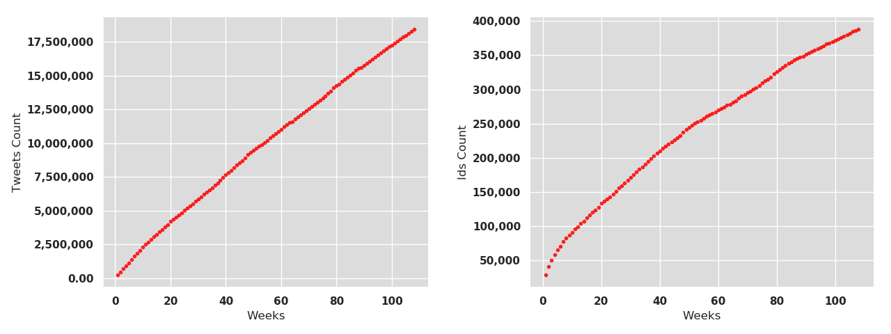
Figure 1. Accumulation of tweets (left) and unique user account ids (right) in the NTS corpus.
Table 1 illustrates a selection of the metadata parameters included for each tweet. These metadata include user-generated, place-related, and service-provided information. The star sign * indicates that this information is automatically generated by Twitter as opposed to being user-provided information that can be misleading and inaccurate.
| User-related information | |
|---|---|
| name | User name |
| screen_name | User’s Twitter name |
| location | User’s location |
| description | User’s description of themselves |
| verified* | Information of whether the account is verified by Twitter |
| tweets_issued* | Number of tweets from a user |
| created_at* | Date the account was created |
| time_zone | Reported time-zone of the user |
| Place-related information | |
| place_type | Place of residence (country/city/etc.) |
| country_code* | Name of country of residence |
| geolocation* | GPS coordinates |
| Tweet-specific info | |
| Date* | Date of publishing the tweet |
| Time | Exact time of publishing the tweet |
| Lang* | Language of a tweet identified by Twitter |
| Tweet | Tweet keyed in by a user |
Table 1. A selection of the metadata parameters in the NTS.
As seen in Table 1, one of the advantages of Twitter data for corpus-based sociolinguists and digital dialectologists is the fact that Twitter tries to assign a geolocation to each tweet (cf. the work done by Huang et al. 2016 for instance). However, although tweets offer an efficient way of capturing data from tens of thousands of individuals, there are limitations. In our case, Twitter users who do not want to share their location are not included. Note that when we refer to locations, we are not referring to named home locations provided by users, which may be misleading or missing (e.g., “Mars”; see Graham et al. 2013) but instead to the geolocation information provided by Twitter. Depending on privacy settings and the geolocation method used, tweets either have an exact location specified as a pair of latitude and longitude coordinates or an approximate location specified as a rectangular bounding box, which are available in the metadata attached to the message. Alternatively, no location at all is specified. This type of geographic information (‘device location’) represents the location of the machine or device from which a user has sent a Twitter message. The data are derived either from the user’s device itself (using GPS) or by detecting the location of the user’s Internet Protocol (IP) address (GeoIP). The primary source for locating an IP address is the regional Internet registries allocating and distributing IP addresses among organizations located in their respective service regions (e.g., RIPE NCC at www.ripe.net handles European IP addresses). Exact coordinates are almost certainly from devices with built-in GPS receivers (e.g., phones and tablets).
Previous studies report that the proportion of geolocated tweets is in general low, between 0.7% and 2.9% depending on geographic contexts (e.g., Barbaresi 2016). In an in-house experiment to test the accuracy of our data (during a 10-day period in August 2017), we compared the number of NTS tweets in which the language tag was Swedish (n=53,614) with tweets taken from another download project that was attempting to capture all tweets that had been language-tagged as Swedish independent of geolocation (n=1,880,844). This result indicates that 2.8% of all tweets tagged as Swedish are geolocated to one of the Nordic countries. It should also be noted that GeoIP-based device location can easily be tricked by using proxy gateways, allowing a user anywhere in the world to “appear” to be located at a particular GeoIP address. The use of proxy gateways to hide the location is probably most common amongst users with a malicious intent, such as bots.
Another reason why Twitter has been tapped into in various scientific projects is that it comes with an open policy allowing third-party tools or users to retrieve at most a 1% sample of all tweets. This service, the Twitter Streaming API, enables programmers to connect to the Twitter server and to download tweets in real time. The Streaming API provides three parameters – keywords, hashtags and geographical boundaries – which can be used to delimit the scope of tweets to be downloaded. The drawback of using the Streaming API is the 1% limitation and the fact that Twitter is secretive about the sampling mechanism used. Morstatter et al. (2013) compare the sample provided by the Streaming API, also known as Gardenhose, with the expensive Firehose API allowing access to 100% of all public tweets. Their investigation shows that the sample provided by the Streaming API was a sufficient random sample when the stream was filtered using geographical boundaries, as we do in the storing process.
To test the usefulness of VR for accessing big language data, we utilize two metadata parameters from the NTS corpus in the empirical part of the project: the geolocation information in the form of longitude and latitude, and information on the language of tweet. The benefit of using these parameters is that they are automatically generated, which reduces observer bias, and the fact that they are available for each tweet. For discussion of the automatic language detection on Twitter, see, e.g., Laitinen et al. (2017) and Coats (2017).
There is a long and rich methodological history to using location-based data in linguistics. Whilst early corpus- and survey-based dialect studies typically had to rely on approximations and generalisations made on the basis of relatively sparse data, modern large corpora, which are more often than not based on data from social media, allow for the use of sophisticated statistical methods such as spatial autocorrelation (Grieve 2018; see also Eisenstein et al. 2014; Huang et al. 2016; Gonçalves et al. 2018). Regardless of the study, the methods need to be appropriate to the volume and distribution of the data available. In our case, although the geolocated NTS data cover the Nordic region, the frequency differences between rural and urban areas are extreme, with small to medium-sized towns contributing perhaps a few dozens of tweets per week while in the same time period the larger cities may contribute thousands or tens of thousands of tweets.
To contextualise the impact of data volume and distribution, we can compare the NTS data with the dataset of American tweets used by Huang et al. (2016) and Grieve et al. (2017). As previously noted, the annual volume of tweets in the NTS dataset is c. 14 million, and the combined geographic area of the five Nordic countries is 1.3 million square kilometers, or approximately one seventh of the land area of the United States. By contrast, the corpus of American tweets was 980 million, which means that after factoring in the area difference, the American dataset is roughly ten times greater. The practical relevance of the sparsity of the Nordic data is that while the large population centres are well represented, there are vast areas that generate only small handfuls of tweets and not enough data to allow for well-argued or statistically robust regional comparisons to be made, particularly when it comes to low-frequency linguistic phenomena such as lexical choice. Another related challenge concerns densely populated areas that produce high volumes of data. In various part of the Nordic region, populous cities can be found in close proximity to each other. In Finland, the adjacent cities of the capital region (Helsinki, Espoo, Vantaa and Kauniainen) all produce large numbers of tweets, and at the Øresund strait that divides Denmark and Sweden, the cities of Copenhagen and Malmö are connected by the 7.8-kilometre Øresund bridge. Depending on the way the data is presented, these regions may merge into single data points, even though, especially in the latter case, they represent linguistically distinct populations. The effective communication of information about the distributional features and the frequency differences is one of the major challenges in the visualisation of the NTS corpus, or any geospatial dataset. The visualisation needs to be both easy to understand and interact with, which means avoiding overplotting and excessive complexity, but at the same time it needs to communicate real-life distributions and frequencies in a truthful and accurate way.
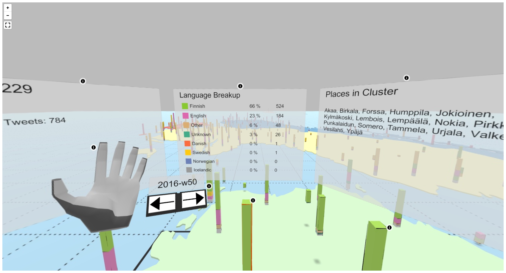
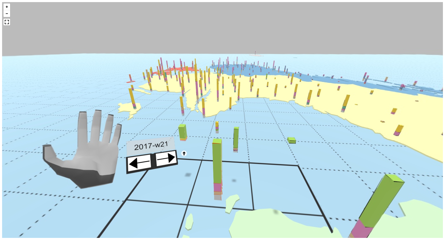
The underlying concept of enabling a user, for instance a researcher, educator, student, or non-expert user, to explore the NTS dataset within an interactive immersive VR environment is based on prior work (Reski & Alissandrakis 2019), which was enhanced by major visual extensions (Alissandrakis et al. 2018). The VR environment displays the five Nordic countries (Denmark, Finland, Iceland, Norway, Sweden) color-coded on the floor within the virtual, computer-generated, three-dimensional (3D) space. The floor provides the VR user with important navigational guidance during the data exploration activity within the immersive environment. Using the geolocation metadata feature attached to each tweet, we have identified 1,452 unique locations in the NTS dataset used here. We further assigned all these unique locations to a total of 309 clusters, with each cluster representing all locations within a radius of 60 km. In more detail, the locations were first clustered (within a 60 km radius) separately for each Nordic country using the R package leaderCluster (Arnold 2014), and then these cluster subsets were added to the final single cluster set. This was done to both keep a reasonable fidelity when reducing the data points (in this case by a factor of approximately five), and at the same time to maintain as separate data points important locations that are geographically close across national borders (e.g., the Malmö and Copenhagen areas). When deciding how to pre-process the data, one needs to take into account both factors that make the data more easily perceived (visually), and that make the data still meaningful to interact with. Using these clusters, it is possible to assign each individual tweet in the NTS dataset to a distinct cluster.
As seen in Video 1 of the virtual 3D space, our VR system displays each cluster as a stacked cuboid (similar to a 3D bar chart), which is positioned at its appropriate geo-location on the virtual floor. Each stacked cuboid consists of four stacks: the size of the top three stacks of the cuboid represent, in order, the three most frequent languages detected within the cluster, while the size of the fourth stack represents the sum of all remaining tweets in other languages than the top three. Color-coding across all cuboid stacks according to the individual languages enables the VR user to get an overall impression of the language distribution across and within all clusters. Additionally, in order to provide the VR user with a visual indication about the overall tweet traffic (e.g. how many tweets were posted at each location, and how often), each stacked cuboid height is scaled according to the total number of tweets within that cluster (the more tweets, the higher the cuboid, using a logarithmic scale).
Video 1. Demonstration of the virtual 3D space.
Using the described approach to visualize the NTS dataset, the VR user can obtain a visual impression of the Twitter social network activity according to location and language variability by looking around within the virtual 3D space. Due to the uniform color-coding of the languages as well as the height scaling of tweet numbers, it is possible, for instance, to spot clusters that are visually distinct compared to others, and are thus potentially interesting for further investigation.
Our VR system allows a user not just to be a passive observer in the virtual environment, but to become an active part within it, as can be seen in this annotated 360° screen capture of the VR system.
Using an additional sensor attached to the front of the HMD, the VR user’s hand and finger movements are detected, and visually translated into the virtual 3D space accordingly. Such gestural commands are common in 3D user interface (UI), enabling the VR user to interact more naturally with the VR system using the own hands rather than by holding physical controllers or gamepads (LaViola Jr et al. 2017).
The VR system features a set of simple hand postures which enable the VR user to actively explore the NTS dataset within the immersive environment. By performing a “thumbs up” hand posture, the VR user can toggle a three-panel window (similar to a three-monitor desktop setup in the real world), displaying detailed information about a selected cluster. The center panel displays information about the language distribution within the cluster (language name and its assigned color, share in percentage, number of tweets). The right-hand panel displays all unique location names contained within the cluster, while the left-hand panel provides further additional information, such as, for instance, the total number of tweets and the time. By looking around, and focusing the gaze on a stacked cuboid representing a cluster, the VR user can make a “point forward” hand posture, indicating the intend to move to this cluster. Using a target-based travel technique (LaViola Jr et al. 2017), moving straight from an origin location to a destination location, the user will be virtually moved and newly positioned next to the pointed at cluster. This mechanism allows the VR user to move from cluster to cluster and thus explore the Nordic countries, and thus the NTS dataset, accordingly. Alternatively, the VR user can also simply “touch” clusters in close proximity to select and further examine that cluster.
Generally, as described earlier, each cluster is virtually placed at its appropriate geo-location on the virtual floor, allowing the VR user get an overview about all clusters, particularly the more distant ones. However, keeping human factors and ergonomics in mind, it would be rather cumbersome to physically reach down in order to touch a cluster in close proximity to the VR user. Consequently, a mechanism that lifts close proximity clusters to the VR user’s chest height has been implemented. This mechanism facilitates closer examination and interaction with each cluster, without losing the desired general perspective offered by more or less neighbouring clusters. While a cluster may be raised for such facilitated interaction, its shadow is projected on the virtual floor to maintain a visual indication of the cluster’s location. This is particularly important for clusters that are located in border regions, for instance close to both Finland and Sweden. While one could argue that the list of unique real world place names in the right information panel provide enough indications whether the cluster is located in one country or the other, it is also important to keep, for instance, novice users in mind. They might be unfamiliar with the dataset or context, and may want to use the immersive VR system to learn about dataset and its characteristics. Therefore, we are argue that providing a range of features and (visual) indications help facilitate the understanding and explorability accordingly. Finally, the VR system attaches a time menu to the VR user's left-hand palm, allowing to move forward and backward in time (based on computed intervals, e.g. daily or weekly) by pressing the corresponding virtual buttons, updating in return all the displayed cluster data accordingly. An interactive time menu 360° screen capture (no information panels) can be viewed online.
Using these features and technologies, the VR user can explore the language variability within the Nordic countries both geographically and across time, as well as in an active, engaging, and enthusiastic way, trying to find patterns and points-of-interest (POIs). Such findings may then be further explored outside the VR environment, using other additional tools, for instance database queries or other sorts of visualizations. It is important to highlight that we envision our VR system as one complementary part of a greater workflow to explore and examine big datasets, such as for instance the NTS dataset, and not as a substitution for other visualization and data exploration tools.
Figure 2 presents some visual impressions of the computer-generated, virtual 3D space of the VR system. A user operating the VR system and exploring the NTS corpus data is shown in Figure 3. Furthermore, an interactive time menu 360° screen capture with displayed information panels of the VR system can be explored online.
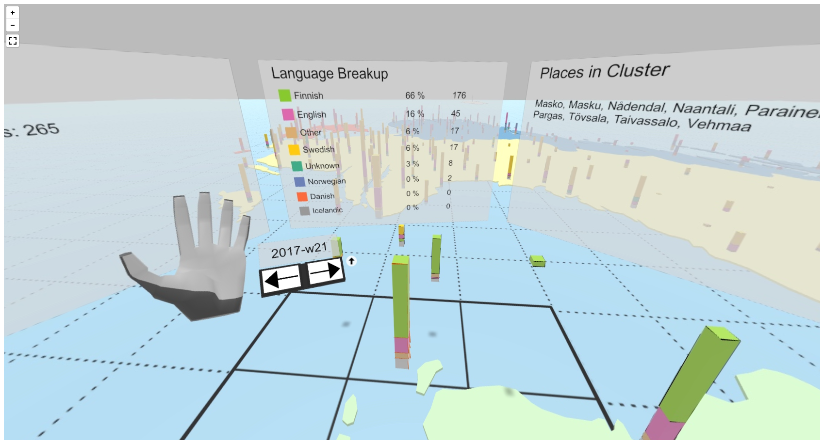
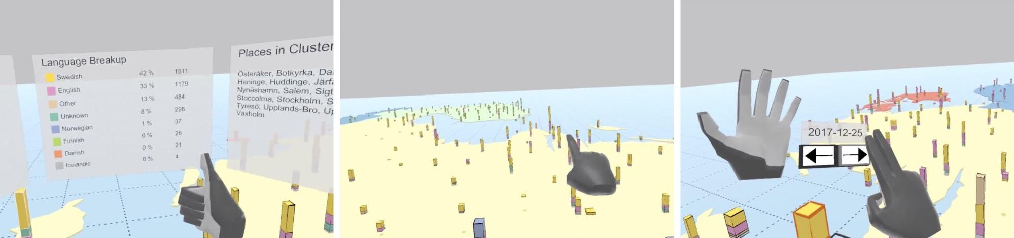
Figure 2. Screenshots from within the VR system. Left to right: display cluster information panels (center and right), target-based travel to move from cluster to cluster, browsing time using time menu.
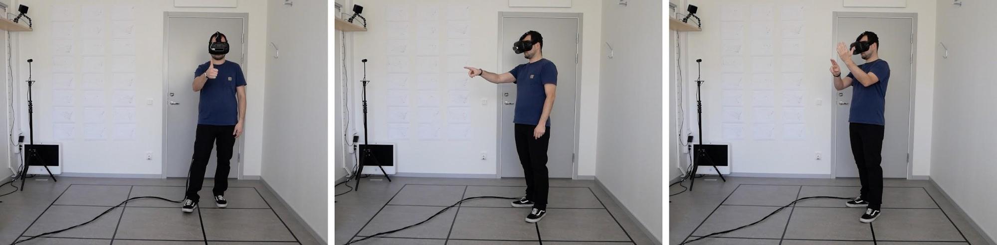
Figure 3. User operating the developed VR system. Left to right: “thumbs up” hand posture, “point forward” hand posture, interaction with time menu attached to the user’s left-hand palm.
From a technical point of view, the VR system is developed using the Unity3D engine and utilizes a HTC Vive HMD as well as a Leap Motion controller for the 3D gestural input. Using the HTC Vive hardware, the user can freely move within a designated physical area (e.g., 2-by-2 meters), and thus within the virtual 3D environment. Additionally, as illustrated in Figure 4, the VR system connects to a server and database, implemented using Node.js and MongoDB, that are responsible for all data transformation and visual mapping related tasks using an pre-defined data structure reference model. This is required in order to prepare the original NTS data for visualization in the virtual, computer-generated environment, as the VR system itself is data-agnostic, and thus entirely independent of the data (potentially even from multiple different sources) it displays.
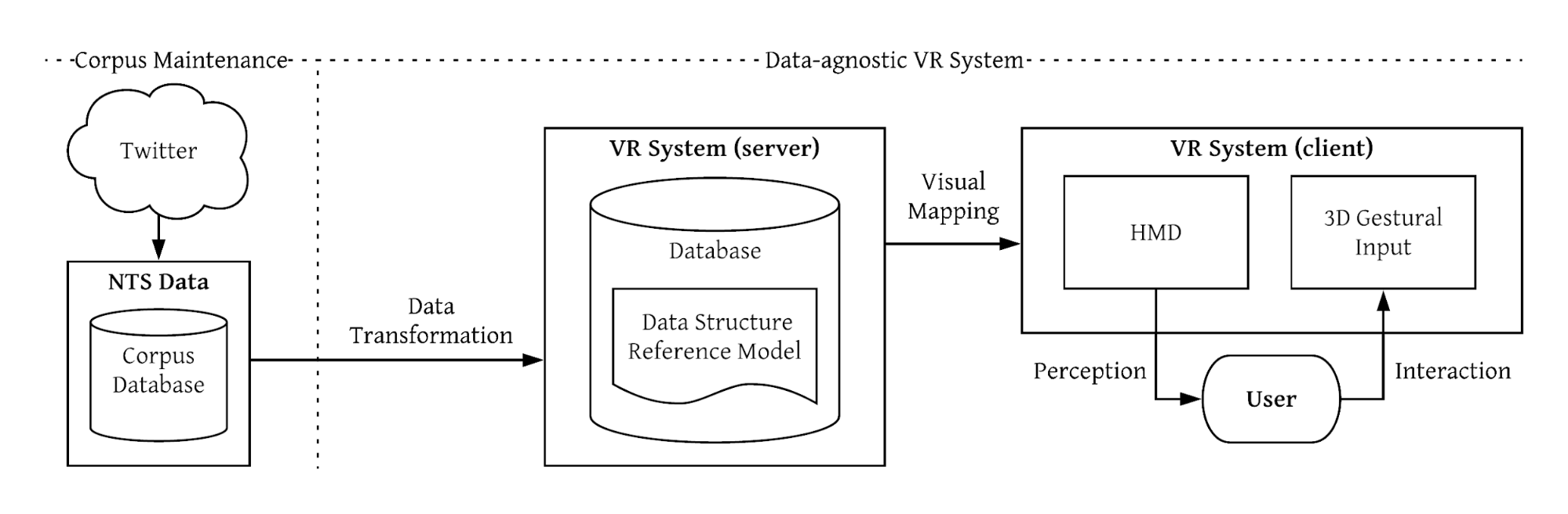
Figure 4. Corpus maintenance and VR system architecture.
In the linguistics classroom, research-based teaching relies increasingly on findings derived from corpora and other massive datasets, often with the aid of data visualisations. While exposure to static visualisations certainly develops the students’ basic statistical literacy skills, it continues to be rare (outside of specialised methodology courses) for students to engage with the data themselves, let alone for them to explore the data in an immersive and engaging way.
The immersive VR system affords students with a new and engaging way of interacting with real research data. Rather than reading and interpreting static graphs and plots that represent pre-determined views to the data, the VR experience places students within the data and into a virtual representation of a landscape they recognise. They are free to roam within the virtual space, explore places of interest, and complete tasks by relying on a combination of previous reading and their own problem-solving skills.
Our first practical case study was conducted on 14 May, 2018 with a small group (n=7) of first-year students from the spring 2018 Sociolinguistics module of the English language BA programme at Linnaeus University. Subsequent experiments and demonstrations of different versions of the system were carried out in May 2018 (demo, n=26), September 2018 (experiment, n=5) and November 2018 (demo, n=11), and further study with students (n=15) and a demonstration (n=21) were carried out in May 2019. In order to assess the VR system, we wanted feedback from students who had no previous experience with VR and no specific knowledge of the tasks ahead of them, which meant that they could not prepare for the experiment ahead of time. Our topic of choice was multilingualism in the Nordic Tweet Stream, specifically the distributions of the main Nordic languages of Danish, Finnish, Icelandic, Norwegian and Swedish, and of English. The topic is explored using the NTS dataset in Laitinen et al. (2017) and (2018); Tyrkkö (2018) and Tyrkkö and Sundberg (2019). Prior to the experiment, the students had been introduced to the topic of multilingualism as a sociolinguistic concept, and they knew that the experiment would have something to do with data from Twitter and virtual reality. They did not, however, know that the data would come from the Nordic region, nor that the specific topic of the experiment would concern language distribution in the Nordic countries. Importantly for assessing the students’ ability to navigate around the virtual space, all the students were either born and raised in the Nordic countries or had lived in the Sweden for a reasonably long period.
The students tried the system one by one with only the student, the two developers of the system, Reski and Alissandrakis, and the professor teaching the course, Tyrkkö, present. After an introduction to the VR system, the students were immersed in the virtual environment. Overall, we were looking for feedback on their user experience, both of the ease of using the HTC Vive controller and the ease of interpreting the virtual environment and the data. The students were asked to orally report on what they were doing, what they saw and what they experienced. The students were given a short period of time to orient themselves to the environment and the user interface, after which they were given two tasks related to multilingualism in the Nordic countries.
First, they were asked about the regional distribution of English in Nordic tweets and where in the Nordic region people tweet the most in Finnish. The students were encouraged to verbalise their actions as they went along. We were interested to observe how the students would approach the task, and different strategies did indeed emerge. Whilst some would explore the virtual map by going from one place to another, others would move to a peripheral location and take in an overview of the whole map. This was in line with previous observations by Reski and Alissandrakis. Similarly, while some students relied on their previous linguistic knowledge and almost immediately started exploring regions that they believed would be the most relevant to completing the task, others appeared to focus more on the data visualisation itself and did not appear to make use of background information. Two examples of user interactions reconstructed using log data from the pilot studies are shown in Figure 5.

Figure 5. Two example user interactions from the pilot studies reconstructed using log data. Location clusters are shown in black, clusters interacted with by the user are shown in blue, the order the clusters were visited is indicated by the blue arrows, the amount of time spent at a specific location is indicated by the size of the blue bubbles. Note that only the spatial and not the time dimension exploration is shown here.
As a second task, the students were asked to explore the Twitter map freely and to find a location that is of interest to them personally. The task was intentionally left vague, because we were curious to see how the students would make use of the environment when left to their own devices. Predictably, many decided to ‘visit’ their hometown or to look for Växjö, the city where one of the two campuses of Linnaeus University is located and where the experiment was conducted. On the other hand, a few students chose to explore the map to find places where the stacked cuboid appeared to indicate a notably different language distribution from the nearby clusters, or to use the time dimension to see changes over time. These discoveries lead to interactions with the instructors and speculations about the possible reasons behind the observed phenomena. More broadly, the different approaches adopted by the students provided valuable information about different learning styles, knowledge-exploration strategies and motivations that users of VR environments may have.
Each session lasted on average 15 min, with at least 10 min within the VR environment, and roughly equal amount of time spent in each of the two tasks. All the participants were able to adapt to the 3D interface (some slightly quicker than others, but no usability issues) and provide a number of answers to the open ended task questions. The general experience was that the students were quick to pick up the basic mechanics of the controller and after a few minutes they could move around the virtual space and interact with the data, represented by the stacked cuboids. Several useful items of feedback were recorded during the experiment, independent of the two tasks:
All in all, the student response was very positive, with several of the students reporting that the immersion allowed them to experience the data in a more ‘real’ and memorable way. The experiential quality of immersive VR data exploration has been replicated in our subsequent experiments and the demonstrations we have carried out at conferences and similar venues. A large part of the experience would appear to be related to the way immersion in the virtual environment focuses the user’s attention on the data. Unlike a visualisation shown on a data projector or printed in a book, an immersive visualisation cannot be glanced at casually or scanned quickly. The experiments with students have proved to us the that the immersive quality of data exploration can be particularly effective as a teaching tool. The experience of immersion in, and interaction with, the data in VR is intended to allow the user to discover relations and patterns. Although immersive exploration is perhaps especially suited for geographic data, we see various other possibilities of representing non-spatial data in the VR environment. For the lecturer or instructor, the ability to observe students problem-solving approaches gives new kinds of insights into learning strategies. As an example, the teacher or lecturer may examine the exploration tracks followed by different students and identify common patterns of behaviour, which can indicate different ways of learning or suggest that specific parts of the data were visited more or less than what would have been ideal.
The students could move back and forth on the timeline. In this experiment the default unit of time was one day, which resulted in considerable variation especially in clusters representing more rural areas. In later experiments, we have opted to use a week as the default time unit, which stabilises the proportional language distributions and makes the data easier to interpret. It is worth noting, however, that there was also inherent value in the shorter time span, because it showed the students how much temporal variation there really is in the data and lead to later discussions in the classroom about data selection and sampling methods.
The experiment also highlighted several issues, many of which we have since addressed. Firstly, although the use of the hand-held controller was generally easy to master, it was not fully intuitive to all users and could hinder quick deployment in settings where new users would ideally need to enter the VR environment with little to no introduction. We now use the pose-and-gesture-based system discussed in Section 5.1, which is extremely natural for users to learn quickly. Secondly, while the timeline functionality works well, it can be somewhat difficult for the immersed data explorer to get an overall view of diachronic trends. This part of the interface was partly improved by changing the unit of time, but we have also developed a system for two (or more) users, where one person is immersed in the VR, and one or more use a desktop application showing a different view of the same dataset. The co-located users can work together, each making use of the best features of the different interfaces. Thirdly, the immersed individual’s inability to take notes or read textual data, such as tweets, limits certain research tasks. These challenges are also addressed by the co-located system. Additionally, a feature we intend to provide in upcoming iterations of our VR system is the ability to export “interesting” findings, that the user came across during the VR exploration session, for further analysis and investigation outside the VR environment using other tools and methods.
This paper introduced a pilot study that utilizes immersive VR technology for the visualisation of regionally distributed quantitative data on multilingualism in the Nordic countries. With data drawn from the Nordic Tweet Stream dataset, we visualised the regional distribution of languages over a period of one year of tweets from the five Nordic countries as a VR environment that allows users to explore the data in both time and space. Our experiments have demonstrated that students find the immersive technology engaging and compelling, and generally find the interface easy to use and the data easy to interpret.
In general, VR offer has a lot of potential for data-rich disciplines in the humanities, such as English corpus linguistics. VR and its properties of immersion and presence can substantially help in data exploration as part of the workflow alongside standard concordance tools, programming environments, and statistical toolkits. Visual stimuli are important and can make data exploration more effective for researchers. In addition, as we have aimed at demonstrating here, immersive exploration can be utilized with students so that big and rich data can be visualized in ways that highlight linguistic diversity through the sense of presence, which is often lacking in the existing tools in corpus linguistics.
We believe that applying VR technologies is not about substituting existing 2D visualization practices, but about adding new 3D user interfaces that synergize and complement data exploration and result visualization. Arguably, there is not a single application or visualization tool to satisfy all user needs, but rather a set of multiple tools that each provide unique features to facilitate an overall data exploration workflow, in particular in the era of big data. As a result, we see a great potential between the interplay of novel 3D user interfaces and established 2D practices (a direction we are interested in investigating in future studies).
The positive experiences we have had with the immersive VR technology for teaching and research have given rise to ideas about several new potential scenarios and datasets. We have started planning a World Englishes application, which would incorporate samples from around the English-speaking world and allow the student to explore the gradual changes in the sounds and features of regional Englishes by virtually moving around the map. Implemented as the co-located application that integrates VR with a desktop interface, the World Englishes application could be used in the classrooms environment or as a game. Similarly, we are planning applications of immersive visualisations for presenting and exploring historical language data, in which the timeline interface would allow the user to explore diachronic changes in linguistic features, affording the student or researcher the opportunity to literally move through time and space.
In conclusion, our pilot project has been a positive and exciting exercise in digital humanities. By reaching across disciplinary aisles and joining forces in a collaborative fashion, we have already made many useful observations that benefit both parties in their own fields and also shine a light on new opportunities and possibilities. We are looking forward to exploring new ways of bringing VR methods into linguistics teaching and research.
The authors would like to thank the participants of the user studies, as well as the attendees who tried out our demo at ICAME 39 in Tampere and in other events and provided us with valuable comments and feedback. This work was partially supported by an internal seed project funding from the Linnaeus University Centre for Data Intensive Sciences and Applications (DISA). The authors also wish to thank the two anonymous reviewers for their constructive comments and suggestions. The usual disclaimers apply.
Gartner Hype Cycle for Emerging Technologies 2017: https://www.gartner.com/smarterwithgartner/top-trends-in-the-gartner-hype-cycle-for-emerging-technologies-2017
Gartner Hype Cycle for Emerging Technologies 2018: https://www.gartner.com/smarterwithgartner/5-trends-emerge-in-gartner-hype-cycle-for-emerging-technologies-2018
Hosebird Client (HBC) at GitHub: https://github.com/twitter/hbc
Sandby borg in Virtual Reality: https://www.sandbyborg.se/en/sandby-borg-in-virtual-reality/
Virtual Archaeology at Hochschule für Technik und Wirtschaft Berlin: https://gamedesign.htw-berlin.de/forschung/virtual-archaeology/
Abrash, Michael. 2014. “What VR could, should, and almost certainly will be within two years”. Presentation at the Steam Dev Days, January 15–16. https://www.youtube.com/watch?v=G-2dQoeqVVo
Alissandrakis, Aris, Nico Reski, Mikko Laitinen, Jukka Tyrkkö, Magnus Levin & Jonas Lundberg. 2018. “Visualizing dynamic text corpora using Virtual Reality”. Book of Abstracts, 39th Annual Conference of the International Computer Archive for Modern and Medieval English (ICAME39): Corpus Linguistics and Changing Society, 205. Tampere: University of Tampere.
Anthony, Laurence. 2018. AntConc (Version 3.5.7) [Computer software]. Tokyo: Waseda University. https://www.laurenceanthony.net/software.html
Arnold, Taylor B. 2014. leaderCluster: Leader Clustering Algorithm. R package version 1.2. https://CRAN.R-project.org/package=leaderCluster
Bamman, David, Jacob Eisenstein & Tyler Schnoebelen. 2014. “Gender identity and lexical variation in social media”. Journal of Sociolinguistics 18: 135–160.
Barbaresi, Adrien. 2016. “Collection and indexation of Tweets with a geographical focus”. Tenth International Conference on Language Resources and Evaluation (LREC 2016), May 2016. Proceedings of the 4th Workshop on Challenges in the Management of Large Corpora (CMLC), (2016) 24–27. <hal-01323274>.
Bayyari, Ahmed & M. Eduard Tudoreanu. 2006. “The impact of immersive virtual reality displays on the understanding of data visualization”. Proceedings of the ACM symposium on Virtual reality software and technology – VRST ’06, ed. by Mel Slater, Yoshifumi Kitamura, Ayellet Tal, Angelos Amditis & Yiorgos Chrysanthou, 368–371. New York, NY: ACM.
Bowman, Doug A. & Ryan P. McMahan. 2007. “Virtual reality: How much immersion is enough?” Computer 40(7): 36–43.
Coats, Steven. 2017. “European language ecology and bilingualism with English on Twitter”. Proceedings of the 5th Conference on CMC and Social Media Corpora for the Humanities, ed. by Ciara Wigham & Egon Stemle, 35–38. Bozen/Bolzano: Eurac Research.
Desagulier, Guillaume. 2017. Corpus Linguistics and Statistics with R. Introduction to Quantitative Methods in Linguistics. Cham: Springer.
Eisenstein, Jacob, Brendan O’Connor, Noah A. Smith & Eric P. Xing. 2014. ”Diffusion of lexical change in social media”. PLoS ONE 9(11): e113114. doi:10.1371/journal.pone.0113114
Gonçalves, Bruno, Lucía Loureiro-Porto, José Ramasco & David Sánchez. 2018. “Mapping the Americanization of English in space and time”. PLoS ONE 13(5): e0197741. doi:10.1371/journal.pone.0197741
Graham, Mark, Scott A. Hale & Devin Gaffney. 2013. “Where in the world are you? Geolocation and language identification in Twitter”. The Professional Geographer 66: 568–578. doi:10.1080/00330124.2014.907699
Gries, Stefan Th. 2016. Quantitative Corpus Linguistics with R: A Practical Introduction. New York: Routledge.
Grieve, Jack. 2014. “A comparison of statistical methods for the aggregation of regional linguistic variation”. Aggregating Dialectology and Typology: Linguistic Variation in Text and Speech, within and across Languages, ed. by Benedikt Szmrecsanyi & Bernhard Wälchli, 53–88. Berlin: Walter De Gruyter. doi:10.1515/9783110317558.53
Grieve, Jack. 2018. “Spatial statistics for dialectology”. The Handbook of Dialectology, ed. by Charles Boberg, John Nerbonne & Dominic Watt, 415–434. New York: Wiley-Blackwell.
Grieve, Jack, Andrea Nini & Diansheng Guo. 2017. “Analyzing lexical emergence in American English online”. English Language and Linguistics 21: 99–127.
Hilpert, Martin. 2011. “Dynamic visualizations of language change: Motion charts on the basis of bivariate and multivariate data from diachronic corpora”. International Journal of Corpus Linguistics 16(4): 435–461. doi:10.1075/ijcl.16.4.01hil
Huang, Yuan, Diansheng Guo, Alice Kasakoff & Jack Grieve. 2016. “Understanding US regional linguistic variation with Twitter data analysis”. Computers, Environment and Urban Systems 59: 244–255. doi:10.1016/j.compenvurbsys.2015.12.003
Imao, Yasu. CasualConc 2.2.2. [Computer software]. https://sites.google.com/site/casualconc
Kopaczyk, Joanna & Jukka Tyrkkö. 2018. “Blogging around the world: Universal and localised patterns in Online Englishes”. Applications of Pattern-Driven Methods in Corpus Linguistics (Studies in Corpus Linguistics 82), ed. by Joanna Kopaczyk & Jukka Tyrkkö, 277–310. Amsterdam: John Benjamins.
Korkiakangas, Timo & Matti Lassila. 2018. “Visualizing linguistic variation in a network of Latin documents and scribes”. Journal of Data Mining and Digital Humanities, Special Issue on Computer-Aided Processing of Intertextuality in Ancient Languages. https://hal.inria.fr/hal-01645124
Kortmann, Bernd. 2018. “Reflecting on the quantitative turn in linguistics”. Lecture at Freiburg Institute for Advanced Studies on 11 January, 2018. https://www.frias.uni-freiburg.de/de/mediathek/podcasts/lunch-lectures/reflecting-on-the-quantitative-turn-in-linguistics
Laitinen, Mikko & Jonas Lundberg. In press. ”ELF, language change and social networks: Evidence from real-time social media data”. Language Change: The Impact of English as a Lingua Franca, ed. by Anna Mauranen & Svetlana Vetchinnikova. Cambridge: Cambridge University Press.
Laitinen, Mikko, Jonas Lundberg, Magnus Levin & Alexander Lakaw 2017. ”Utilizing multilingual language data in (nearly) real time: The case of the Nordic Tweet Stream”. Journal of Universal Computer Science 23(11): 1038–1056. doi:10.3217/jucs-023-11-1038
Laitinen, Mikko, Jonas Lundberg, Magnus Levin & Rafael Martins. 2018. “The Nordic Tweet Stream: A dynamic real-time monitor corpus of big and rich language data”. Proceedings of Digital Humanities in the Nordic Countries 3rd Conference, Helsinki, Finland, March 7–9, 2018, ed. by Eetu Mäkelä, Mikko Tolonen & Jouni Tuominen, 349–362. Aachen: CEUR-WS.org. http://ceur-ws.org/Vol-2084/short10.pdf
Lamanna, Fabio, Maxime Lenormand, María Henar Salas-Olmedo, Gustavo Romanillos, Bruno Gonçalves & José J. Ramasco. 2016. “Immigrant community integration in world cities”. PLoS ONE 13(3): e1091612. doi:10.1371/journal.pone.0191612
Lanman, Douglas, Henry Fuchs, Mark Mine, Ian McDowall & Michael Abrash. 2014. “Put on your 3D glasses now”. SIGGRAPH ’14 ACM SIGGRAPH 2014 Courses, 173. New York, NY: ACM.
LaValle, Steven M. 2016. Virtual Reality. http://vr.cs.uiuc.edu
LaViola, Joseph J. Jr., Ernst Kruijff, Ryan P. McMahan, Doug A. Bowman & Ivan P. Poupyrev. 2017. 3D User Interfaces: Theory and Practice. 2nd ed. Amsterdam: Addison-Wesley Professional.
Levshina, Natalia. 2015. How to do Linguistics with R. Data Exploration and Statistical Analysis. Amsterdam & Philadelphia: John Benjamins.
Mocanu, Delia, Andrea Baronchelli, Nicola Perra, Bruno Gonçalves, Qian Zhang & Alessandro Vespignani. 2013. “The Twitter of Babel: Mapping world languages through microblogging platforms”. PLoS ONE 8(4): e61981. doi:10.1371/journal.pone.0061981
Morstatter, Fred, Jürgen Pfeffer, Huan Liu & Kathleen M. Carley. 2013. “Is the sample good enough? Comparing data from Twitter’s streaming API with Twitter’s firehose”. Association for the Advancement of Artificial Intelligence International Conference on Weblogs and Social Media (AAAI-ICWSM 2013) 7, 400–408. https://www.aaai.org/ocs/index.php/ICWSM/ICWSM13/paper/view/6071
Parkin, Simon. 2013. “Oculus Rift brings virtual reality to verge of the mainstream”. MIT Technology Review. https://www.technologyreview.com/s/519801/can-oculus-rift-turn-virtual-wonder-into-commercial-reality/
Reski, Nico & Aris Alissandrakis. 2019. “Open data exploration in virtual reality: A comparative study of input technology”. Virtual Reality. doi:10.1007/s10055-019-00378-w
Sacha, Dominik, Michael Sedlmair, Leishi Zhang, John Aldo Lee, Daniel Weiskopf, Stephen North & Daniel Keim. 2016. “Human-centered machine learning through interactive visualization: Review and open challenges”. Proceedings of the 24th European Symposium on Artificial Neural Networks, Computational Intelligence and Machine Learning, 641–646. Louvain-la-Neuve: ESANN. https://www.elen.ucl.ac.be/Proceedings/esann/esannpdf/es2016-166.pdf
Säily, Tanja & Jukka Suomela. 2017. “types2: Exploring word-frequency differences in corpora”. Big and Rich Data in English Corpus Linguistics: Methods and Explorations (Studies in Variation, Contacts and Change in English 19), ed. by Turo Hiltunen, Joe McVeigh & Tanja Säily. Helsinki: VARIENG. http://www.helsinki.fi/varieng/series/volumes/19/saily_suomela/
Schätzle, Christin, Michael Hund, Frederik L. Dennig, Miriam Butt & Daniel E. Keim. 2017. “HistoBankVis: Detecting language change via data visualization”. Proceedings of the NoDaLiDa 2017 Workshop on Processing Historical Language, ed. by Gerlof Bouma & Yvonne Adesam, 32–39. Linköping: Linköping University Electronic Press. http://www.ep.liu.se/ecp/133/007/ecp17133007.pdf
Siirtola, Harri, Poika Isokoski, Tanja Säily & Terttu Nevalainen. 2016. Interactive text visualization with Text Variation Explorer. Proceedings of the 20th International Conference Information Visualisation, ed. by Ebad Banissi, 330–335. Los Alamitos, CA: IEEE Computer Society. doi:10.1109/IV.2016.57
Siirtola, Harri, Terttu Nevalainen, Tanja Säily & Kari-Jouko Räihä. 2011. “Visualisation of text corpora: A case study of the PCEEC”. How to Deal with Data: Problems and Approaches to the Investigation of the English Language over Time and Space (Studies in Variation, Contacts and Change in English 7), ed. by Terttu Nevalainen & Susan Fitzmaurice. Helsinki: VARIENG. http://www.helsinki.fi/varieng/series/volumes/07/siirtola_et_al/
Squires, Lauren. 2012. “Whos punctuating what? Sociolinguistic variation in instant messaging”. Ortography as Social Action: Scripts, Spelling, Identity and Power (Language and Social Processes 3), ed. by Alexandra Jaffe, Jannis Androutsopoulos, Mark Sebba & Sally Johnson, 289–324. Berlin: De Gruyter Mouton.
Sutherland, Ivan E. 1968. “A head-mounted three dimensional display”. Proceedings of the December 9–11, 1968, Fall Joint Computer Conference, Part I (AFIPS’68), 757–764. New York, NY: ACM.
Tufte, Edward R. 2001. The Visual Display of Quantitative Information. Cheshire, CT: Graphics Press.
Tyrkkö, Jukka. 2018. “How Nordic is Nordic tweeting? Big data perspectives to online multilingualism”. Workshop presentation at Poznan Linguistics Meet, 13–15 September, 2018, Poznan.
Tyrkkö, Jukka & Daniel Sundberg. 2019. “Translanguaging in Swedish tweets: A corpus-based perspective”. Conference presentation at Translanguaging in the Individual, at School and in Society, 11–12 April, 2019, Växjö.
Wickham, Hadley. 2010. “A layered grammar of graphics”. Journal of Computational and Graphical Statistics 19(1): 3–28.
Wilkinson, Leland. 2005. The Grammar of Graphics. 2nd ed. New York: Springer.