
Studies in Variation, Contacts and Change in English
Studies in Variation, Contacts and Change in English
Lukas Sönning, University of Bamberg
Ole Schützler, Leipzig University
Across the quantitative sciences, empirical work has evolved to a stage where data visualization has become an integral part of daily practice. Indeed, in many settings it is difficult to imagine what data analysis and communication would look like without graphical tools. This is particularly true for highly structured data settings, as visual representations allow us to interact with a set of observations at different levels of granularity and from different perspectives. They facilitate the detection and description of distributional patterns in the data and are therefore essential aids anywhere along the continuum from exploratory to confirmatory work.
Corpus linguistics is, by definition, a highly quantitative discipline. Data extracted from a corpus often have a complex structure and come with multiple features of potential interest. This is in part due to the growing number and size of richly annotated and stratified corpora. Furthermore, the increased reliance on automated data extraction and annotation procedures may in certain settings obviate the need for manual disambiguation and coding, yielding additional features for analysis at little extra cost. As a result, the corpus linguist nowadays often ends up with a set of observations with multiple layers of characteristics. For instance, hits extracted from a spoken corpus may have been produced in a certain communicative setting, by a speaker with certain social characteristics, and, depending on the structure of interest, they may come with various language-internal factors to consider. Likewise, tokens from a written corpus can be traced to a text written by a particular author, dating to a certain period of time, and representing a specific genre within a nested arrangement of micro- and macro-level text categories – all of these factors again combining with language-internal parameters. Given the inherently quantitative character as well as the potentially multifaceted nature of corpus data, there can be little doubt about the relevance of visual tools for this branch of linguistics.
From a broader perspective, the study of language is currently driven by two methodological trends. For one, linguistics has taken a quantitative turn in the sense that most scholarly work aims to learn about language through empirical means (Sampson 2005, 2013). This trend has in part been accelerated by an increasing reliance on corpus-based methodologies, which is reflected in the growing number of large and freely accessible sources of data, the emergence of core techniques for text analysis (e.g. frequency and dispersion profiles, keyword detection, co-occurrence analyses; see Gries 2016) and the expanding methodological literature on corpus data analysis (e.g. Desagulier 2017; Brezina 2018; Egbert et al. 2020; Wallis 2021; Schützler & Schlüter, eds., 2022). Further, the empirical sciences – among them (corpus) linguistics – are confronted with an unprecedented supply of statistical procedures and visualization forms, which are nowadays straightforward to implement with open-source software (especially in the R environment; R Core Team 2022). As a result, corpus linguists are facing an overabundance of graph types. While this state of affairs holds out many opportunities both for the individual researcher and for the scientific community, it also necessitates critical reflection and debate about the merits and added value of novel plot types. The current volume aims to contribute towards this goal. It addresses the role of graphical techniques for corpus data analysis and presentation by critically reflecting on the state of the art and examining avenues for future practice, supported by the case studies presented in the individual chapters.
The influx of new chart types is becoming increasingly visible in the methodological literature, including the textbooks by Baayen (2008), Gries (2016, 2021), Levshina (2015), Desagulier (2017), Brezina (2018), and Rühlemann (2020). Apart from the common core of statistical graphics (e.g. bar chart, line plot, scatter plot), these reference works introduce (corpus) linguistic scholars to novel techniques. Their exposition usually involves the demonstration of how to implement specific forms in the open-source software R, using language data for illustration. The present volume aims to complement these practical resources with the aim of working towards a critical assessment that allows for an informed use of and choice among existing techniques, design options and ways of (re)expressing quantitative information. The focus is therefore on the discussion of strengths, weaknesses and different information values of visual forms and their sensitivity to certain decisions in the process of constructing a display. Based on an overarching and explicit discussion of the affordances and limitations of graphical tools and their envelope of variation, the ultimate goal is to provide a set of heuristics and principles that will enable researchers to weigh alternatives and make informed choices in their applied work. Of course, the present volume can only take a step towards this broader goal.
This introductory chapter is structured as follows. Section 2 outlines a heuristic model for the discussion and comparison of data-based visualizations. This framework identifies key elements of the communicative settings in which graphs are put to use. In Section 3, we present a survey of graph usage in the current corpus-based research literature. Our focus will be on the use of graphs vs. tables for the communication of quantitative information, and on the variety of chart types that feature in research articles. To map current usage patterns of visualization types, we conducted a survey of n = 558 corpus-based articles published in linguistic journals between 2015 and 2020. Section 4 then provides an overview of the contributions to the present volume.
As such, graphs tap into an enormously powerful pattern-finding device: the human visual system. A successful visualization not only heeds but actively exploits perceptual principles governing this system and thereby reveals structure in the data in a compelling and accessible way. Nevertheless, graphs frequently fail to facilitate communication: Unfortunate choices among graph types and design options may obscure the substantive message, unduly increase the viewer’s cognitive load, or even mislead the audience.
However, the success and effectiveness of visual messages hinge on more than just the choice of chart type and its appearance. To establish a framework for the reflection on the process of graphical data communication and the comparative evaluation of different forms, we set forth the heuristic model shown in Figure 1. It serves to highlight agents and components of the process as well as connections between them.
Four key elements may be identified: A researcher employs a display to analyze data or to communicate quantitative insights to an audience. Fienberg (1979) distinguishes between graphs for data analysis and data presentation. While analysis graphs serve to communicate between researcher and data, presentation graphs aim to convey findings to a reader or an audience. Our focus is on graphs for data presentation, since we are interested in how visualizations are used to communicate insights to the (corpus) linguistic community. Our survey of usage patterns in corpus-based articles (see Section 3) documents the usage of presentation graphs in one specific setting, that is, in journal articles.

Figure 1. A heuristic model of the process of visual data communication.
The success of a visualization effort depends on a number of factors. First and foremost, the researcher must be clear about their communicative goals. Before we go about drawing a chart, we should ask ourselves: What do I want my audience to take away from this graph? Whether or not a display succeeds can only be evaluated in the light of its intended message. The (re)examination of charts in light of our communicative goals usually makes graphing data an iterative process.
Competent usage of graphical tools furthermore requires an awareness of the human factors that regulate and constrain the process of visual data communication (see Cleveland 1994; Kosslyn 2006). Different geometric representations of quantitative information, for instance, require the viewer to perform different perceptual tasks, which have been shown to vary in terms of decoding accuracy (Cleveland & McGill 1984). It is easier, for instance, to compare lengths (as in bar charts) than areas (mosaic charts) or angles (pie charts). Thus, the researcher must pay attention to working memory constraints and cognitive biases in visual perception and processing.
Graphical competence also involves choosing an appropriate display type. Every visual form has strengths and weaknesses, and chart types vary in their suitability for particular types of data. This can be rooted in issues of cognitive fit between graph and data (Vessey 1991) or conventionalized form-function mappings, that is, established links between the arrangement of geometric elements and subject-matter content. Change over time, for instance, is commonly represented on the horizontal axis.
While language data share many features with the types of quantitative information used in other disciplines, there are also qualities that are particularly characteristic of language. These include the temporal linearity of our object of study as well as the inherently hierarchical structure of records of natural language use. We would argue that traits like these often do not sufficiently inform the selection of analytic/visual tools. Thus, reporting and graphing a single percentage for a sociodemographic subgroup – say, female speakers aged 60 or older – conceals between-speaker variability (as well as the actual number of speakers) underlying this summary figure.
For presentation graphs, the researcher must take into consideration the intended audience or readership. Thus, even for empirically trained scholars, exotic visuals may obscure or fail to communicate the linguistic message. As Kosslyn (1985: 507) notes, “if one has never seen a display type before, it is a problem to be solved – not a display to be read”. It will accelerate the flow of information if the viewer is familiar with a graphical form. The level of graphicacy (i.e. the graphical literacy) of the audience therefore restricts the choice of technique. Considering the ever-growing pool of visualization techniques available, this factor seems to merit particular attention. Novel (and hence unfamiliar) forms should only be used if they offer added value over a conventional alternative. Certain graphical inventions may prove useful for the quantitative demands of corpus-based work, and may eventually be added to the core inventory of our discipline. This selection process, however, must proceed in an informed way.
It is the aim of this volume to stimulate discussion about best practices in corpus data visualization. We argue that it is genuinely worth considering whether and how issues raised in the literature on statistical graphics (e.g. Tukey 1977, 1993; Cleveland 1993, 1994; Tufte 1983/2001; Kosslyn 2006; Ware 2013; Unwin 2015) equally apply to our field. This includes discussions of necessary discipline-specific adaptations. Furthermore, we raise the following points for discussion:
The introduction of novel graphical techniques (and the use of graphics in general) are of course negotiated by the academic community. However, we believe that this process will be made more interesting, efficient and successful if it is based on a critical and informed discourse on the topic. It is the aim of the proposed volume to take a step in this direction.
For our survey of graph usage in corpus studies, we first selected a number of journals that we considered likely to include corpus-based work (see Table 1). From each journal, we then retrieved all research articles that appeared between 2015 and 2020, which produced a collection of 1,238 articles. The following survey only deals with work that relies on a corpus as a source of data. For each article, we did a word search for “corpus” and decided on the basis of the hits whether the study qualified as corpus-based.
In total, there were 558 corpus-based articles in our survey. Their distribution by journal and year is shown in Table 1, where journals are ranked by the total number of relevant studies: We obtained 98 publications from the International Journal of Corpus Linguistics but only 10 from Natural Language and Linguistic Theory. The appendix gives details about the percentage of corpus-based research articles in each year and journal. There was considerable variation across journals, from less than 20% (Language, Natural Language and Linguistic Theory) to almost 90% (Corpus Linguistics and Linguistics Theory, International Journal of Corpus Linguistics).
| Journal | 2015 | 2016 | 2017 | 2018 | 2019 | 2020 | Total |
|---|---|---|---|---|---|---|---|
| International Journal of Corpus Linguistics | 14 | 19 | 17 | 16 | 15 | 17 | 98 |
| English Language and Linguistics | 12 | 16 | 14 | 11 | 13 | 20 | 86 |
| Corpora | 9 | 13 | 13 | 11 | 12 | 14 | 72 |
| Corpus Linguistics and Linguistics Theory | 8 | 11 | 8 | 11 | 14 | 19 | 71 |
| Linguistics | 10 | 6 | 6 | 12 | 14 | 9 | 57 |
| International Journal of Learner Corpus Research | 8 | 10 | 8 | 9 | 7 | 6 | 48 |
| English World-Wide | 4 | 8 | 8 | 6 | 4 | 9 | 39 |
| Language Variation and Change | 5 | 9 | 4 | 7 | 3 | 6 | 34 |
| Language | 1 | 9 | 3 | 4 | 3 | 8 | 28 |
| ICAME Journal | 2 | 3 | 4 | 5 | 0 | 1 | 15 |
| Natural Language and Linguistic Theory | 2 | 2 | 2 | 2 | 1 | 1 | 10 |
| Total | 75 | 106 | 87 | 94 | 86 | 110 | 558 |
Table 1. Number of corpus-based research articles in our survey, by journal and year.
Before we take a closer look at the types of graphs that are typically used in corpus-based studies, let us consider the balance between tabular and graphical forms of communication. To some extent, there is a division of labor between the two modes. In general, tables are better for communicating precise values. Graphs, on the other hand, facilitate comparisons and reveal structure and patterns in a set of data or data summaries (see Gelman et al. 2002: 121; Kosslyn 2006: 30–33). For this reason, graphs usually feature in the main body of the text, while tables may (also) be relegated to the appendix of a paper.
There are settings where a given set of numbers is equally amenable to visual or tabular representation; we can then choose between the two forms. In such cases, there tends to be a slight preference for tables over graphs. This may be because drawing a graph requires additional technical facilities, or because authors are not aware that the information at hand could also be presented visually. While the assessment of a bias towards tables would require empirical substantiation, relevant contributions to the methodological literature are inclined to promote the choice of graphs and demonstrate how tables can be fruitfully translated into visual representations (e.g. Gelman et al. 2002; Kastellec & Leoni 2007).
To gain a rough overview of relative usage rates, we counted the number of graphs and tables for each corpus-based article in our survey. We restricted our attention to the main body of the text and disregarded instances in the appendices and supplementary materials. Overall, 68% (n = 381) of the texts featured at least one graph, and 91% (n = 506) showed at least one table. This indicates that tables enjoy wider currency in our sample of research articles. Figure 2 breaks down these usage rates by journal and arranges them according to the usage rate of graphs. At the right margin, we report the number of articles represented by each percentage (cf. Table 1).
The share of articles with at least one graph ranges from about 55% (Corpora, Linguistics) to just under 90% (Language Variation and Change). The percentage of articles with at least one table varies between 80% (Natural Language and Linguistic Theory) and 100% (Language Variation and Change). For each publication channel, the prevalence of tables exceeds that of graphs, sometimes substantially so. It follows that there is a substantial number of publications that use tables as their only means of conveying quantitative information. Overall, these data summaries are consistent with an overall preference for tables over graphs.
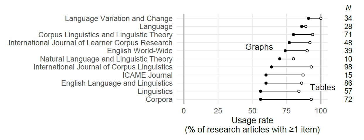
Figure 2. Percentage of research articles including at least one graph (filled circles) and at least one table (empty circles). For each journal, N refers to the total number of corpus-based research articles appearing in our survey.
The figures so far have captured the share of articles featuring at least one instance of either medium. It is also of interest to consider the actual number of graphs and tables that appear in each article. Figure 3 shows the distribution of these counts. Each article is represented by a small bar, and these symbols pile up to form a histogram-like representation. Articles with no graphs and/or no tables appear in grey, at the bottom of the graph. Quite expectedly, both distributions are skewed. Especially the number of graphs per article is distributed very unevenly: 32% of articles contain no data-based visualizations. In contrast, tables are absent from only 9% of the papers in our survey. Very few articles have more than 10 figures or tables and a single outlier features 37 charts.
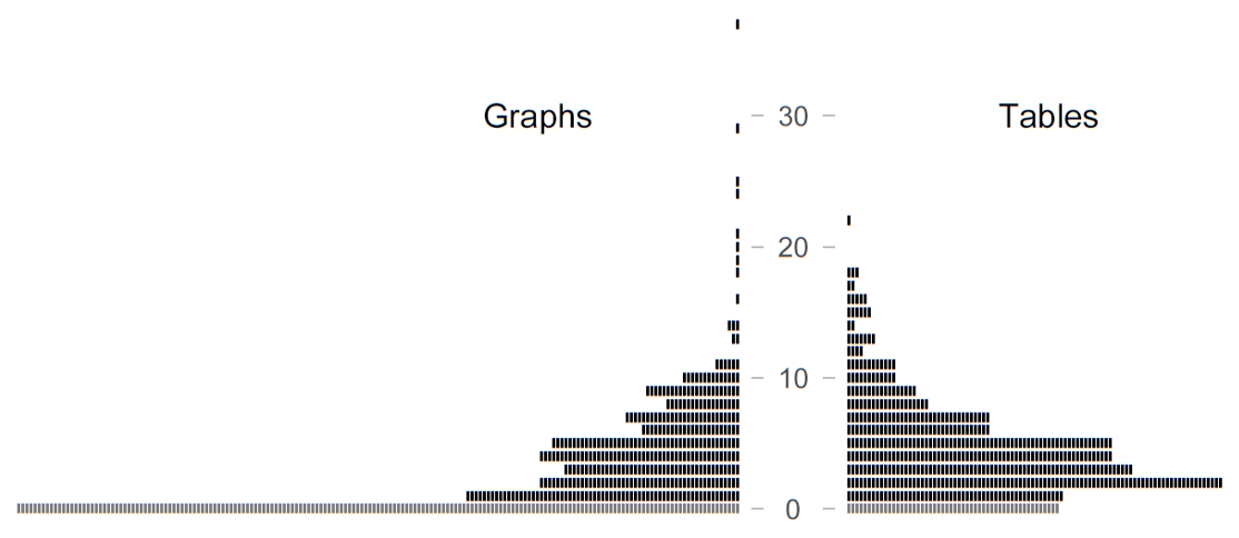
Figure 3. Distribution of graph and table counts across the 558 articles in our survey: Each symbol represents one article. Articles with a count of zero are shown in grey (at the bottom).
A comparison of the distributions in Figure 3 again demonstrates the higher currency of tables. While the skew in these distributions makes it difficult to report the typical number of graphs and tables per article, the inclination towards tables surfaces in the mean (4.5 vs. 3.4), the 10% trimmed mean (4.0 vs. 2.7), the 20% trimmed mean (3.8 vs. 2.4), and the median (4 vs. 2). However, these summary figures should not distract from the great variability among articles that is evident from Figure 3.
So far, we have failed to link counts from the same paper. This is what Figure 4 intends to show. The spiky profiles in the middle panel show the number of graphs (blue) and the number of tables (red) for each text. Research articles are ordered by graph count, increasing from left (32% of the total with no charts) to right (the handful of outliers with more than 20 graphs). The histogram-like profiles at the left margin are the same ones as in Figure 3.
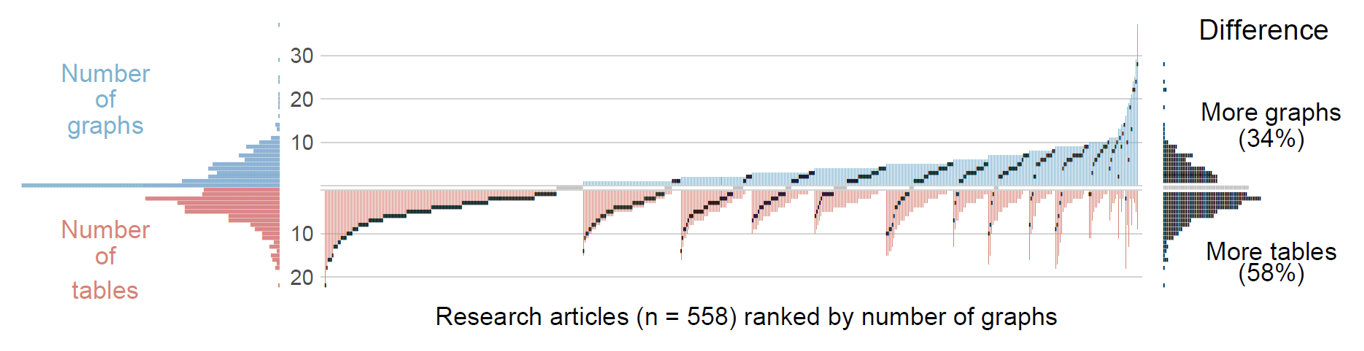
Figure 4. Distribution of graph and table counts across the 558 articles in our survey: Texts are ordered by graph count (blue). The black marks show, for each article, the difference between the number of graphs and the number of tables. The distribution of these differences is summarized at the right margin.
The middle panel also includes a small black bar for each article, which marks the difference between graph and table count. If the symbol appears in the upper, blue half of the display, this signals that the paper features more graphs than tables. At the right margin, the black markers are collected to display the distribution of differences observed across the 558 papers. This pile of differences reveals a tendency for articles to feature more tables than graphs, which is the case for 58% of the texts. This compares to 34%, the share of articles where graphs are in the majority. In 8% of the texts, the tallies are on a par; these cases are represented by grey markers.
In summary, we observe that, while a clear majority of corpus-based work draws on statistical graphics for data communication, tables are overall more prevalent: They feature in more than 90% of the articles (vs. 68% for graphs), and they tend to outnumber graphs. Considering our description of corpus-based work as highly quantitative, potentially involving complex data layouts, the inclination towards tabular modes of data presentation is, in our view at least, somewhat surprising, if not unsatisfactory. The fact that almost a third of the papers featured no graphs at all indicates that visual means may, on average, be underrepresented throughout the published research literature. However, there is considerable variability among articles suggesting that the corpus linguistic community is fairly heterogeneous in terms of their affinity for data-based graphics.
Next, we take a closer look at the graph types that are used for data presentation in corpus-based work.
To obtain an overview of the specific forms employed, we categorized each graph in our survey in terms of the general type it represents. In most cases, the classification was straightforward. The ensuing summary of usage patterns includes the category “Other”. In the initial round of annotation, we used this label for figures that did not resemble one of the familiar, major types. After our initial coding, we also assigned all minor chart types to this category. We used the 1% mark as a threshold: If fewer than 6 out of the 558 articles in our survey (i.e. <1%) featured the graphical form, we considered it a minor variant and assigned it to the category “Other”. Among these graph types are violin plots, correspondence analysis displays, 3D scatterplots and radial plots.
Some of our graph categories deserve further comments. We use the term “dot plot” to refer to Cleveland dot plots (Cleveland 1984; see also Sönning 2016), where each dot has its own line and label. Note that dot plots, in our classification scheme, can be arranged horizontally or vertically – that is, the accompanying label may also surface at the bottom of the graph. The label “CART” refers to graphical displays of classification and regression trees (Breiman et al. 1984), where branches show the splits and nodes produced via recursive partitioning. The leaves of such displays typically show bar charts (for classification trees) or boxplots (for regression trees). Finally, strip plots are basically one-dimensional scatterplots (see Chambers et al. 1983: 19), where data points form a single column along a quantitative axis.
Let us now turn to the results of our analysis. Figure 5 indicates a predominance of classical variants. The most common type is the bar chart, which occurs in 48% of the articles. Line plots also feature prominently, occurring at least once in 32% of texts. Next in line are scatter plots (17%), dot plots (10%) and box plots (8%). The remaining types occur in fewer than 5% of the articles in our survey.
This snapshot suggests that corpus data visualization is bar chart territory. Overall, there is a strong reliance on well-established graph schemas (Pinker 1990), which is certainly desirable from the point of view of the audience, who will be familiar with these entrenched forms. While most of the display types encountered in our survey therefore belong to the common core of statistical graphics, less familiar forms are also found. Thus, we do recognize a number of aspirants for the common core of graph types. Among these are dendrograms, CART charts, and mosaic charts.
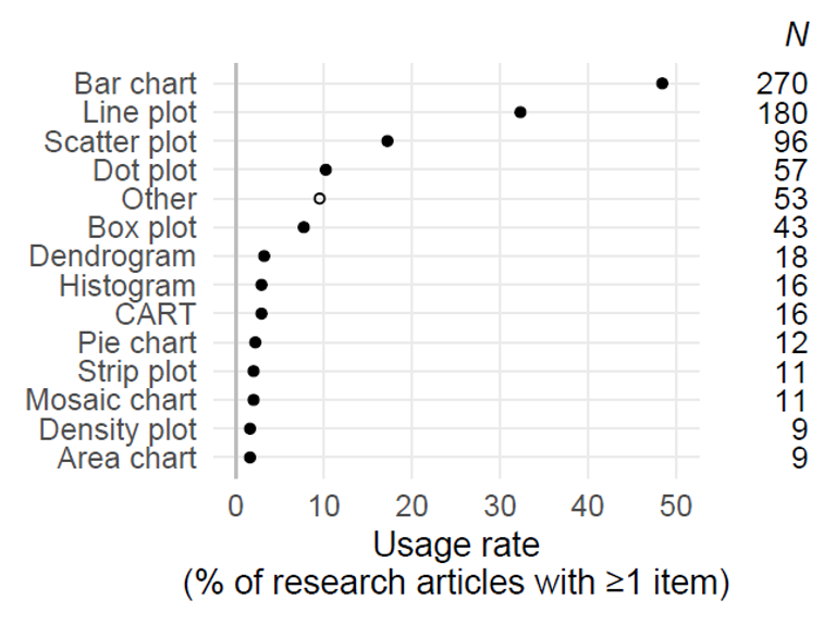
Figure 5. Distribution of graph types across the 558 articles in our survey: Percentages denote the share of articles featuring at least one graph of the respective type. N refers to the total number of corpus-based research articles in our survey featuring at least one instance.
To briefly illustrate what we mean by the ‘informed choices’ that researchers have to make, let us first take the case of the dendrogram, which seems to be making inroads into the methodological landscape (see Woods et al. 1986: 254–261 for an early treatment in the methodological literature aimed at linguists). This graph type has no competition in the common core. It shows a tree-like representation of a hierarchical clustering procedure, which is used to portray similarities among a set of observations measured along multiple traits. Dendrograms are therefore inextricably linked to a black-box algorithm, which requires the user to make certain choices. It would seem that their informed usage in corpus-linguistic settings requires engagement with the options available. This is because decisions on, say, the scaling of input variables, the type of linkage chosen, and the choice of measure expressing the (dis-)similarity between all pairs of data points, can yield drastically different visual arrangements. If these form the basis of our linguistic interpretations, we should be alert to the consequences of arbitrary settings (see James et al. 2013: 390–401). Further, it is not clear to what extent cognitive factors may interfere with the accurate decoding of dendrograms.
Another candidate for the corpus linguist’s permanent toolkit are CART charts (see Tagliamonte & Baayen 2012 for an early application of these techniques to language data). Like dendrograms, these are tied to an algorithmic procedure, and therefore do not compete with any of the classic variants. Again, the attention of the corpus linguistic community should be directed at the underlying computations, and whether they are appropriate, given the objectives of our investigation and our knowledge of the data layout. Thus, the recursive partitioning tools that appeared in our survey are unable to represent hierarchical data structures, and therefore fail to link tokens produced by the same speaker (or writer) during the analysis. As for perception, it is unclear whether the interpretation of, say, a classification tree is really as straightforward as some authors claim (see Grafmiller, this volume, for further discussion).
Finally, mosaic charts seem to be climbing the ladder to the status of a routine procedure (see Baayen 2008: 34 for one of the first linguistic references to this graph type). Unlike dendrograms and CART charts, they have a clear contender in the pantheon of graph types: the bar chart. It would therefore seem worthwhile to carefully consider the advantages and disadvantages of mosaic charts and bar charts. Familiarity arguments aside, mosaic charts add information on cell counts in a contingency table, which may be critical when it comes to interpreting the resulting percentages. Three-way (or higher-dimensional) mosaic charts, however, require the viewer to compare non-aligned box lengths, which is mentally taxing. A graph type that avoids such non-aligned length comparisons, and features strengths of the bar and mosaic forms is the double-decker plot (for an illustration see Unwin 2015, chapter 7).
The chapter by Schützler starts from the premise that, although central to much of corpus-linguistic research, the concepts of ‘frequency’ and ‘frequency differences’ have not been sufficiently discussed and problematized. The author proceeds from general and theoretical considerations to their application in data scaling and visualization, drawing both on idealized/schematic data and on previously published studies for illustration. Three frequency-based concepts and different transformations applied to them are discussed: (i) normalized text frequency (e.g. per million words), (ii) differences in text frequency and (iii) proportions (or percentages). Different ways of scaling (and thus visualizing) these measures are pitched against each other and compared concerning their cognitive plausibility and immediacy for the reader, as well as their practical implications for the plottability and processability particularly of extreme values. Other aspects that are covered include the (in-)appropriateness of basic plot types (e.g. bar charts vs. dot plots/line plots) in combination with the suggested approaches and the use of transparent and informative tick marks and axis labels for logarithmically scaled plots. The chapter thus explains basic concepts and metrics, develops strategies for the visualization and interpretation of results, and makes suggestions for the informative and accessible communication of the (seemingly) more abstract outcomes.
The aim of Sönning’s chapter is to draw attention to an underused display type for data analysis and presentation: the line plot. Though familiar to most (if not all) linguists, this graph type is commonly associated with time series data. In this contribution, however, it is argued that the true potential of line plots unfolds in their application to multifactorial data sets involving discrete (categorical) variables. Such analytic settings are often encountered in corpus-based work, which underscores the relevance of line plots for corpus data analysis and presentation. Drawing on theoretical and empirical insights into visual perception, the author provides evidence-based recommendations for the use of line plots in empirical research. Their added value and applicability to corpus data are demonstrated by redesigning selected graphs from the literature. The author argues that the line plot holds out several distinct advantages over its biggest competitor, the bar chart. It (i) minimizes redundant visual information, (ii) offers benefits in terms of resolution, and (iii) provides an extended set of coding strategies, which can be exploited to improve the clarity and decoding of complex patterns emerging from multiple (potentially interacting) variables. The greatest advantage of line plots, however, is the fact that they allow the researcher to exploit principles of human cognition to facilitate the decoding of a graph, taking advantage of Gestalt laws of perceptual organization. These hard-wired biases can reduce processing effort and thereby counter capacity constraints on our visual working memory. While certain remaining issues and limitations are also discussed, the chapter argues strongly for a routine use of line plots for corpus data analysis and presentation.
In his chapter, Moisl addresses the problem of data with a dimensionality greater than three, in which case direct graphical representation with the aim of identifying latent structure and formulating hypotheses is not possible. The author argues that the competent application of the necessary indirect methods requires an understanding of a range of mathematical concepts. His contribution outlines such concepts in an intuitively accessible way and demonstrates how this knowledge may be fruitfully applied in the visualization of high-dimensional data. The paper defines central concepts (e.g. vector, matrix, vector space and manifolds), introduces the illustrative dataset (comprised of texts from Old, Middle and Early Modern English whose dimensionality consists of the frequencies of a large array of graphematic patterns), discusses and exemplifies the concept of projection (i.e. dimensionality reduction), and shows what shape the dataset takes in visualizations based on two approaches, (linear) Principal Components Analysis (PCA) and topological mapping using a (nonlinear) Self-Organizing Map (SOM). While differences exist and are discussed, Moisl concludes that both PCA and SOM produce broadly compatible groupings of texts, but that neither of them is fully reliable on its own for the generation of optimal visualizations of any given data. Several visualization methods should therefore be applied and consensus among them identified.
In the context of ‘comparative variationist research’, the chapter by Grafmiller examines methods for assessing the grammatical similarity between language varieties. One of the primary aims of the chapter is to highlight the positive contribution visualizations can make to understanding complex statistical models in recurrent research settings. In this specific case, grammatical similarity is operationalized as the (dis)similarity of the effects certain factors have on the genitive alternation, across different genres of American English from two time periods. The author outlines two of the most widely used techniques for variationist analysis, namely generalized linear mixed models (GLMMs) and random forests (RFs) and discusses the various advantages and disadvantages of these methods. The presentation of model output is approached and discussed from different visual perspectives. To mention but one example, breakdown plots are presented as a method for examining the way a model classifies individual observations, and how specific feature values contribute to those classifications.
The chapter by Tyrkkö starts with the observation that, due in part to the design of online and standalone corpus tools, it is commonplace to treat corpora exclusively from the so-called bag-of-words perspective, although the data at hand are almost invariably complex and relational in nature. As the sizes of corpora have increased, the author argues, it has become increasingly difficult to understand the structure and meta-data of a corpus and the associations between linguistic features. Against this background, the chapter focuses on network visualizations, which are suited for both exploring and presenting complex linked data. The main tool discussed is Cytoscape, an open-access network visualization tool widely used in bioinformatics and supported by a large user base. A number of case studies are presented to illustrate how network visualizations can assist in both exploratory analysis and descriptive visualization of corpora and linguistic data, for instance to explore the structure of text collections and their metadata and to clarify collocate relationships, or to analyze the distribution of multilingual elements across millions of tweets, combining linguistic data and metadata to produce an overview that could not be represented otherwise. The case studies present the workflow behind the visualizations themselves, showing how data visualization can be integrated into the research cycle, instead of only being its end result. Whilst the application of choice is Cytoscape, the methods described are generic in nature and largely available in other network visualization environments, too.
Kretzschmar & Coats build their chapter on the argument that frequency lists of words or collocates in corpora all come out with nonlinear, Zipfian distributions that will also materialize in subsamples of the same data. They argue that this scale-free ‘self-similarity’ between and within samples is evidence of fractal distributions, which are not well described by visualizations that assume a central tendency; corpus linguists should therefore choose visualizations that display nonlinear distributions, not means and standard deviations. The problem for corpus linguists, after having done so, is how to compare the self-similar charts, all of which look the same. The chapter demonstrates three basic methods for effective comparisons: position of keywords on nonlinear graphs, clustered/composite graphs, and paired graphs. These are illustrated using the software tool ZipfExplorer and Microsoft Excel. The authors argue that the reviewed methods make for a more effective exploration of data by detecting the presence, assessing the magnitude and understanding the nature of differences in usage patterns across different samples.
Baayen, R. Harald. 2008. Analyzing Linguistic Data: A Practical Introduction to Statistics Using R. Cambridge: Cambridge University Press.
Breiman, Leo, Jerome H. Friedman, Richard A. Olson & Charles J. Stone. 1984. Classification and Regression Trees. New York: Chapman & Hall.
Brezina, Vaclav. 2018. Statistics in Corpus Linguistics: A Practical Guide. Cambridge: Cambridge University Press.
Chambers, John M., William S. Cleveland, Beat Kleiner & Paul A. Tukey. 1983. Graphical Methods for Data Analysis. Belmont, CA: Wadsworth.
Cleveland, William S. 1984. “Graphical methods for data presentation: Full scale breaks, dot charts, and multibased logging”. The American Statistician 38(4): 270–280. doi:10.2307/2683401
Cleveland, William S. 1993. Visualizing Data. Summit, NJ: Hobart Press.
Cleveland, William S. 1994. The Elements of Graphing Data. Summit, NJ: Hobart Press.
Cleveland, William S. & Robert McGill. 1984. “Graphical perception: Theory, experimentation, and application to the development of graphical methods”. Journal of the American Statistical Association 79: 531–554. doi:10.2307/2981473
Desagulier, Guillaume. 2017. Corpus Linguistics and Statistics with R. Introduction to Quantitative Methods in Linguistics. Cham: Springer.
Egbert, Jesse, Tove Larsson & Douglas Biber. 2020. Doing Linguistics with a Corpus. Cambridge: Cambridge University Press.
Fienberg, Stephen E. 1979. “Graphical methods in statistics”. American Statistician 33(4): 165–178. doi:10.1080/00031305.1979.10482688
Gelman, Andrew, Cristian Pasarica & Rahul Dodhia. 2002. “Let’s practice what we preach: Turning tables into graphs”. The American Statistician 56(2): 121–130. doi:10.1198/000313002317572790
Gries, Stefan Th. 2016. Quantitative Corpus Linguistics with R: A Practical Introduction. New York: Routledge.
Gries, Stefan Th. 2021. Statistics for Linguistics with R: A Practical Introduction. Berlin: Mouton de Gruyter.
James, Gareth, Daniela Witten, Trevor Hastie & Robert Tibshirani. 2013. An Introduction to Statistical Learning. New York: Springer.
Kastellec, Jonathan P. & Eduardo L. Leoni. 2007. “Using graphs instead of tables in political science”. Perspectives on Politics 5(4): 755–771. doi:10.1017/S1537592707072209
Kosslyn, Stephen M. 1985. “Graphics and human information processing: A review of five books”. Journal of the American Statistical Association 80: 499–512. doi:10.2307/2288463
Kosslyn, Stephen M. 2006. Graph Design for the Eye and Mind. Oxford: Oxford University Press.
Levshina, Natalia. 2015. How to do Linguistics with R: Data Exploration and Statistical Analysis. Amsterdam: John Benjamins.
Pinker, Steven. 1990. “A theory of graph comprehension”. Artificial Intelligence and the Future of Testing, ed. by Roy Freedle, 73–126. Hillsdale, NJ: Lawrence Erlbaum Associates.
R Core Team. 2022. R: A language and environment for statistical computing. R Foundation for Statistical Computing, Vienna, Austria. https://www.R-project.org/
Rühlemann, Christoph. 2020. Visual Linguistics with R: A Practical Introduction to Quantitative Interactional Linguistics. Amsterdam: John Benjamins.
Sampson, Geoffrey R. 2005. “Quantifying the shift towards empirical methods”. International Journal of Corpus Linguistics 10(1): 10–36. doi:10.1075/ijcl.10.1.02sam
Sampson, Geoffrey R. 2013. “The empirical trend: Ten years on”. International Journal of Corpus Linguistics 18(2): 281–289. doi:10.1075/ijcl.18.2.05sam
Schützler, Ole & Julia Schlüter, eds. 2022. Data and Methods in Corpus Linguistics: Comparative Approaches. Cambridge: Cambridge University Press.
Sönning, Lukas. 2016. “The dot plot: A graphical tool for data analysis and presentation”. A Blend of MaLT: Selected Contributions from the Methods and Linguistic Theories Symposium, ed. by Hanna Christ, Daniel Klenovšak, Lukas Sönning & Valentin Werner, 101–129. Bamberg: University of Bamberg Press.
Tagliamonte, Sali A. & R. Harald Baayen. 2012. “Models, forests, and trees of York English: Was/were variation as a case study for statistical practice”. Language Variation and Change 24(2): 135–178. doi:10.1017/S0954394512000129
Tufte, Edward R. 1983/2001. The Visual Display of Quantitative Information. Cheshire: Graphics Press.
Tufte, Edward R. 1990. Envisioning Information. Cheshire: Graphics Press.
Tukey, John W. 1977. Exploratory Data Analysis. Reading, MA: Addison-Wesley.
Tukey, John W. 1993. “Graphic comparisons of several linked aspects: Alternatives and suggested principles”. Journal of Computational and Graphical Statistics 2(1): 1–33. doi:10.1080/10618600.1993.10474595
Unwin, Antony. 2015. Graphical Data Analysis with R. Boca Raton: CRC Press.
Vessey, Iris. 1991. “Cognitive fit: A theory-based analysis of the graphs vs. tables literature”. Decision Sciences 22: 219–241. doi:10.1111/j.1540-5915.1991.tb00344.x
Wallis, Sean. 2021. Statistics in Corpus Linguistics Research: A New Approach. London: Routledge.
Ware, Colin. 2013. Information Visualization: Perception for Design. Amsterdam: Elsevier.
Woods, Anthony, Paul Fletcher & Arthur Hughes. 1986. Statistics in Language Studies. Cambridge: Cambridge University Press.
| Journal | 2015 | 2016 | 2017 | 2018 | 2019 | 2020 | Total |
|---|---|---|---|---|---|---|---|
| International Journal of Corpus Linguistics | 14/19 (74%) |
19/21 (90%) |
17/19 (89%) |
16/17 (94%) |
15/18 (83%) |
17/19 (89%) |
98/113 (87%) |
| English Language and Linguistics | 12/19 (63%) |
16/20 (80%) |
14/18 (78%) |
11/20 (55%) |
13/31 (42%) |
20/31 (65%) |
86/139 (62%) |
| Corpora | 9/13 (69%) |
13/17 (76%) |
13/16 (81%) |
11/13 (85%) |
12/14 (86%) |
14/15 (93%) |
72/88 (82%) |
| Corpus Linguistics and Linguistics Theory | 8/10 (80%) |
11/11 (100%) |
8/12 (67%) |
11/12 (92%) |
14/14 (100%) |
19/21 (90%) |
71/80 (89%) |
| Linguistics | 10/37 (27%) |
6/37 (16%) |
6/39 (15%) |
12/39 (31%) |
14/37 (38%) |
9/51 (18%) |
57/240 (24%) |
| International Journal of Learner Corpus Research | 8/10 (80%) |
10/11 (91%) |
8/9 (89%) |
9/10 (90%) |
7/8 (88%) |
6/9 (67%) |
48/57 (84%) |
| English World-Wide | 4/9 (44%) |
8/11 (73%) |
8/12 (67%) |
6/12 (50%) |
4/12 (33%) |
9/12 (75%) |
39/68 (57%) |
| Language Variation and Change | 5/14 (36%) |
9/14 (64%) |
4/15 (27%) |
7/15 (47%) |
3/10 (30%) |
6/15 (40%) |
34/83 (41%) |
| Language | 1/23 (4%) |
9/25 (36%) |
3/26 (12%) |
4/26 (15%) |
3/21 (14%) |
8/25 (32%) |
28/146 (19%) |
| ICAME Journal | 2/2 (100%) |
3/4 (75%) |
4/5 (80%) |
5/5 (100%) |
0/0 | 1/6 (17%) |
15/22 (68%) |
| Natural Language and Linguistic Theory | 2/41 (5%) |
2/37 (5%) |
2/27 (7%) |
2/34 (6%) |
1/35 (3%) |
1/28 (4%) |
10/202 (5%) |
| Total | 75/197 (38%) |
106/208 (51%) |
87/198 (44%) |
94/203 (46%) |
86/200 (43%) |
110/232 (47%) |
558/1238 (45%) |
Table 2. Share of articles with a corpus-linguistic orientation by journal and year (see Section 3).

University of Helsinki